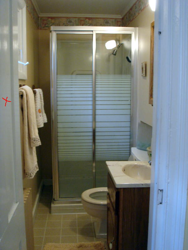
In addition to being tiny, the bathroom layout was a straight railroad, which limited the floor space. The shower was a pre-fab 36 inch square, but the remaining unused 7 inches was useless. The opaque shower doors limited the visual size of the room by seeming like a solid wall. We won’t even bother discussing the color, the fittings or that wallpaper border. There were no redeeming qualities whatsoever!
Changes to the original floor plan below include sealing the door into the bathroom and moving it to where the sink is shown. The sink will be relocated to the where the door was. The shower pan will be 42 inches wide and fill the whole back wall. The shower doors will be frameless glass so that the line of vision goes all the way to the back wall, making the bathroom feel visually larger.
The layout of the whole downstairs was one of the problems as well. The bathroom was entered through the back bedroom/TV room (which was itself entered through the kitchen). Our first step was to change the entrance to both rooms, sealing the kitchen entrance (and gaining a pantry) and turning the doors of both rooms to enter directly into the main house. Here is the back corner under the stairs before the renovation.
Here it is with the two new doors. The door on the left opens into the TV room/extra bedroom. The door on the right is the new bathroom door.
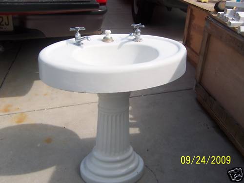
The house is a very simple 1880s Victorian cottage. Neither the budget nor the room itself calls for anything fancy and I want the bathroom to look as if maybe it was always just like that. My inspiration for the design came from a small French watercolor that I love, the historic pharmacy turned ice cream shop in town, and other original fixtures in the house made of aged brass. I had already bought a salvaged white pedestal sink from the turn of the century in anticipation. So that means simple white fittings – 1 inch white hexagon tiles for the floor and subway tiles for the shower enclosure – and unlacquered brass faucets and fixtures. Planning for Farrow & Ball Pale Powder on the walls, which is the second lightest color in the second column of the paint chart on the inspiration board below.
Natural or unlacquered brass is definitely on its way back – take a look at the droolicious Henry Collection at Waterworks – but try convincing the locals around here. Everybody was worrying about polishing! It took a lot to convince them that I wanted that deep oxidized caramel color and that my only worry was how long it would take to stop being “brassy” looking. The Waterworks collection was both budget busting and frankly, too stylized to suit my house, which was actually a relief to not have to want it! Nickel or chrome fittings also felt too 1920s art deco.
Here are a few photos from my inspiration files. This bathroom had just the kind of exposed shower I was looking for, but the color and the shelves also really caught my eye. No chance of opening the sheetrock in my tiny space, but I think it is a great idea. Sometimes shells and sea motifs can feel trite in a beach house, but this is charming. It also has a single plain framed window, similar to my bathroom.
This next photo has the hexagon tiles, vintage sink and natural unrenovated, undecorated look I want. We have discussed beadboard to death too, as the house has some original in the kitchen, but in the end, simplicity won out and not the beadboard. Again, space was a big issue and giving up half an inch to beadboard on the walls felt like it would make the room smaller.
The renovation was well on its way when the Dec/Jan issue of House Beautiful came out, featuring a gorgeous Windsor Smith project with this bathroom. While dressier that I plan and significantly more glamorous, this has the closest feel, with thick white molding, a beautifully shaped white tub, and pale wall color. It has a wood floor, not tile, which adds a dark note, which I am hoping to add to my room with a wooden mirror and accessories.
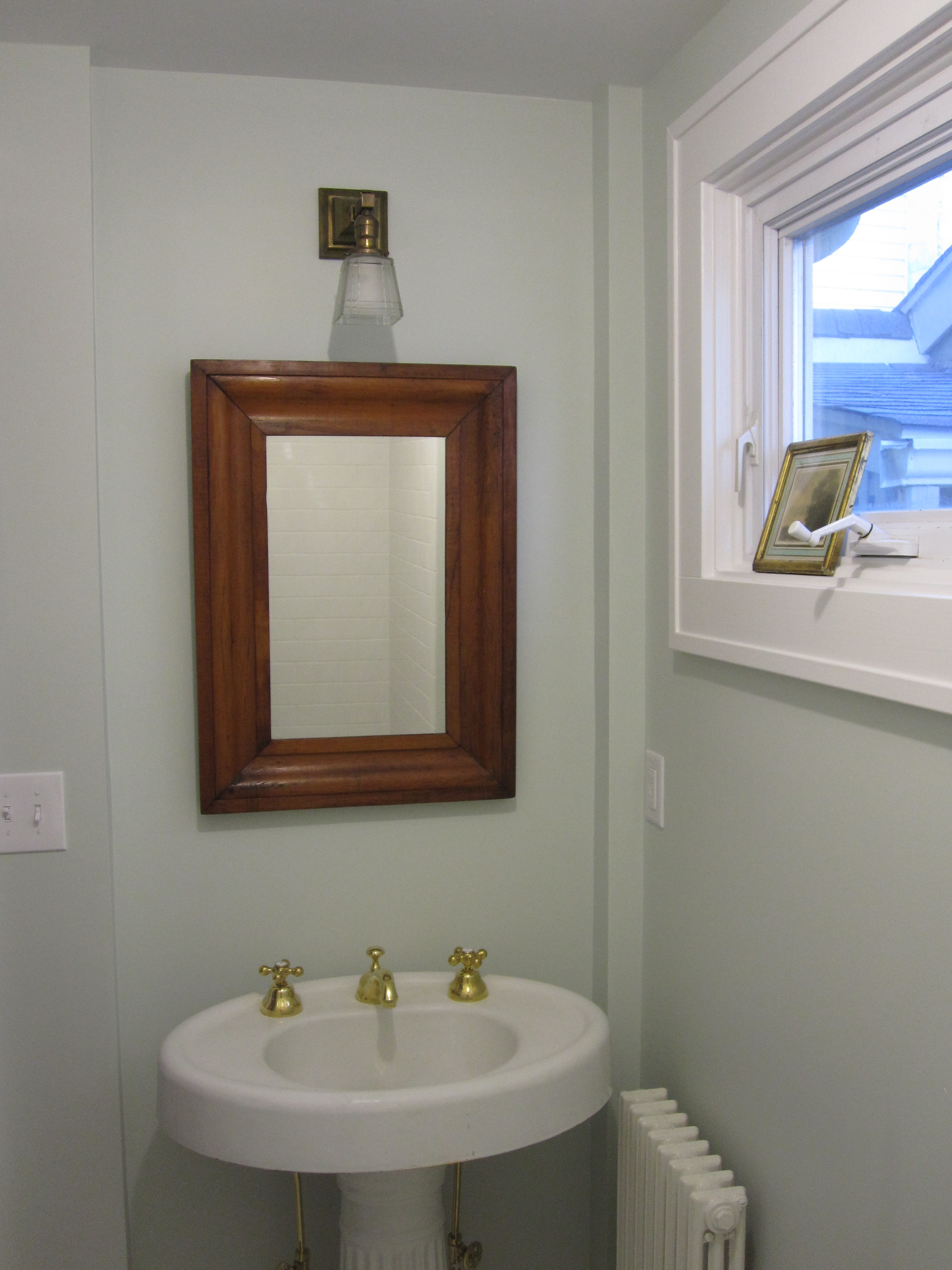
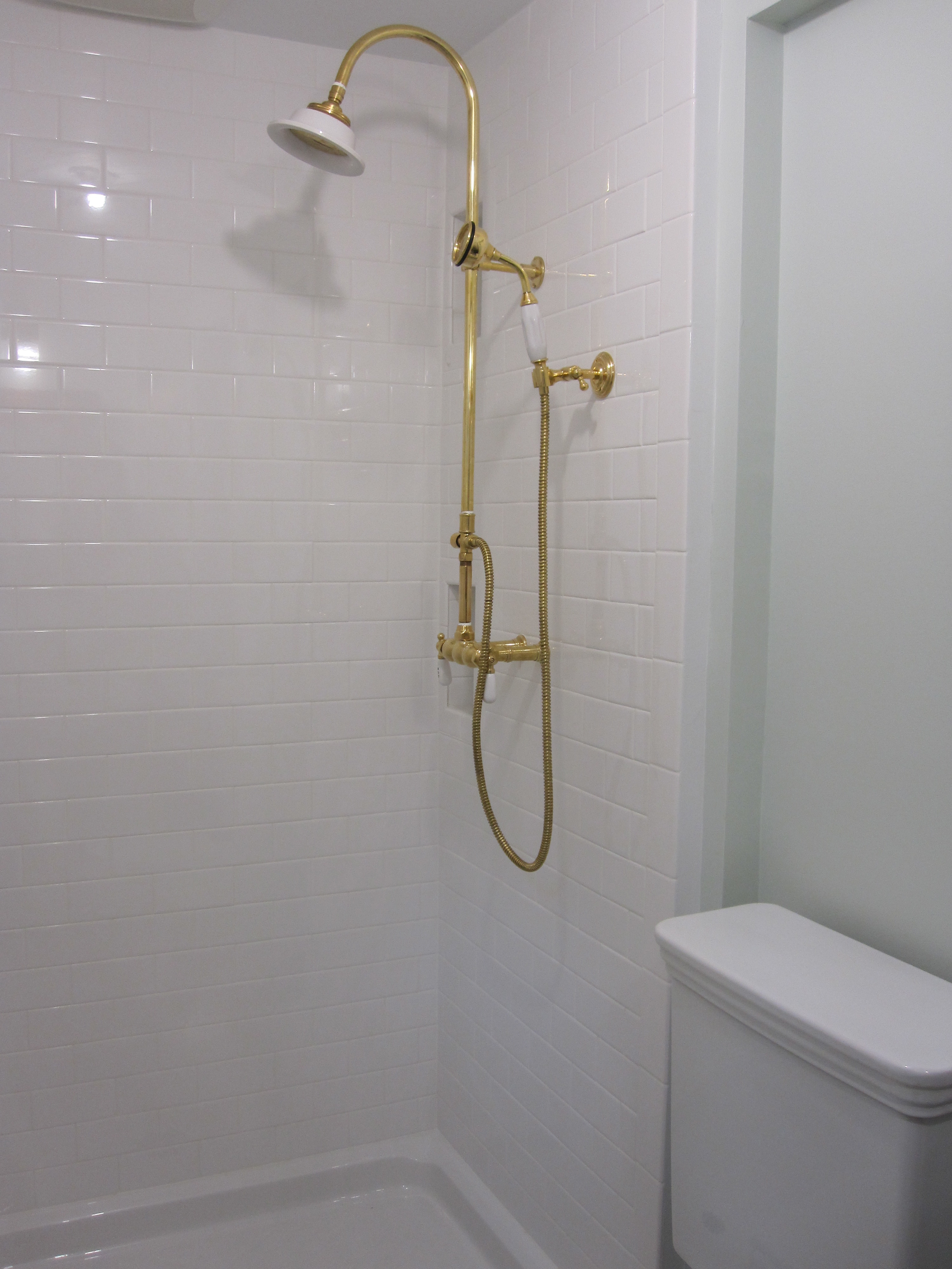
We assembled the pieces – the vintage sink, a round profile Promenade toilet from Toto, which has just the right amount of vintage feeling and is very compact and well priced, an exposed shower from Baths From the Past and an unlacquered brass faucet from Sunrise Specialty to retrofit the sink. I was the only one in the family who voted to keep the original separate hot and cold taps on the sink for authenticity! I also bought a salvaged 24 inch door from Recycling the Past in Barnegat, New Jersey as the original door is too large for the new entrance.
Here is the (almost) finished project. I got into town 3 days ago and was lucky enough to find the perfect mirror at a favorite antiques store (antiquing on the Jersey shore is fabulous – and I am sure I’ll post about it this summer). The frameless shower doors will be installed soon and there is no styling or accessories yet, but you can get the basic idea….
I am planning on small shelves in the cutout above the toilet, like the ones behind the bathtub in the Windsor Smith bathroom. Not sure how long the oxidation will take, but some of the brass is tarnishing already. I also bought a great vintage brass towel bar for a song on eBay, and that will go up on the wall opposite the toilet.
The bathroom is so light and pretty – even more that I expected – and it feels roomier too. I’d love to hear from you all and know what you think! Styling and accessories will have to wait until the summer as we leave for Florida tomorrow, but it gives me something to hunt for. Oh, and I am still considering wallpaper (and can pull out inspiration photos of quirky wallpapered bathrooms too) so let me know what you think of that…
Image Credits: 1-5, 9, 13-16. me, 6. via The Lettered Cottage, 7. from Found Style by David and Amy Butler, 8. House Beautiful December/January 2011 photo credit: Victoria Pearson, 10. Toto, 11. Baths From the Past, 12. Sunrise Specialty


