Right now I am working on a really fun project, quite different from my usual style. It is a bedroom for a teenager with a strong sense of what she likes without knowing how to make it get that way. Rather than giving me a list of furniture or a design style, her inspiration photos, sourced by her on Tumblr, communicate emotion and personality – a distinct mood. Take a look….
What do these all have in common? A dreamy feel. Obviously little white sparkle lights, perhaps even with tiny lanterns are an absolute given, as is a collage wall of photos, ephemera and other goodies. She is already at work collecting pictures and images she likes. The de-riguer Apple lap top which is a requirement for high school she already has. What these photos also have in common is what they don’t have, i.e. there is no significant or important furniture or art, which bodes well for the budget. On the other hand, the room needs to be more than just some sparkly white lights. It needs to be functional and practical and perhaps able to mature along with its owner.
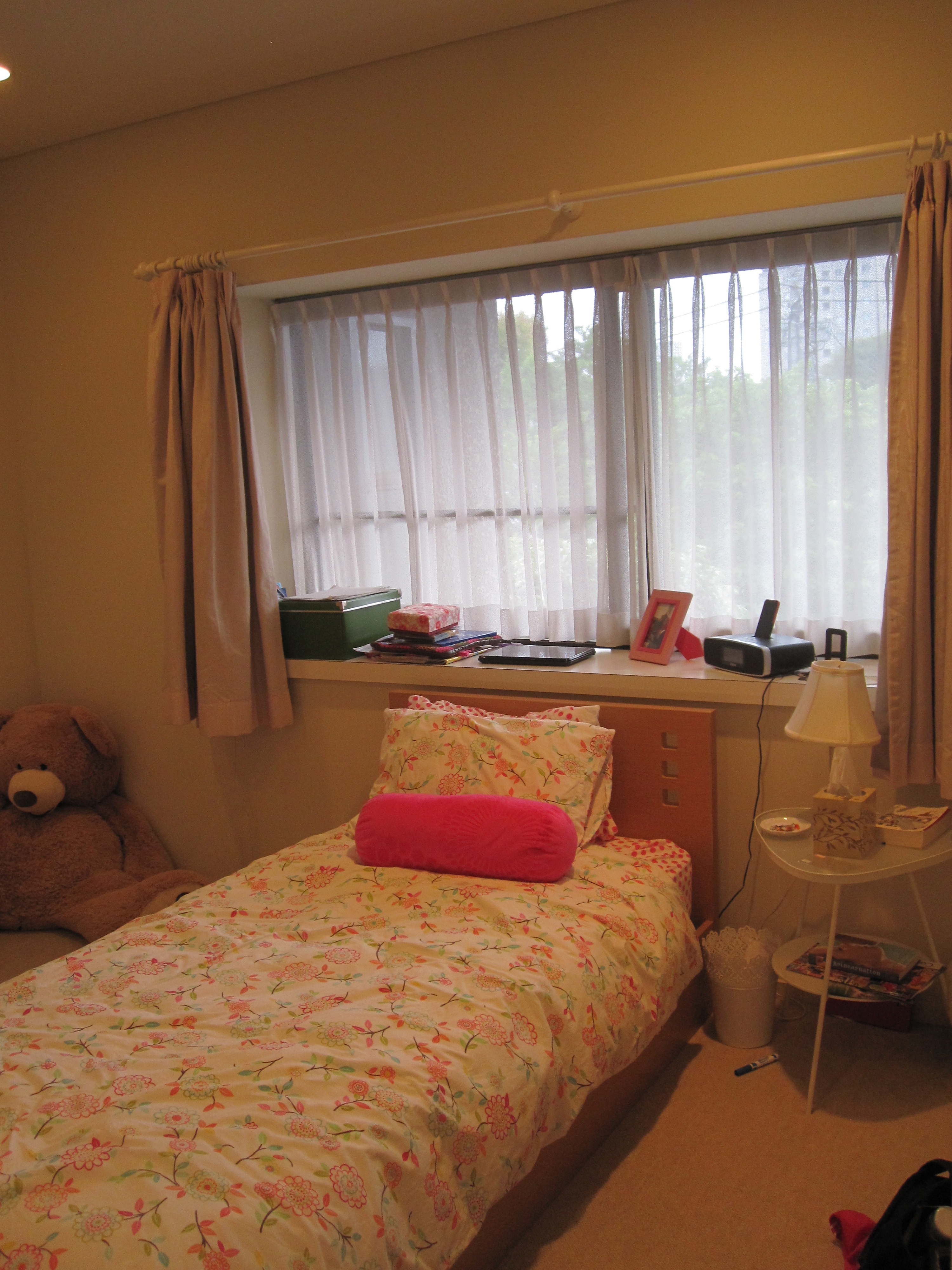
The room itself is absolute Tokyo standard – small, with ugly off-white wallpaper and carpet and no interesting architectural features. Tracy the bear has to stay.
Her other dictates are also quite clear:
She loves bright pink.
She doesn’t like “Asian”.
And her mom’s dictates are clear too:
She needs the room to grow with her.
This needs to be done on a budget.
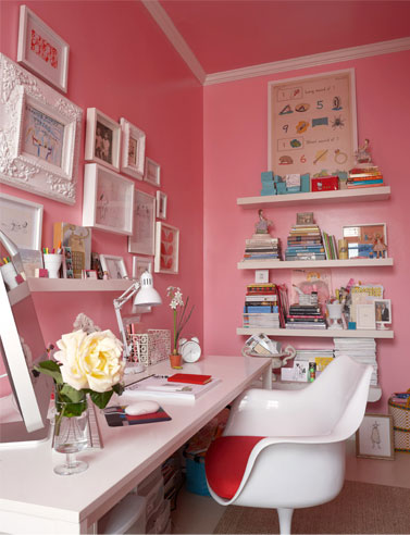
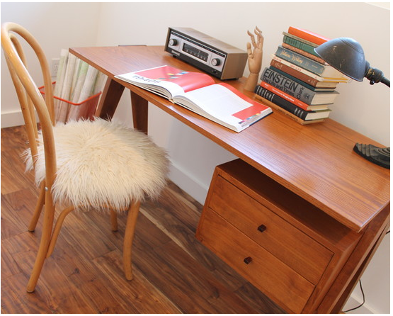
My additional inspiration photos for desk and orderly display include quite a bit of white and pink, containers for order, cute desk lamps and a mid-century modern chair. (From here, here, and here.)
Our resources here in Tokyo are limited, particularly on a budget. I know readers in the US and elsewhere think of Japan as a design mecca, but when it comes to reasonably sized furniture (as in not miniature) at reasonable prices, the selection here is very small. We have IKEA, shrine sales for an occasional find, IKEA, antique stores, IKEA, some sweet boutiques and mail order for accessories, and IKEA. We can’t paint or change anything and arguably can’t even put holes in the wall.
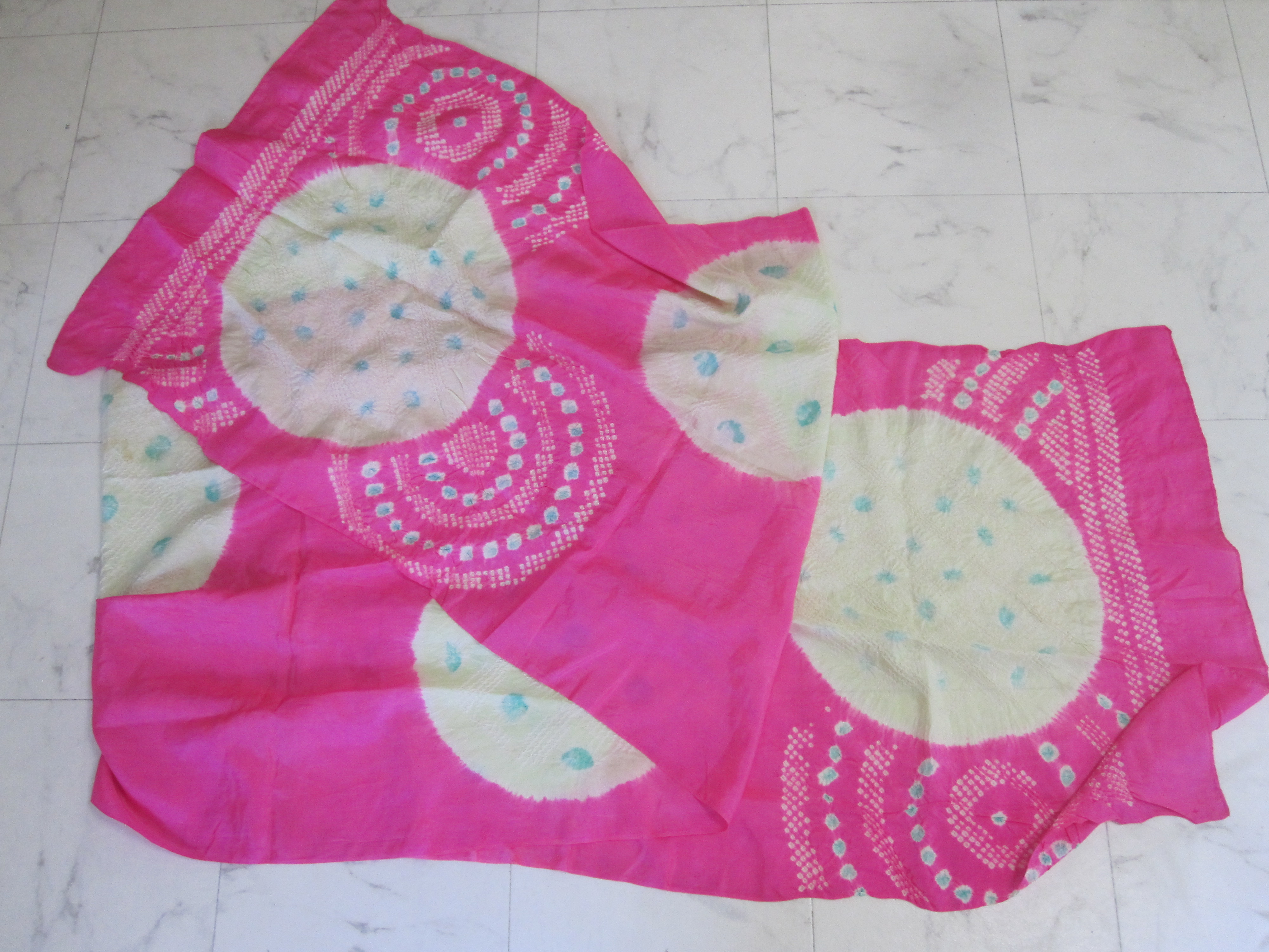
That she doesn’t love “Asian” can’t really go over well as that is one of our only pools of choice. I think it requires a bit of trickery – choosing things Japanese that she doesn’t consciously read as Japanese. For instance, one of the key pieces in the design is this hot pink shibori silk kimono obi for a window valence bought at a shrine sale. Quintessentially Japanese, but to her it reads as funky tie-dye. It has her pink and a soft accent of turquoise, which we will also be using.
IKEA, IKEA, IKEA
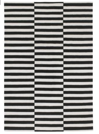
While an absolutely amazing resource, we don’t mean for the space to end up looking like one of the little sample rooms at the store. That being said, items from IKEA will be the backbone of the design, in particular this black and white Stockholm Rand dhurrie rug.
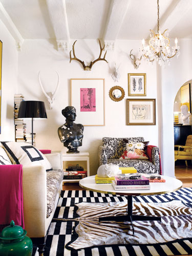
We have pulled this living room photo as a working tool. The black and white rug grounds the pink and makes it more sophisticated and eclectic. It also allows for later changes and updates. My theory on these Rand rugs is that we should all buy one and put it away. Some day soon IKEA will stop making them and we will all be reminiscing about them for years.
The brand new issue of Lonny also had a perfect inspiration space for this project. Here the striped rug is actually a zig zag, but it has just the kind of bedding mix we want to put together – white background and pink and turquoise accents. Note the mid-century chair here too. (You need to look left and right here as it is the same room in this screen shot.)
For bedding ideas we can turn to the internet, especially since the sizes of local linens doesn’t match the US standard sizes, and order things to be sent to a friend’s house in the USA and shipped here. We will stop into some cute local design stores here that aren’t a fortune too, like Franc Franc and Afternoon Tea, for throw pillows and other accessories like desk lamps and organizers.
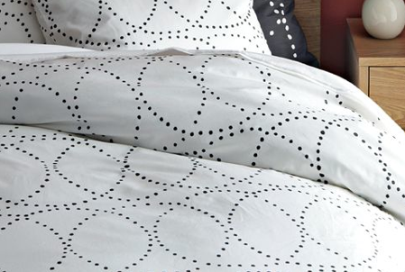
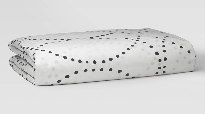
I am still on the hunt for the perfect duvet cover, but this Nile cover from West Elm on big sale for $24.99 might do. I’d really rather find something more like the Roberta Roller Rabbit duvet in the Lonny photo above.
We are all loving this long accent bolster from Pine Cone Hill.
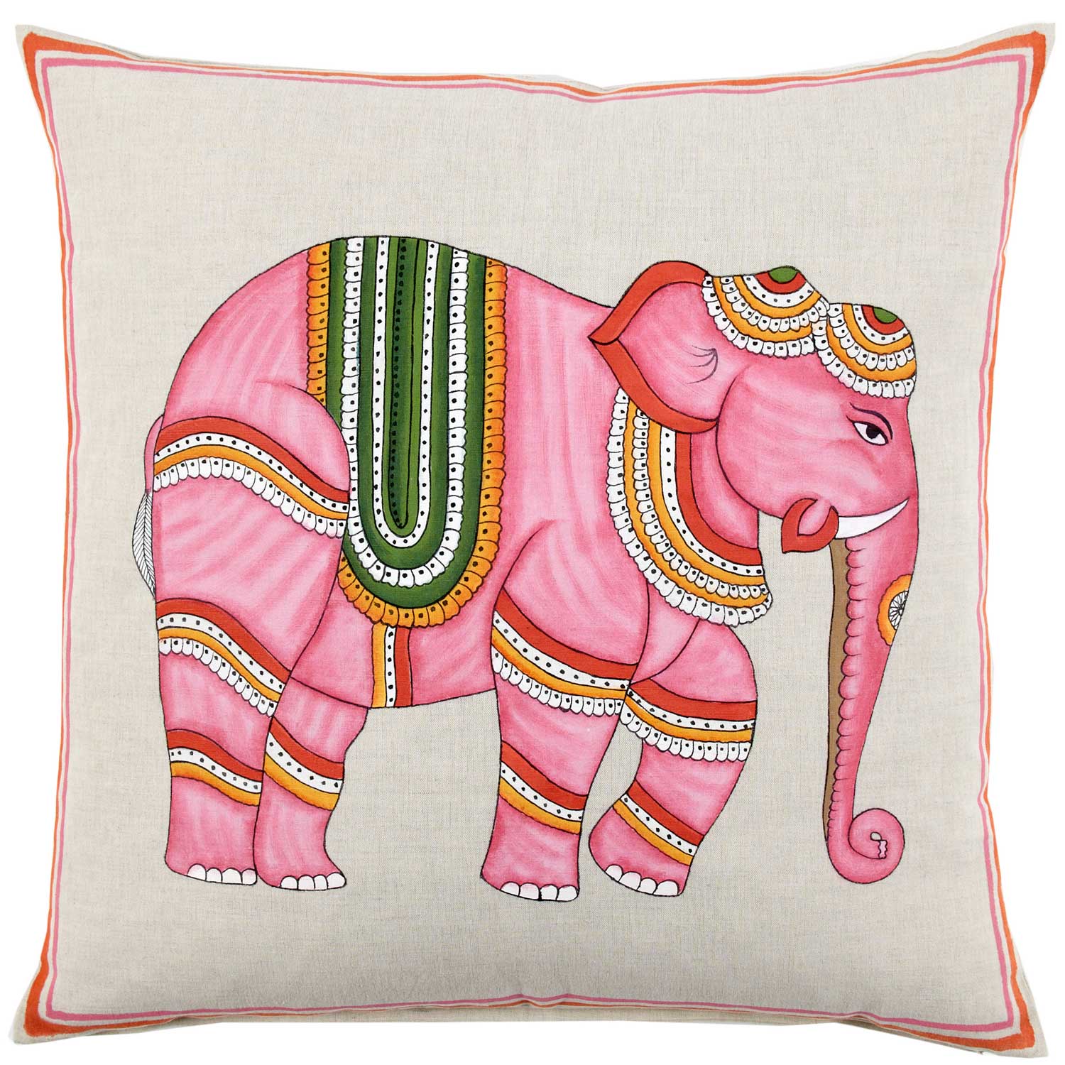
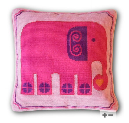
Perhaps a splurge on a special elephant pillow from John Robshaw or Jonathan Adler. The choice depends on which way we swing the mood.
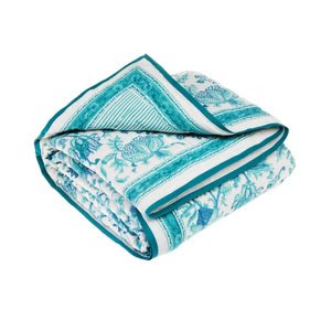
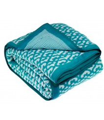
And we definitely plan to add some turquoise with either a quilt like these – the Amanda or Big Cata from Roberta Roller Rabbit…
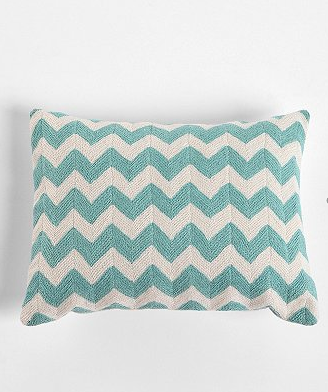
…or a little turquoise trellis, quatrefoil or zig zag in a pillow or two, like this one from Urban Outfitters.
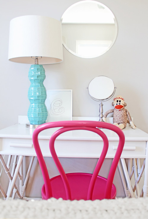
The desk and chair combo needs a little modern sleekness mixed with vintage style. Although the room could use a little brown wood to weight it and keep it from being too child-like, we’d take Carla Fahden‘s exact set-up as-is – vintage white wicker desk with hot pink bentwood chair and turquoise peanut lamp. The lamp is on sale at Pier One right now, so maybe we can order it along with the little white string lights and add it to our box coming from the US.
There are plenty of vintage bentwood chairs at the shrine sales if we want to go that direction, whether in wood or painted pink!
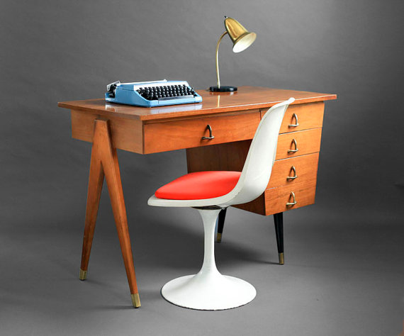
Here’s a mid-century desk + plastic Eames type chair from a great Etsy shop – too bad they can’t ship to Japan.
We could use the IKEA Snille in white (or pink!) and shop Meguro-dori for a desk to get the look above…
We are planning on hunting up the more unique accessories at shrine sales in the coming weeks. I’ll let you know how this develops and hope to have a full reveal quite soon – teenage clients are very impatient!


