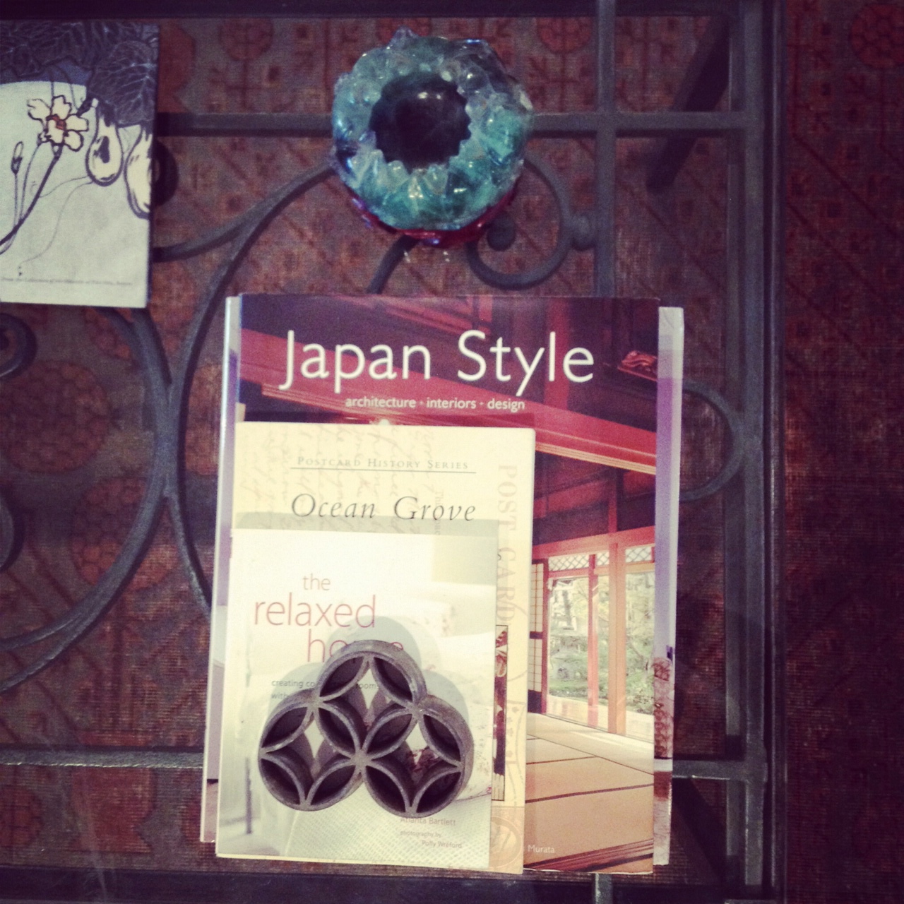
So my subconscious kept percolating about this little book on my coffee table – The Relaxed Home by Atlanta Bartlett – and the idea of links between it and my last post on mirrors. A little gift from a friend for design inspiration after we bought our beach  house, I have enjoyed its photographs of pretty vignettes and romantic rooms. I decided to do a little research about Ms. Bartlett and it turns out that she and her husband Dave Coote are both bigwigs in the world of styling and interior design. She is a stylist with a series of books under her belt and he is an interior and furniture designer known for his use of reclaimed materials. Between the two of their websites and portfolios, I seem to have hit the mother lode of grouped plateaus and other vintage mirrors. At this point, if you had no interest in yesterday’s post, you might stop reading, but if you loved it, time to open up your Pinterest page, because you will surely be pinning!
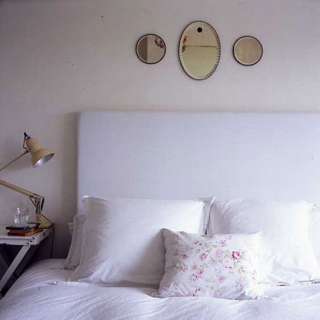
His portfolio is full of simply styled rooms chock full of detail, like these three engraved mirrors hanging above a bed.
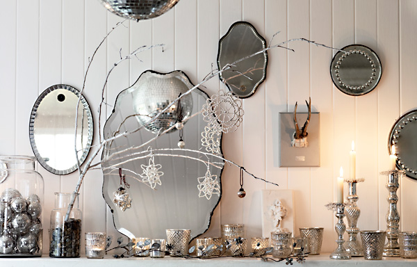
There is a sparkling all white and silver Christmas mantle.
I guess Dave Coote saw and loved the 2003 Martha Stewart Living cover too.
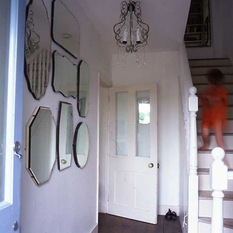
Another mirrored grouping in an entry hall.
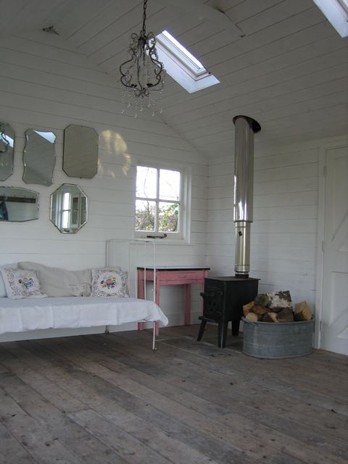
And again, above a daybed in a rustic cabin.
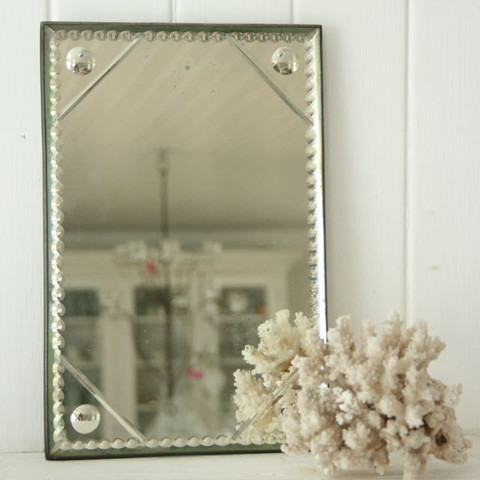
Together they also have an online store called Pale & Interesting, where this incredible antique mirror is for sale.
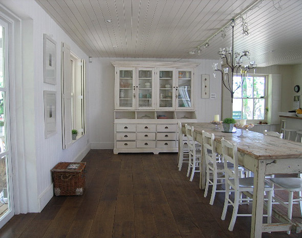
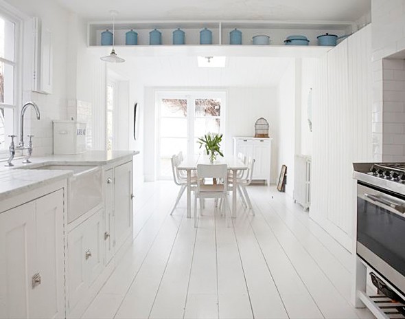
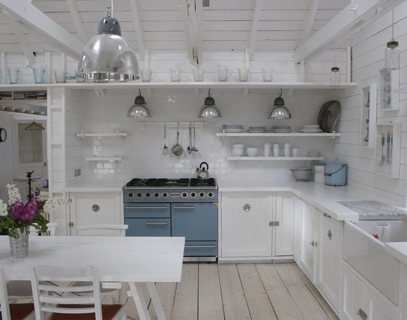
While their aesthetic is definitely linked to Martha Stewart and Rachel Ashwell of Shabby Chic, they add their particularly casual Aussie-Kiwi white sensibility to the spaces they design. You can just tell that all of the following kitchens are not found in the USA.
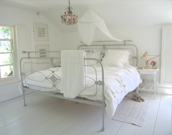
They paint floors white or pickle them a light color in many of the spaces for a dreamy look, like this white bedroom…
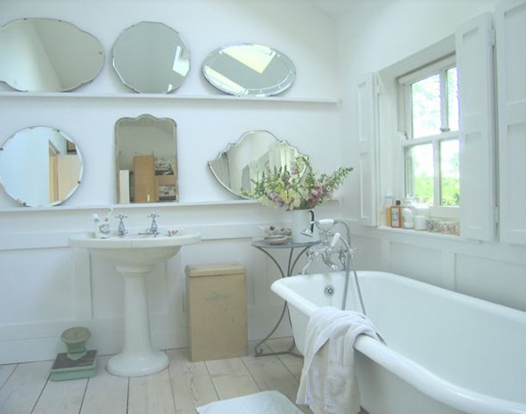
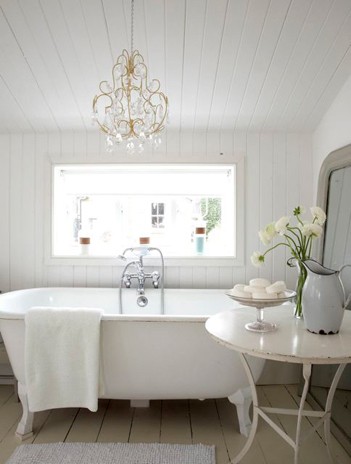
…and bath. If some of these spaces seem familiar to you it is because they also run a photographic locations agency and many of their spaces have been styled in advertisements and shelter magazines.
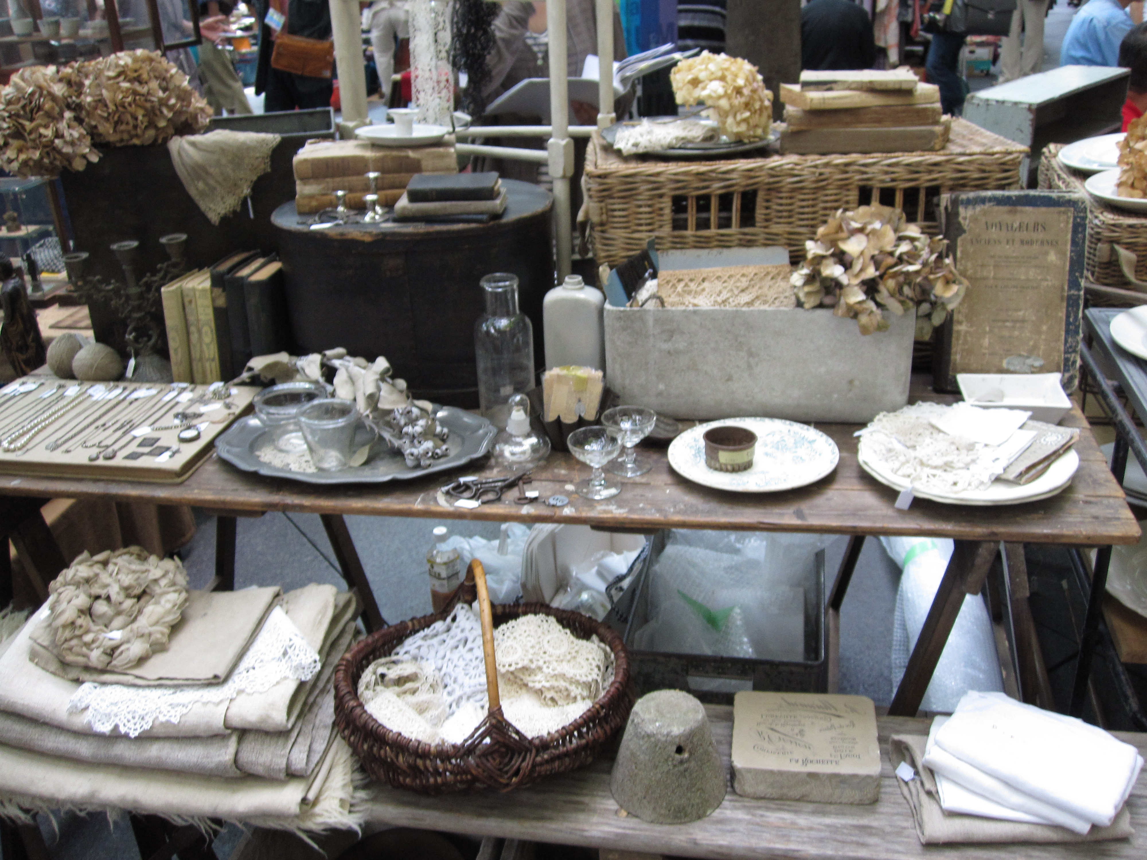
This painty white aesthetic is also hugely popular in Japan and you see it in styling at clothing and home goods stores and even at some charming antique market booths, like these at the Oedo market.
This one is more French, but similar in overall feel.
I love these white spaces, but I am not sure I could give up color…What about you?
Related Posts:
Perfectly Pale…Megan Morton’s Australian Home
More Pale Grey From Abroad
Image credits: All photos via Dave Coote or Atlanta Bartlett except the first and final two from me.

