I had long been saving photos of groupings of porcelain on brackets or corbels, a classic way to present a collection en masse. For example, this 1959 photo of Jayne Wrightsman’s Palm Beach library designed by Maison Jansen, with a grouping of what looks to be Meissen figurines.
Figurines not withstanding, Asian porcelain, whether Chinese or other, blue and white or polychrome, tends to be the most commonly presented in this fashion. Aerin Lauder inherited this collection as well as the house from her grandmother Estée…
…and it still looks fresh today in that East Hampton home.
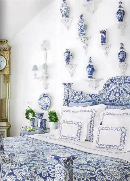
Carolyne Roehm went completely blue and white in her bedroom, even painting the brackets to fit in with the decor. Can’t imagine doing this in Japan, as the earthquakes would be sure to give you an unpleasant surprise one night.
Thomas Burak went with an all out chinoiserie theme in this Bridgehampton bedroom, pagoda bed, and all.
And another view.
Designer Mary Watkins Wood simplifies the look with a white background, white linens and white brackets, using mainly Chinese ginger jars. I think Japanese jubako (stacked lunch boxes) would give a similar effect. Gotta love that fantastic Portuguese bed!
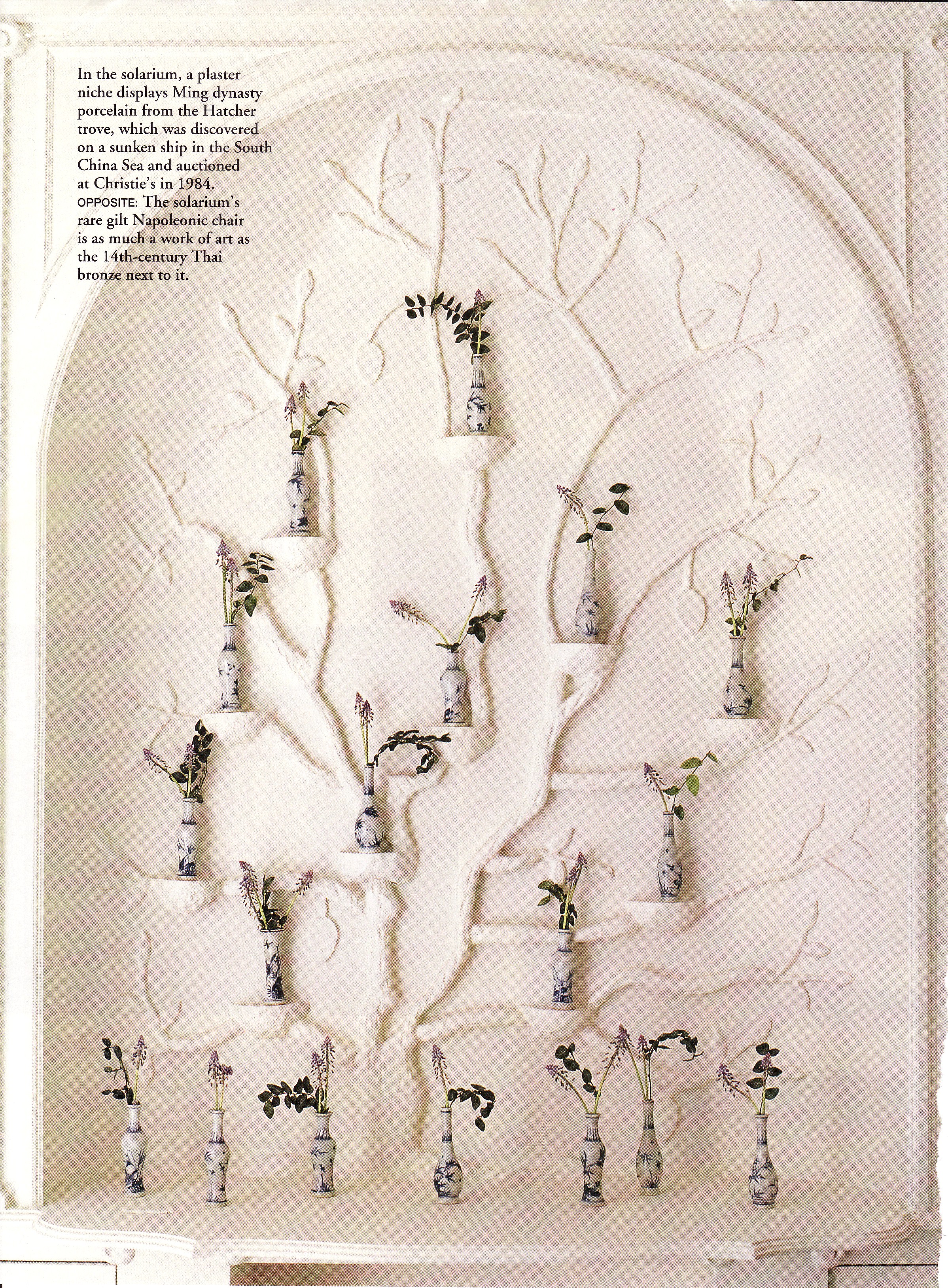
Did Dallas store owner Betty Gertz have this niche custom designer for this amazing grouping of Chinese vases or was it already there? The vases themselves are Ming dynasty antiques, part of the Hatcher trove. Now how’s that for provenance?
I had never seen this show house hallway by Mary McDonald before – thanks to Jennifer at The Peak of Chic for the photos.
I love the blue and white against the grey.
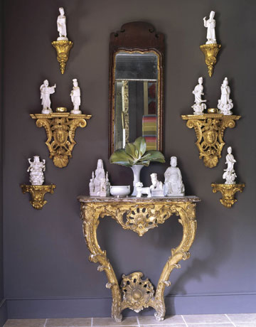
Not limiting the post to blue & white, here Robert Goodwin uses a collection of Blanc de Chine figurines in a similar fashion. The fabulous wall color is Benjamin Moore’s Iron Mountain.
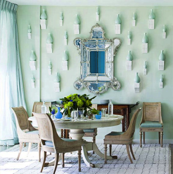
Miles Redd turns up the modernity a notch in this celadon dining room with a grouping of simple celadon vases on plainer matched brackets.
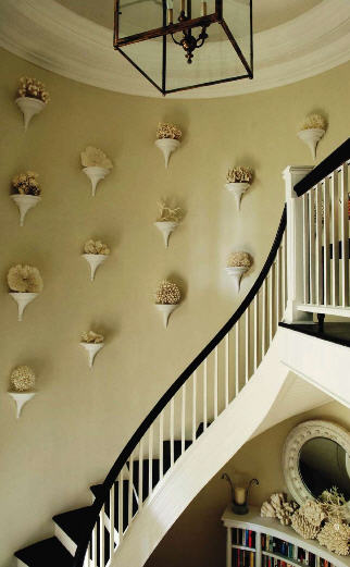
Here Oscar de la Renta does the same with coral in his Punta Cana home.
And perhaps the most tongue in cheek is this simple bathroom with the grandest of porcelain displays.
My question for you readers, is whether you like this look? Do you find it traditional? Elegant? Fussy? Do you like the brackets to all be the same? Or a variety? Painted like the wall color, contrasting or gilded? I am thinking on it too, considering it for an upcoming project…
Related Posts:
Colors of the Rainbow…Blue and White Porcelain is Neutral
Image credits: 1. via The Peak of Chic, , 2-3. Elle Decor, 4. Veranda via Chinoiserie Chic, 5. via The Enchanted Home, 6. House & Garden via Chinoiserie Chic, 7, 11-12. House Beautiful, 8. scanned by me from magazine tear sheets, but credit unknown, 9-10. via The Peak of Chic, 13. via Habitually Chic, 14. Martha Stewart Living via The Enchanted Home.


