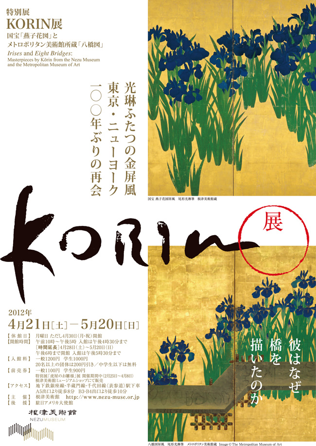
 In honor of the just opened exhibit Irises and Eight Bridges: Masterpieces by Kōrin from the Nezu Museum and the Metropolitan Museum of Art, I have gathered some images of Japanese byobu (screens) in Western interiors. If you are looking for more details on these extraordinary screens, take a look at a post I wrote last year, Ogata Korin’s Iris Masterpieces Reunion Postponed, when the exhibition was originally supposed to have taken place. I didn’t think there was any reason to recreate the wheel, so this post is going to be pure eye candy.
Byobu literally means “wind wall” which gives a clear sense of their original purpose – to block drafts. Over time their mobility and flexibility allowed them to be used almost anywhere, to block unsightly objects or repurpose a room, as well as serving as beautiful backdrops for tea ceremony and ikebana. Ornate screens and those using gold and silver leaf helped proclaim the status of their owner. Like much of Japanese artwork, screens originated in China but were slowly but surely domesticated and changed in Japan, with a high point being the introduction of paper hinges, allowing the artist a single large canvas to create an image, rather than completely divided panels.
Today, screens are more likely to be hung on the wall rather than stood on the floor and like blue & white porcelain, they work in almost any design style. Here John Saladino places a simple 2 panel screen with other traditional Japanese items – an incredible mon covered lacquer trunk and altar candlesticks.
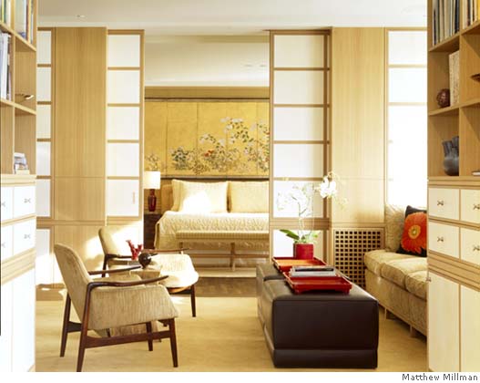
In a completely contemporary room with a strong Japanese vibe (note the shoji screens) Jonathan Straley hangs an Edo period byobu above the bed.
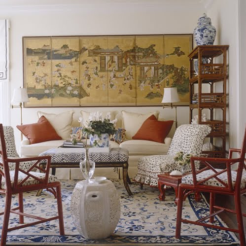
Meg Braff uses an ukiyo-e style screen depicting everyday business in this room filled with modern casual Chinoiserie details.
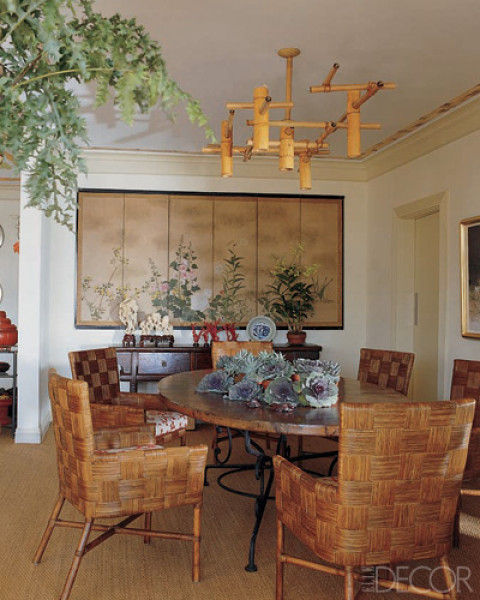
In Renny Renolds and Jack Staub‘s dining room we also have some modern Asian touches like the quirky bamboo chandelier and woven chairs.
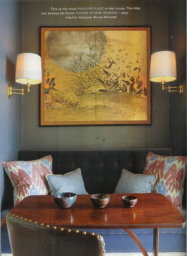
I adore Bruce Shostak‘s little banquet with its golden screen highlighted by moody colors.
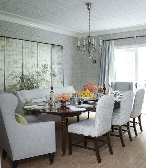
Changing gears entirely, there are other byobu made with squares of silver leaf that tend to be very simple, sometime even entirely plain. This dining room by Windsor Smith positively glows with its fabric covered walls and silver screen.
Michael Smith uses a simple silver-leafed screen as a highlight behind his sofa, placed on the floor and used as a backdrop. I love that he has layered a small painting on top of it.
Jerry Jacobs uses a similar screen in a similar fashion in this San Francisco living room.
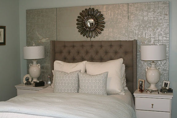
Caitlin Creer uses a Japanese screen on the wall behind her bed. While it functions to highlight the headboard and lamps, its real purpose in being there is to block an off-center and unsightly window. For more on her bedroom, click here.
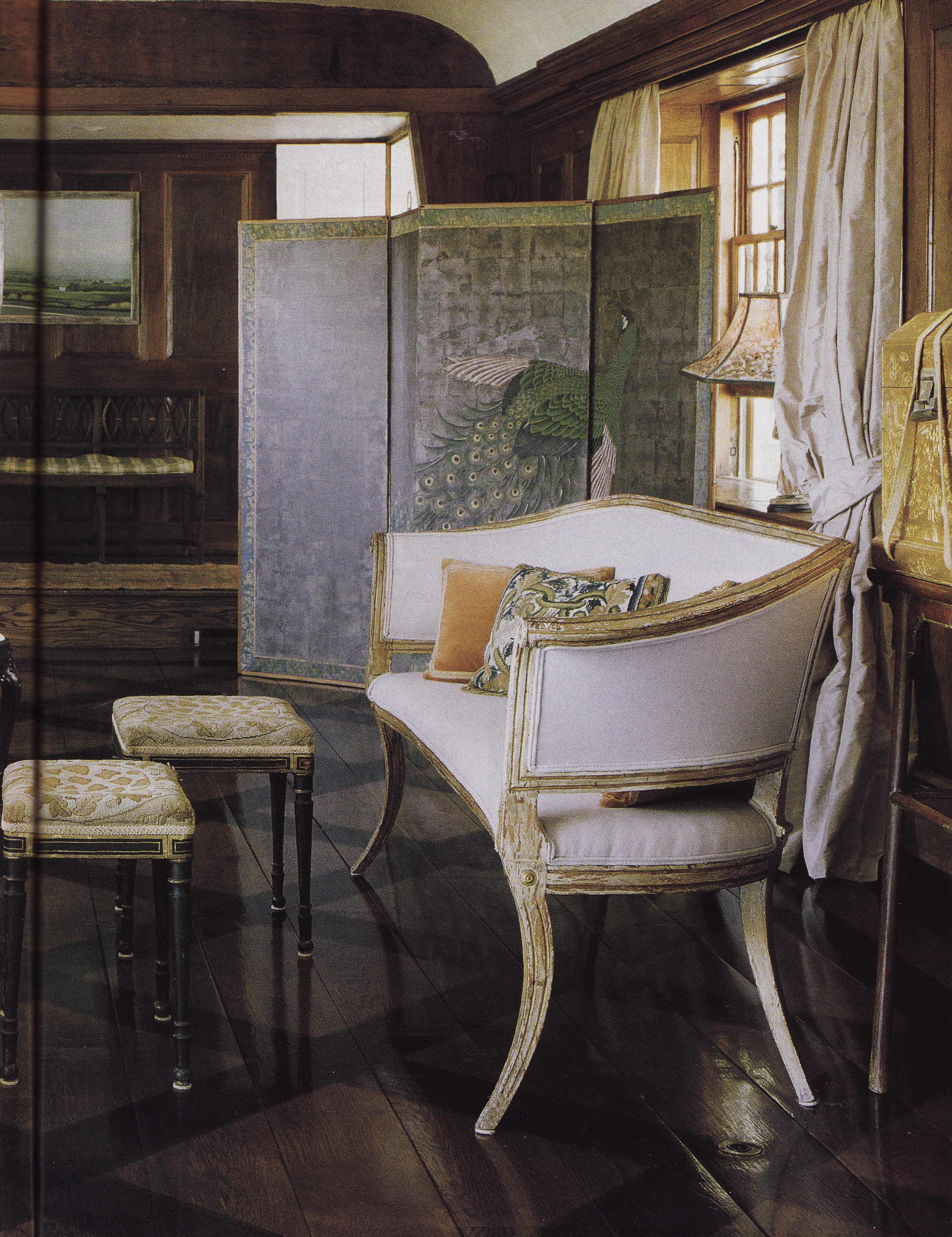
This entry hall by Mallory Marshall and James Light uses a giant peacock screen in much the way it might have been used originally.
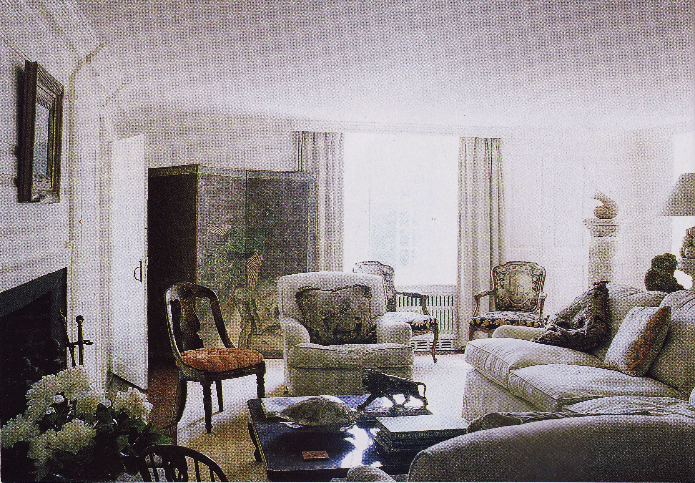
Here it is yet again, demonstrating its decorative power. I assume the stylist and the photographer couldn’t resist re-using it or it is blocking something they would rather not have in the photo.
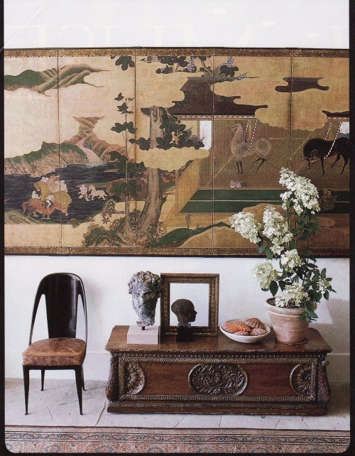
Another John Saladino vignette with an amazing Edo period screen, this time mixed in with European antiques. For more of this amazing house, click here.
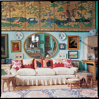
The placement of a screen on the wall allows a designer to alter the volume of the space, whether it be to enlarge it or make it smaller. This screen may not be Japanese, but I had to include it for its extraordinary placement in antique dealer Peter Hinwood’s giant high-ceilinged room. It unifies a disparate set of objects hung gallery style below and brings the ceiling down to make the room cozier. This is cluttered at its best!
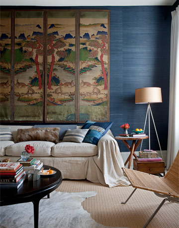
Here stylist Peter Frank has hung not a Japanese screen but instead a Korean one, working in a similar but opposite fashion, pushing up a low ceiling.
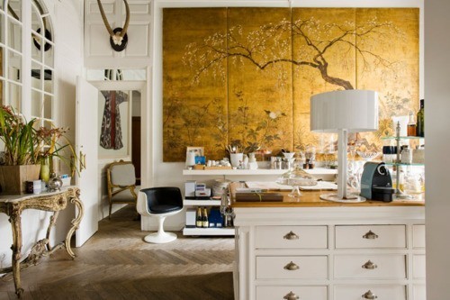
This golden screen is such a focal point in this eclectic room by Lazaro Rosa-Violan you almost can’t look at anything else as it pulls your eye back and upwards. As a result, the volume of the space is what is emphasized.
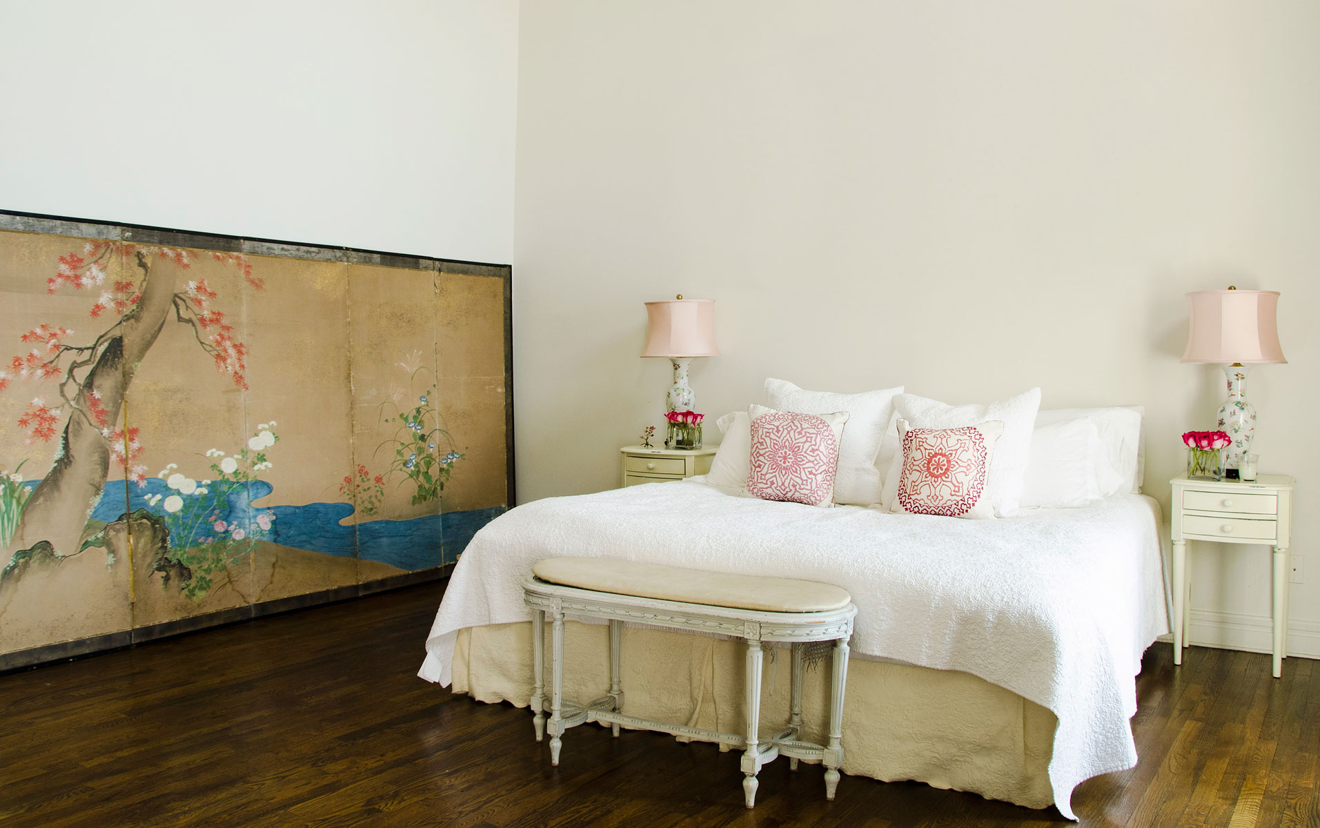
Volume in Erin Fetherston’s loft bedroom is emphasized in the reverse, with the screen low down on the floor, the empty space above it is what you notice most.
I can’t say it enough, if you are in Japan over this next month, make the effort to get to the Nezu Museum as this exhibit should not be missed and the exhibit is only running until May 20. I don’t know if these National Treasures are likely to be reunited again anytime soon.
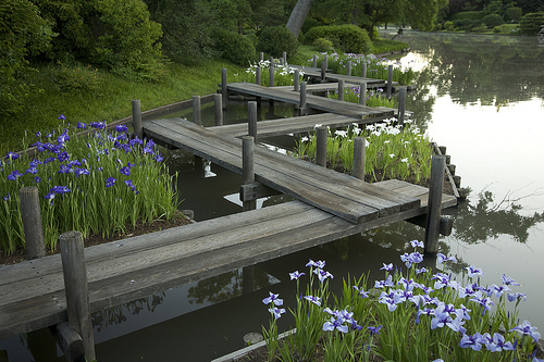
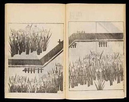
And speaking of those bridges, a few readers have had trouble understanding their depiction on the screens. Korin has painted them with that flattened perspective unique to Japanese art. I think this live example helps make it clear.
Let me know what you think of the exhibit!
Related Posts:
Ogata Korin’s Iris Masterpieces Reunion Postponed
Image credits: 1. & 12, House & Garden June 1998, photo credit: William Waldron, 2. via Jonathan Straley, photo credit: Matthew Millman, 3. House Beautiful June 2007, photo credit: Simon Upton, 4. Elle Decor March 2008, photo credit: William Waldron, 5. New York Spaces 12-1-11, 6. House Beautiful December 2010, photo credit: Victoria Pearson, 7. Metroplitan Home?, date unknown, 8. via Jerry Jacobs Design, 9. via Caitlin Creer Interiors, 10-11. House Beautiful January 1999, photo credit: William Waldron, 13. via Stylebeat, from Rooms to Inspire in the City by Anne Kelly, photo credit: Tim Street-Porter, 14. House Beautiful October 201o, photo credit: William Abranowicz, 15. via Lazaro Rosa-Violan, 16. Vogue May 2011, photo credit: Claiborne Swanson Frank


