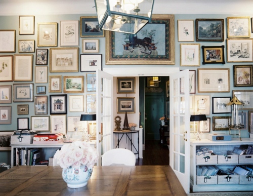
Charlotte Moss has a particular flair for one of my favorite colors – green – and in this case has pulled off the magic perfect green wall color in her office. It is exactly the shade that I have always dreamed of for my own living room, an ambiguous watery color that makes you ask, is it green? is it grey? She has mixed in a variety of fine antiques, all sturdy and workable, with great art, simple lighting and floor covering. But it is the elusive color of those walls that has caught me and I am dying to know what it is!
I know this is her office but it reads like a modern-day dining room, multitasking as no one seems to need a devoted dining room anymore.
She is a master of the gallery wall and this one is truly amazing. You know there are a lot of very fine pieces up there too. And this color green looks so good with old gilded frames.
The details are all there – custom colored Arbre de Matisse curtains and a lampshade of Les Indiennes.
I love fabrics with silhouette reverse colorways like many of the China Seas fabrics.
And speaking of green, gallery walls and one room showstoppers, who can forget her Kips Bay sitting room/bedroom in 2009 that is on the cover of her previous book Charlotte Moss Decorates. One of the best gallery walls ever and again the use of green with elusive shades of grey and old gilt. There are numerous items here, including the desk and some artwork, that are now in her office.
And for those of you who are up to your ears in hearing about ticking, this is the last time for a while. Upcoming posts on blue and white porcelain, the CWAJ Print Show and a new shrine sale schedule are in the works, I promise. But in the meantime, I can’t help myself! Look at the bathroom in Moss’s office! Ticking plus Chinoiserie and a little gilding – that great casual/fancy mash up.
And on One Kings Lane today a French settee covered in silk ticking – yum!
Now the challenge is to find out the name of that paint color. You know (and I know, sigh) that it is the quality of the light in the room that makes the color so perfect and there is no guarantee that it would look the same elsewhere, but you can’t blame a girl for trying.
Related Posts:
Gorgeous Green…Rooms Inspired by a Bamboo Forest
Views To a Room…Green Guest Bedroom at the Shore
Ticking Takes The Stuffiness Out
The Mail is Always Late Part II…More Ticking From Carolina Herrera Baez


