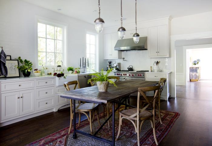
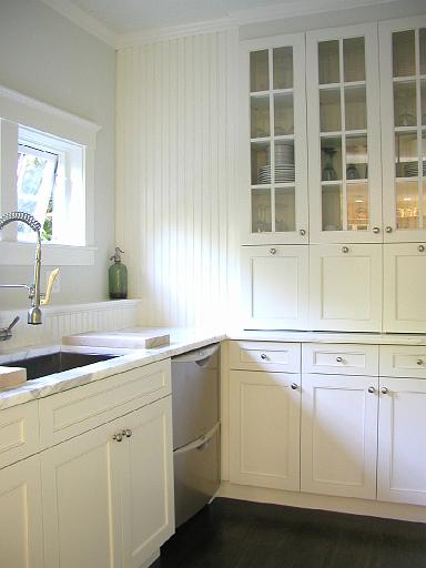
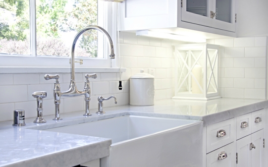
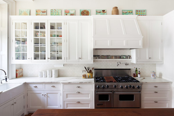
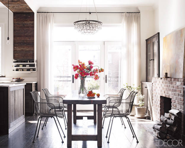
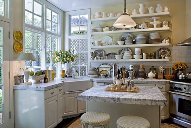
It’s easy to pick out images that I know represent my client’s dream kitchen. Over and over again, it’s simple white Shaker-style cabinets with white stone counters. Invariably, the kitchens we love have inset doors on the cabinets – if you go back to the previous posts on this project you’ll see that is almost always the case. For those of you not familiar with this term, it means the cabinet doors are inset into the cabinet box, framed, like a piece of furniture, rather than attached over and covering the cabinet box. Sometimes the door hinges are hidden, like the ones in Michelle’s Mill Valley kitchen here.
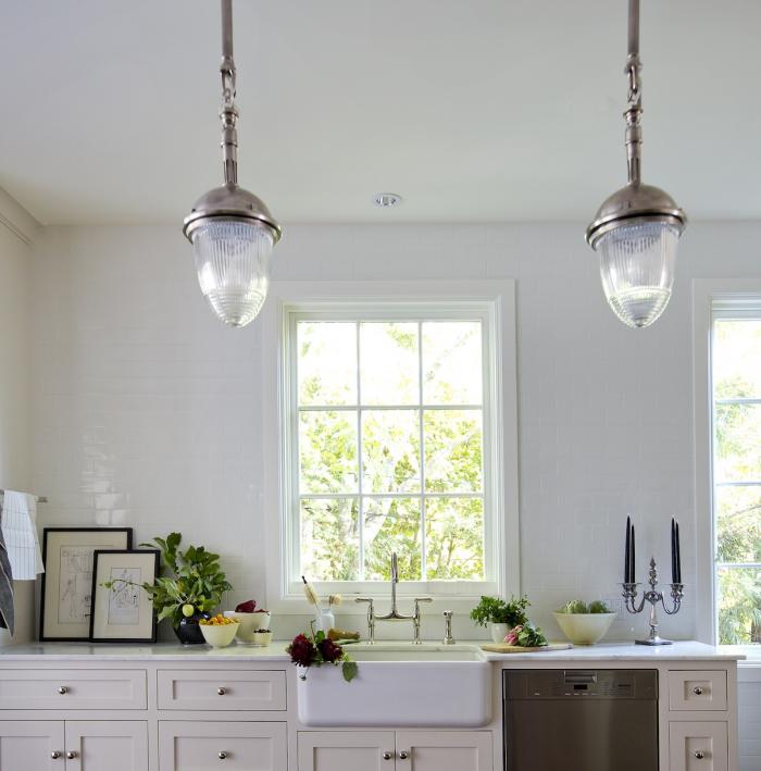
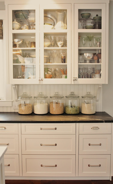
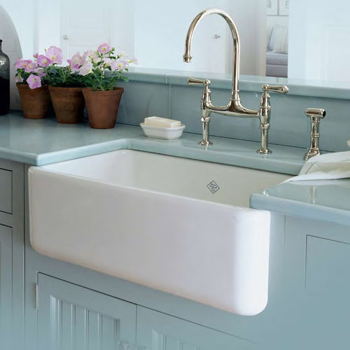
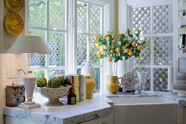
Other times the hinges are visible on the inset doors like these here…
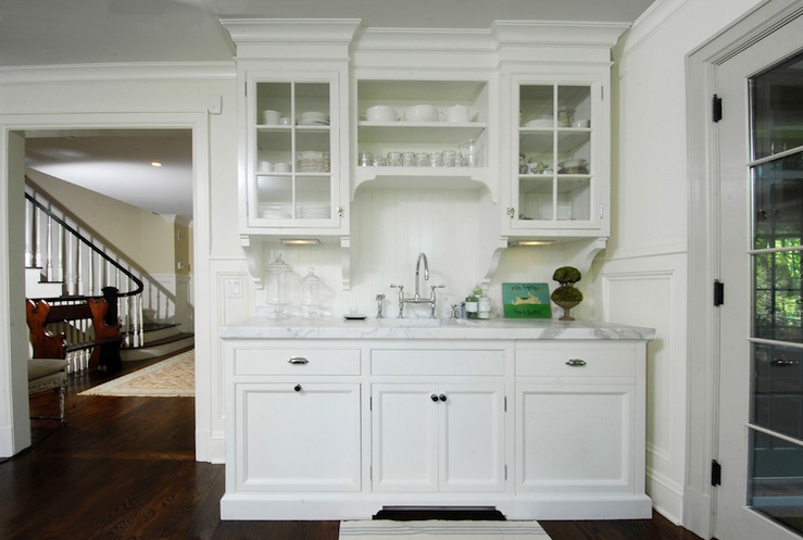
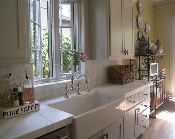
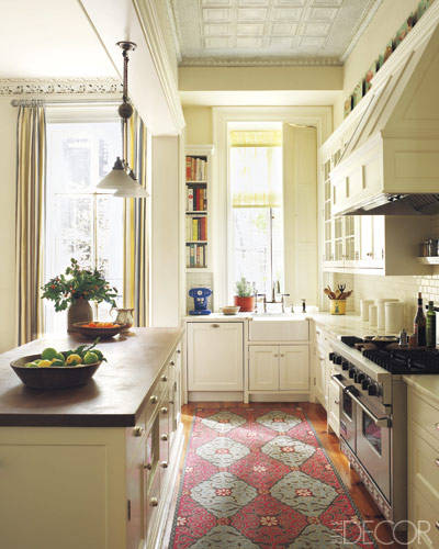
…and here. The Sheila Bridges kitchen has inset doors with exposed hinges too.
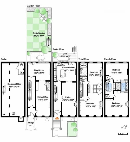
So what’s the conundrum here you ask? The problem is that inset doors on cabinets can cause you to lose space – not a lot – just an inch here or there – but considering the size of the kitchen we are working with – we feel like we can’t afford to lose any! The drawer units in particular lose width space from the framing, while the door units less so, although they do lose a bit of depth. Inset doors also tend to me more expensive – many are custom – but again price isn’t so much the issue as the kitchen is small. Space is the real issue we keep returning to.
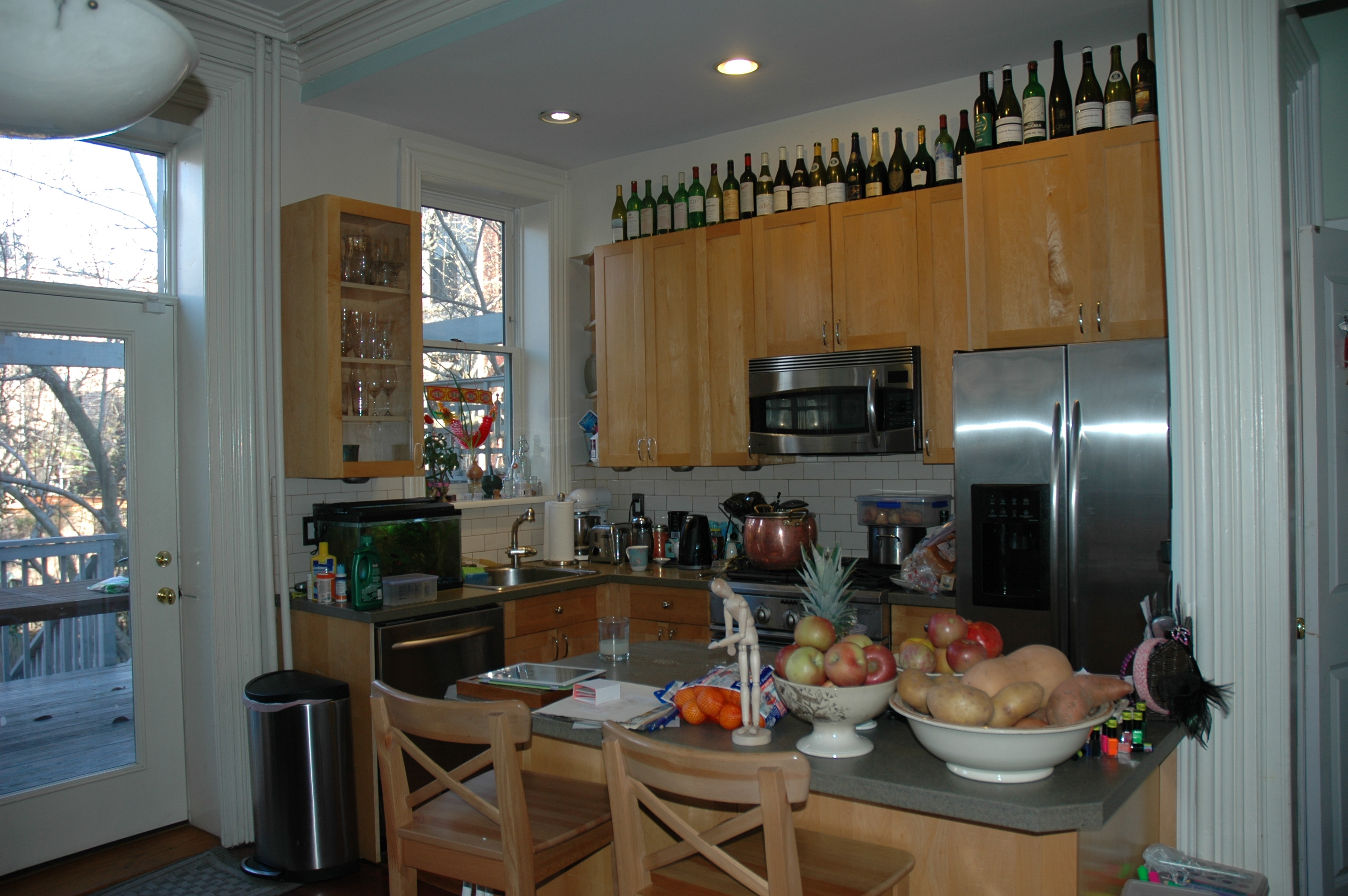
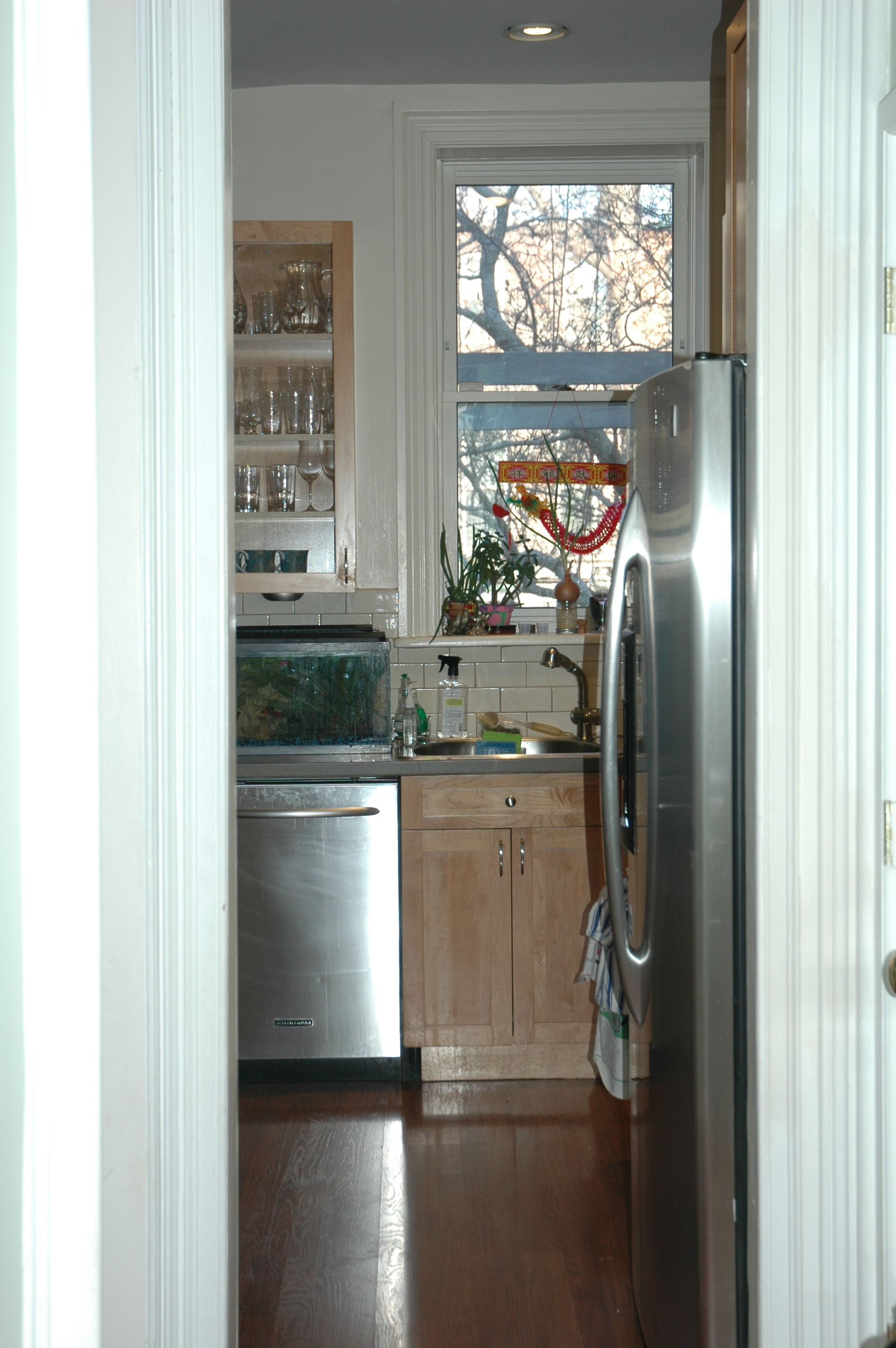
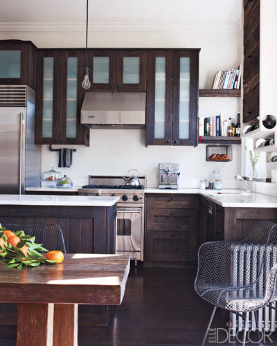
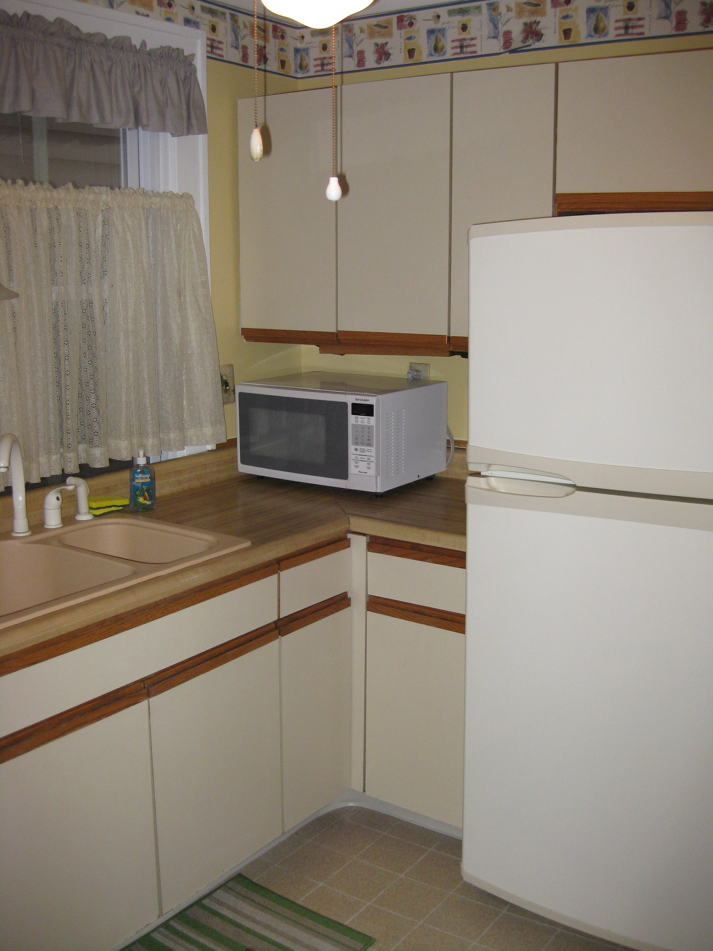
In general we never like the overlay doors. Overlay doors tend to look like they came from box stores to me – ready made and much less like real furniture. The owner’s current kitchen has blond wood overlay cabinets – here’s the photo to remind you. These are at least “full overlay” in which you don’t see any of the cabinet box peeking out from the doors. I’m not going to even mention “partial overlay” cabinet doors – it would give us all some bad 1970s nightmares.
In trying to justify overlay panels we keep returning to Molly Frey’s portfolio. She routinely uses overlay doors and in fact, all the kitchens of her designs that I’ve seen use the same exact white cabinets.
See how the overlay doors almost touch and you see none of the surrounding framework? Some people prefer this look, particularly in modern design kitchens. You can also see that it maximizes the available space. I think the key to overlay doors is purchasing high-grade cabinets with a really nice paint finish. One thing to be cautious of with overlay panels is some of the mechanisms, for instance soft-close drawers, can be set in deeply on the sides, causing a loss of space. It would be depressing if we chose them for space reasons, only to be sabotaged by deeply set in drawers.
I did have what I thought was a genius idea, but it turns out many others have had it too. Why not use inset doors on the upper cabinets for style reasons – those are the ones that really get looked at and the space loss is minimal – and overlay panels on all the lower units, which are predominantly drawers? It’s definitely something to consider.
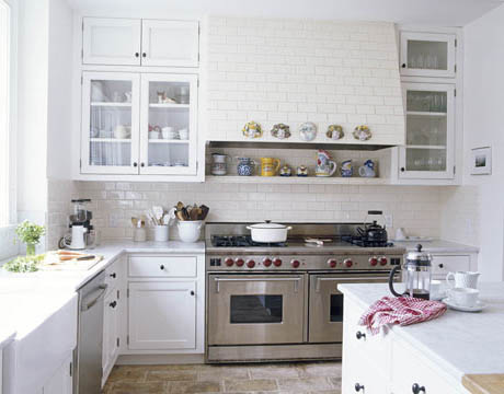
One of the inspiration kitchens we love is Joan’s New Hampshire kitchen here, which seems to have some sort of hybrid between overlay and inset doors. No surprise that these were custom built by a cabinet maker – if only we could get him to move from New Hampshire to Brooklyn.
So the big questions are whether we care more about looks or space. What say you all? Form or function?
Related Posts:
Form Versus Function…White Marble Countertops? Really?
Form Versus Function…A Farmhouse Sink and That Perrin & Rowe Bridge Mixer Faucet
Brownstone Kitchen Inspiration From Sheila Bridges
Thoughts for 2013…Matisse at The Met, Comfort and Kitchens

