OK, so maybe that title is a little extreme, but I am so excited by my recent find and actually, I think she would be too! For those of you not familiar with her name, Katie Ridder is one of my favorite designers working today, with a most accomplished and interesting approach to interiors, a refined and coordinated eclecticism. Ridder has a brand new book out called Rooms, which I am dying for, of course! Unfortunately, I haven’t managed to get my hands on a copy yet (heavy holiday hint here).
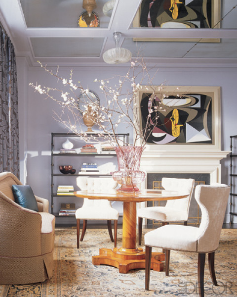
Katie loves color and has a particular penchant for my favorite – lavender. In addition to the iconic book cover image with its amazing Kiki Smith etching, you can find the hue sprinkled liberally throughout her designs…
…and gently too.
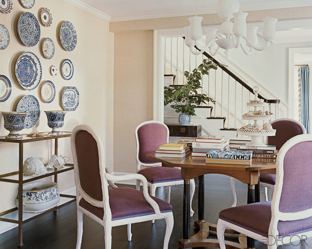
She is also quite skilled at mixing it with blue and white porcelain, another favorite trick of mine.
She is a big fan of Muriel Brandolini prints, and also has her own line of charming patterns, including Peony…
…and the Japanese inspired Wave.
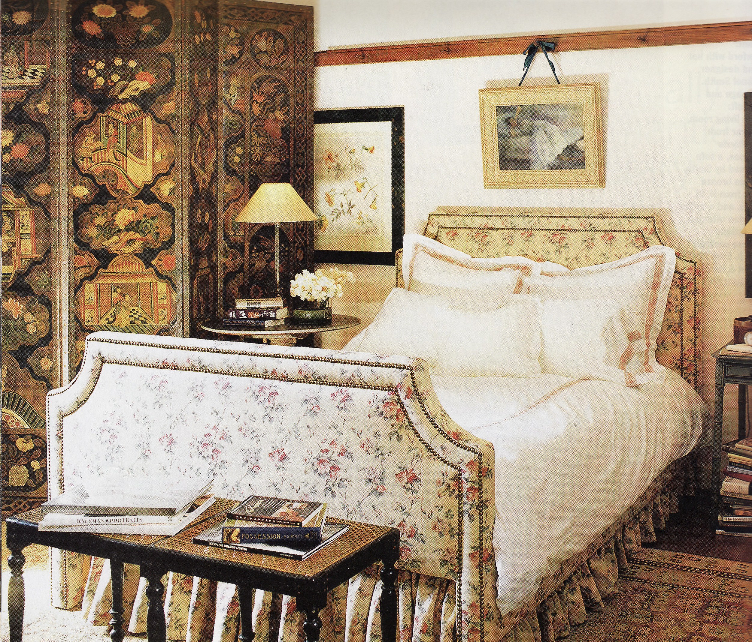
For me, Katie’s first great lavender room is from the days before digital images (1993!), but I am lucky enough to have saved it in my tear sheets, although it took me a good half day to find it. Featuring a lavender Asian toile from Manuel Canovas called Mandarin and quite a bit of whimsical ingenuity (love that valence) mixed with modern details, the small showhouse guest room, completed on a tight budget, was a clear stylistic precursor of what was to come. She worked with her husband, architect Peter Pennoyer, and I believe it was meant to invoke the Brighton Pavilion. Sorry the scan just can’t do the colors justice!
(Quick Addendum: I found a close-up of the toile in an old House & Garden tear sheet on Chinoiserie toiles. When I was writing this post originally, I couldn’t find a sample anywhere.)
More recently, to counter the vibrantly colored, robust and complex public living spaces she designs, Katie most often creates cool and tranquil sleeping areas. I come back to this simple guest room all the time, drawn in by the crisp hotel-like linens, Murano glass lamps and the mid-century Japanese brass globe lantern which, for me, is the key element that makes the space.
And so on to my find…Last weekend, I stumbled across not one, but two similar lanterns, in absolutely perfect condition. They also have a scrolling karakusa (arabesque vine) pattern, but no large flowers like Katie’s. And this photo, taken on the spot, somehow makes them look small, which they are not. No current plans for them, but I grabbed them as soon as I saw them and took them home! So let me gloat a little, and hope that the book finds its way to me this holiday season…
Image credits: 1-2, 6-7, 10-11. via Katie Ridder, 3-4 Elle Decor March 2008, photo credit: William Waldron, 5 & 13. Elle Decor March 2006, photo credit: Pieter Estersohn, 8. Elle Decor June 2009, photo credit: William Waldron, 9. Country Living November 2010, photo credit: Lucas Allen, 12. House Beautiful March 1993, photo credit: Antoine Bootz, 14. me. <a href=”http://www.bloglovin.com/blog/3209837/tokyo-jinja?claim=bhbgv3skc8m”>Follow my blog with Bloglovin</a>


