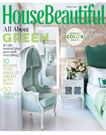
 Last year both House Beautiful‘s February color issue and Pantone pegged pink as the color of the year. This year, Pantone chose tangerine for 2012, but the magazine has struck out on their own with a green issue, so I am going to use this as an excuse to write about the color for me personally. One of my most popular posts features moody deep green rooms, but I have also been tracking soft green spaces as inspiration for my guest room in the New Jersey beach house.
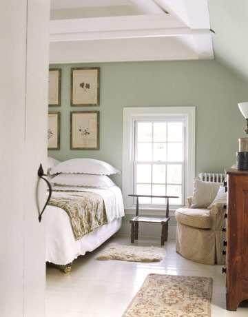
One of my earliest tear sheets, I carried the image below in my minds eye, knowing I would try to employ its best features one day. It seems fitting that the room that started my journey towards a simple but elegant country bedroom painted green – not sage, not mint – but that elusive color in between which didn’t seem to exist until Farrow & Ball, comes from the same magazine, although an issue that is almost 20 years old now. I love the dragged effect on the walls too and have it as a “possible” on my own checklist. The “definites” on that list include the white framed windows, simple sheers, wooden furniture, lace-edged white bedding, a duvet covered in green and white ticking, some tiny prints as shown on the wallpapered screen and a comfy antique chair in the corner. A cloth-covered table is a possible too. Some of the details are pre-existing, like the sloped ceiling and bare wood floors, both of which I have in my guest room.
A more recent photo with the same appeal adds some other requirements. Again there are the lovely soft green walls, simple white bedding (matelesse in this case), wooden furniture and corner chair, but a matched set of herbiers, pressed botanicals, has been added.
This room punches the wall color up a few notches, but manages to make what is normally an eyesore – the ceiling fan – look good, something else I am attempting. As much as I wish I could take mine out for aesthetic reasons, a summer house just needs ceiling fans for practicality and being green – the other kind of green that is. In particular I love the botanical prints and their pyramidal arrangement here.
No doubt about it, groupings of small vintage prints are a must!
This oft blogged about photo from Martha Stewart Living is more elegant and formal than my house can pull off, but I do so love it!
I’ve pulled this bathroom photo because I love the ebonized aesthetic movement cabinet against the green. The ornate quality of the cabinet is lessened by the austerity of the space. My plan is similar, but I am using an amazing grouping of antique faux bamboo furniture from the same period instead.
Not painted but wallpapered, this room just charms the pants off of me! I love the contrast of flowers with the plaid rug (plaid being another pattern I would like to add), the lines of the chairs, the Victorian magazine stand, and the wisp of a ruffled valence.
Drumroll please…and a disclaimer on the photos. I do promise to do a proper job this summer, using all the great techniques I am learning from Camille at The Vintique Object. But in the meantime, please excuse these quick point and shoot versions.
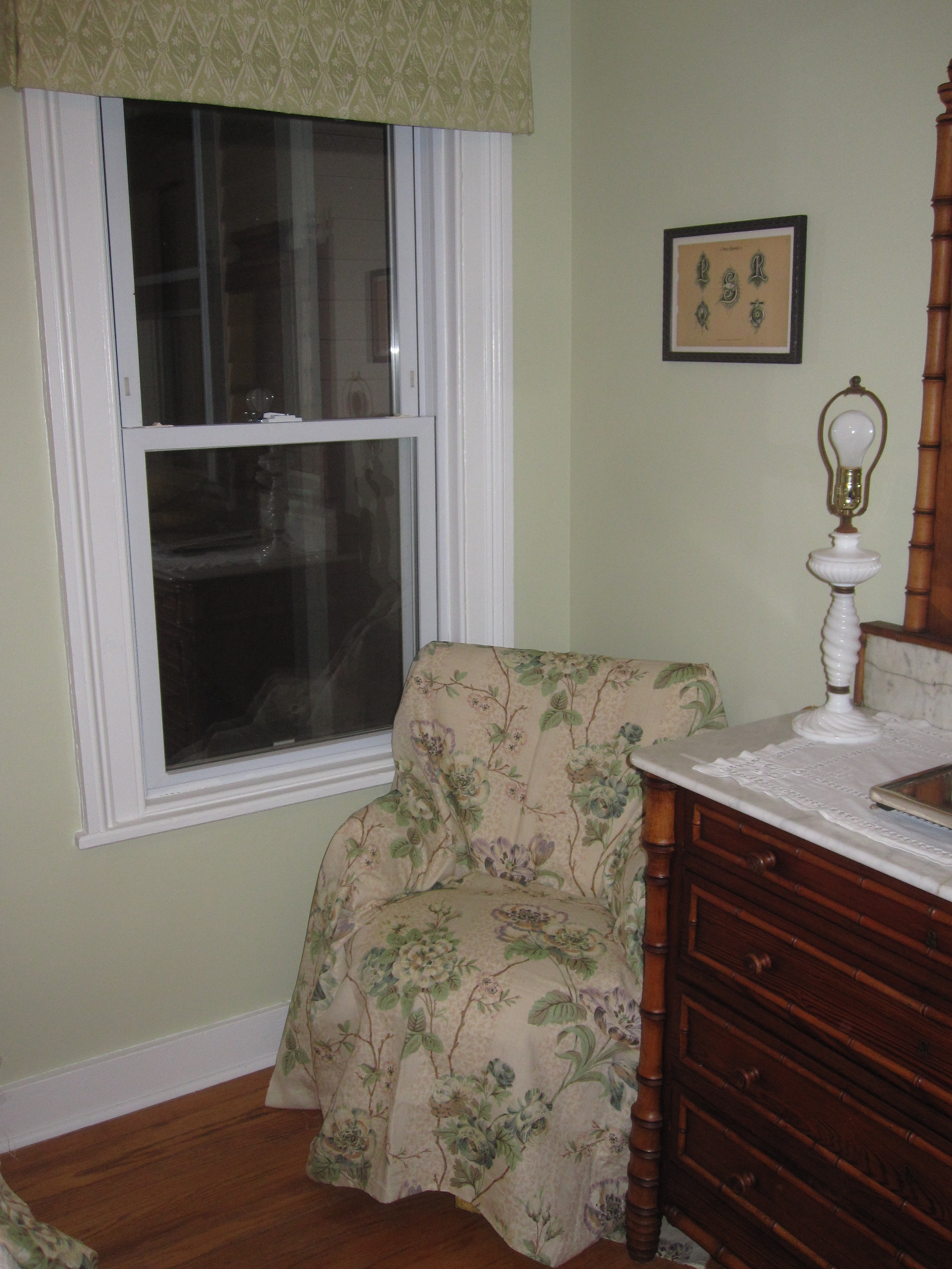
I have made quite a bit of progress, although the lamps look anemic without their long-awaited lampshades. The room is small, with two windows, a closet and a sloped ceiling on one side. We have painted it Farrow & Ball Green Ground and I am still considering doing a dragging technique on it to give it a little texture. Check mark to the white lace and matelesse bedding and antique botanical prints, a local bargain find. I am working on the ticking duvet cover by sewing one from a fabric shower curtain, but in the meantime I have added a vintage plaid woolen blanket for warmth, both literal and visual. You can see bits of the faux bamboo furniture peeking out and the strings hanging from the ceiling fan (Oh, I had not noticed that tassel – gotta get it off).
Tiny prints include the patterns on the custom lamp shades (the color looks off in the photo below) still to come and valances made of Kathryn Ireland’s Diamond Batik fabric.
The vintage chair in the corner is out at the upholsterer’s getting redone in the linen floral shown draped over it – unfortunately the name of the pattern escapes me right now. You can see the edge of the mirrored dresser which functions as both storage and a dressing table, so useful in a guest room without its own bath. I am working on layering up the artwork, but want to let it evolve naturally as I find things.
There is still much to do, but I think most of my guests last summer found it quite comfortable!
Related Posts:
Gorgeous Green…Rooms Inspired by a Bamboo Forest
Ume Blooming…Maybe Pantone Should Have Called Their Color of the Year Plum Blossom?
O-Hanami Decorating…Pale Pink Bedrooms for Cherry Blossom Season
Image credits: House Beautiful February 2012, photo credit: xxx, 2. House Beautiful December 1994, photo credit: xxx, 3. Country Living January 2006, photo credit: David Prince, 4. Mary Cooper, no credit, 5. via Chiarabelle’s Flickr photostream, 6-7 Martha Stewart Living, 8. photo credit unknown – please let me know if you have any information on this, 8-9, 11. me, 10. via Kathryn Ireland.


