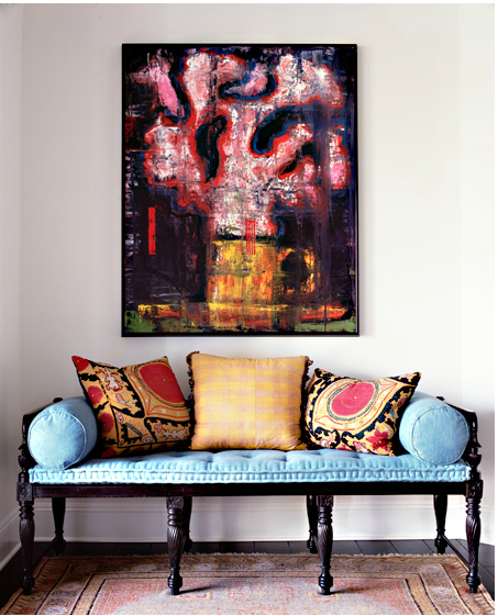
In addition to many of the usual Asian pieces, there are lots of great antique Anglo-Indian pieces throughout the home. Anglo-Indian furniture is another favorite of mine because like everything I love, it was created from the mix of two cultures, the colonizing British and the local Indian craftsmen. Victorian details ended up stylized and simpler, particularly in the dark rosewood and ebony, making it perfect for modern interiors, the entry bench below being a great example. Mixed with a well-worn Persian on the floor, some suzani pillows and a modern painting, it certainly says “hello.”
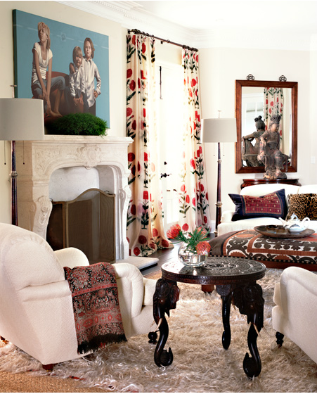
The living room has some fun pieces like the elephant head (and tusks!) side table and what looks like Brigitte Singh’s “Poppy on Cream” Indian block print on the windows.
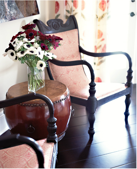
A pair of Anglo-Indian plantation chairs with a Chinese style drum between them anchors another corner.
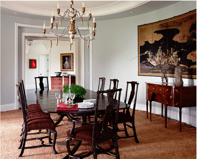
Who doesn’t have a traditional Colonial Revival sideboard or dining table like this – or at least their parents or grandparents have one? Updated here with Chinese style chairs, the ever popular Italian-style wooden chandelier and that fantastic looking Japanese screen (which I wish I could see more closely).
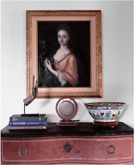
And this combo seen up close from the photo above – European painting, Imari bowl, prayer hand, and painted serpentine front chest.
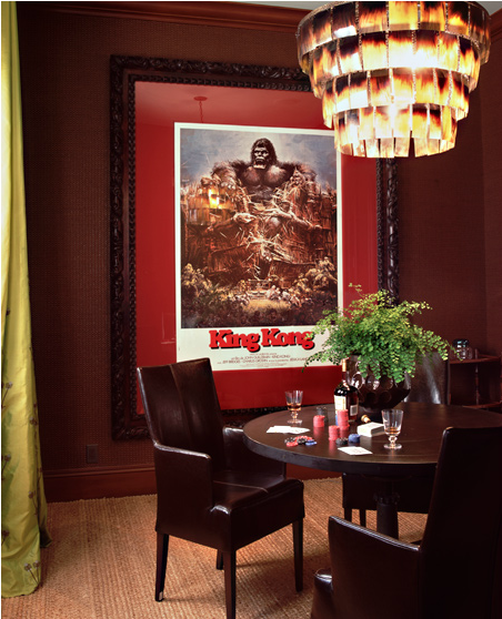
The King Kong poster makes me chuckle every time I look at it and really enlivens this darker space.
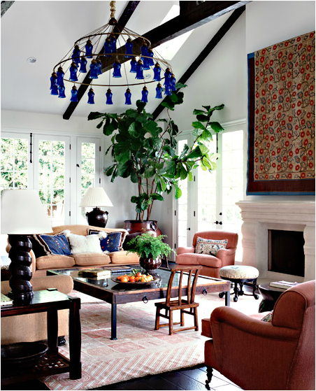
The expansive family room has bits from everywhere and looks divinely comfortable.
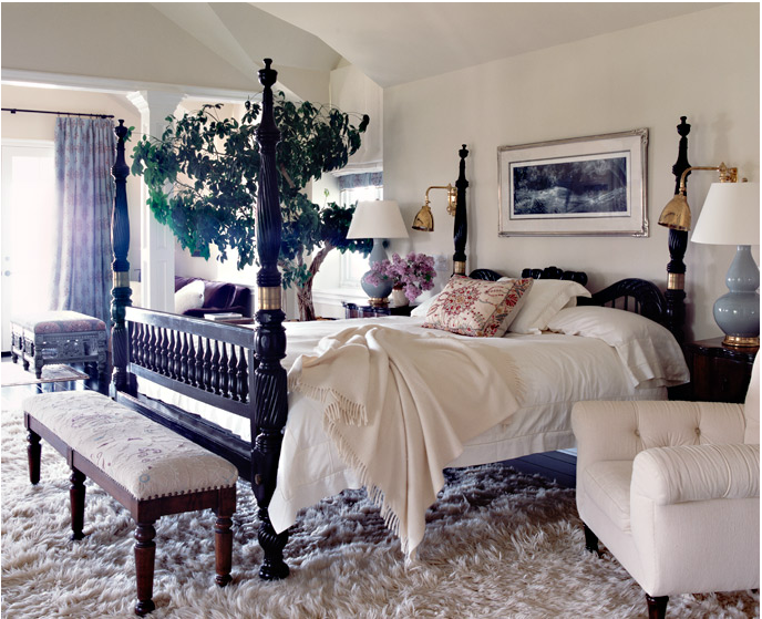
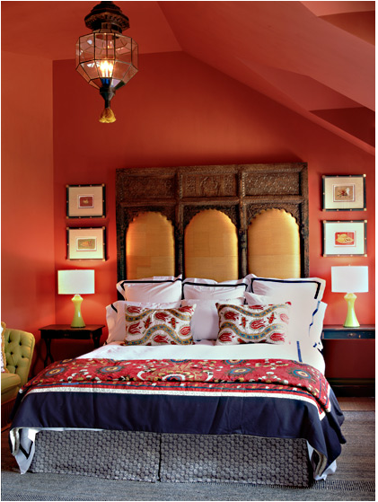
The bedroom has another of those bold Anglo-Indian pieces, in this case the bed, but it is the furniture and textiles at the other end of the room that really grab my attention.
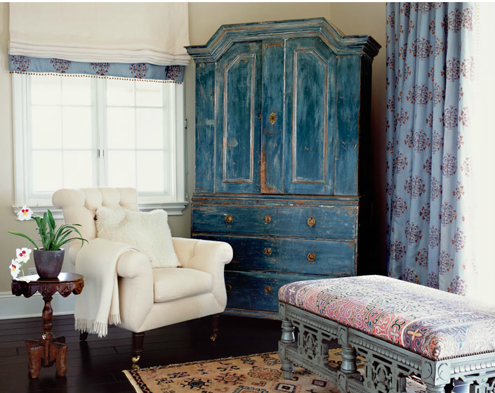
The painted Scandinavian cupboard, block printed curtain and to quote Krista, “that bench!”
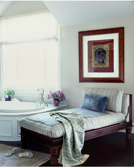
Is the daybed South East Asian? Balinese? Thai? And I have no idea what the art really is, but it sure reminds me of work by modern Japanese printmakers like Shuji Wako.
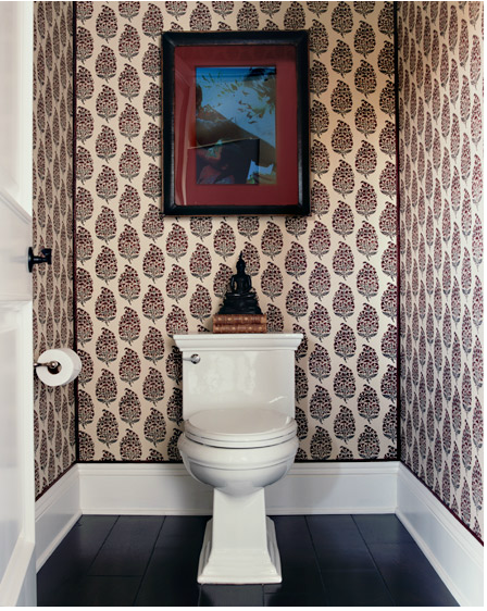
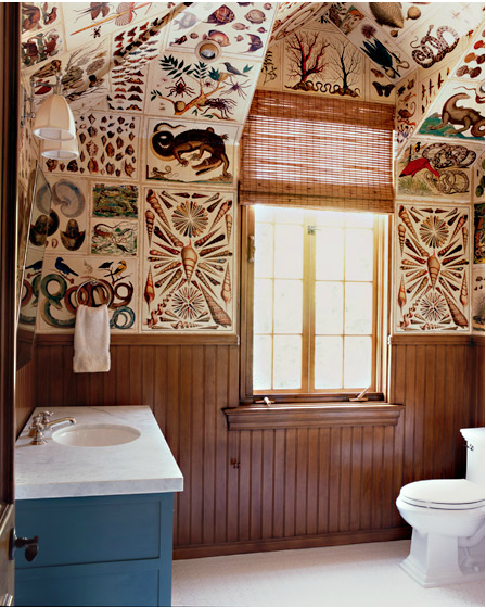
This photo might be the dearest to my heart as it a more colorful and busy version of the woodblock print “wallpaper” I have been long planning for my master bathroom. In fact, as I type, my trusty contractor is working on installing the long-awaited pocket door! Yeah! More on that soon.
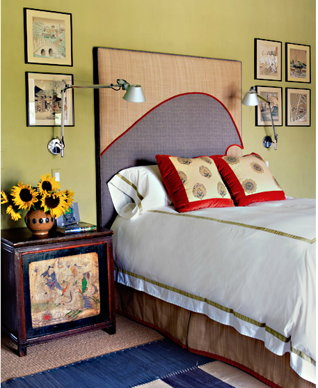
Who doesn’t love this witty fabric covered headboard? Does anyone else see Hokusai’s masterpiece The Great Wave off Kanagawa or is it just me? Add in a small painted Chinese chest, a Madeline Weinrib indigo rug, some Japanese prints and those fabulous reticulated lamps and this bedroom is amazing.
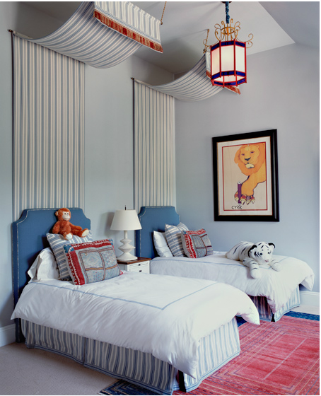
Love the details in the kids room too – I could write an entire post with the number of fabric canopied bed photos I have in my inspiration files.
I am always suggesting and selling screens and ranma for use as headboards, but love the novel ideal of upholstering one for comfort. Another amazing textile mix in this guest room too.
And I can’t resist including this final image of what I believe must be the pool house bathroom, papered as a cabinet of curiosities with antique (or antique looking) botanical and specimen prints. Yowza!
For more on Katie, check out her interview over at Cloth & Kind. Enjoy!

