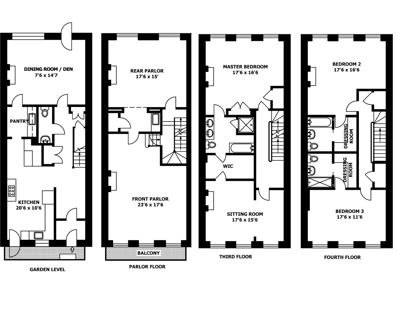
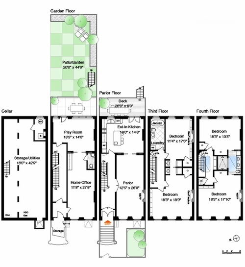
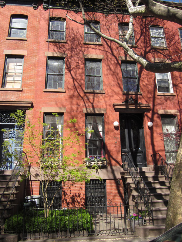
 New York row houses or brownstones, as they are so commonly called (even when they are made of brick and not actually brownstones at all) have a basic standard shape. Usually 3-5 stories high and rectangular, being 16-25 feet wide (on average 20) and either double parlored (about 40 feet deep) or triple parlored (in the case of later deep ones), there are only so many ways to arrange the rooms inside them. This typical 1860-70s brick row house in Brooklyn is quite similar to the one I have been working on for the last few years and is about 20 feet wide and four stories tall. You’ll note the three windows across, with the parlor floor being the first floor up the steps and the “English basement” being the ground floor (most brownstone have even an additional lower level cellar or true basement for mechanicals and storage below).
One layout choice is to have the kitchen fill the back or the front of that ground floor, with the dining room in the opposite end and the double parlor floor above used as formal and casual living rooms, as shown below. (This house is actually Katherine Hepburn’s Turtle Bay brownstone)
Some people don’t like this arrangement and want kitchen/dining/living all on one floor especially as separate dining spaces can end up being totally unused these days. Modern people don’t have servants to do the cooking, so why spend most of your time on the ground floor which gets less light? Also it’s very common to have the English basement floor renovated as a distinct income earning apartment. So the kitchen is often tucked into one of the corners of the back room on the grander parlor floor, sharing the space with the dining table. Usually an island is added for extra workspace and as a room divider. (This is a very nice but unknown persons house in Park Slope, Brooklyn).
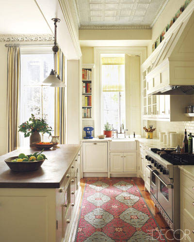
This is the current situation of the kitchen we are preparing to renovate and as major structural changes are out of the question, we won’t be expanding the square footage. Luckily a project by designer Sheila Bridges from the June 2011 Elle Decor has been the perfect visual aid to help us imagine what the space will look like. When both the home owner and I saw the issue, we were grabbed by how similar the two spaces were – the kitchen perhaps only in our mind’s eye – but certainly the dining area, in terms of layout, materials and overall feel.
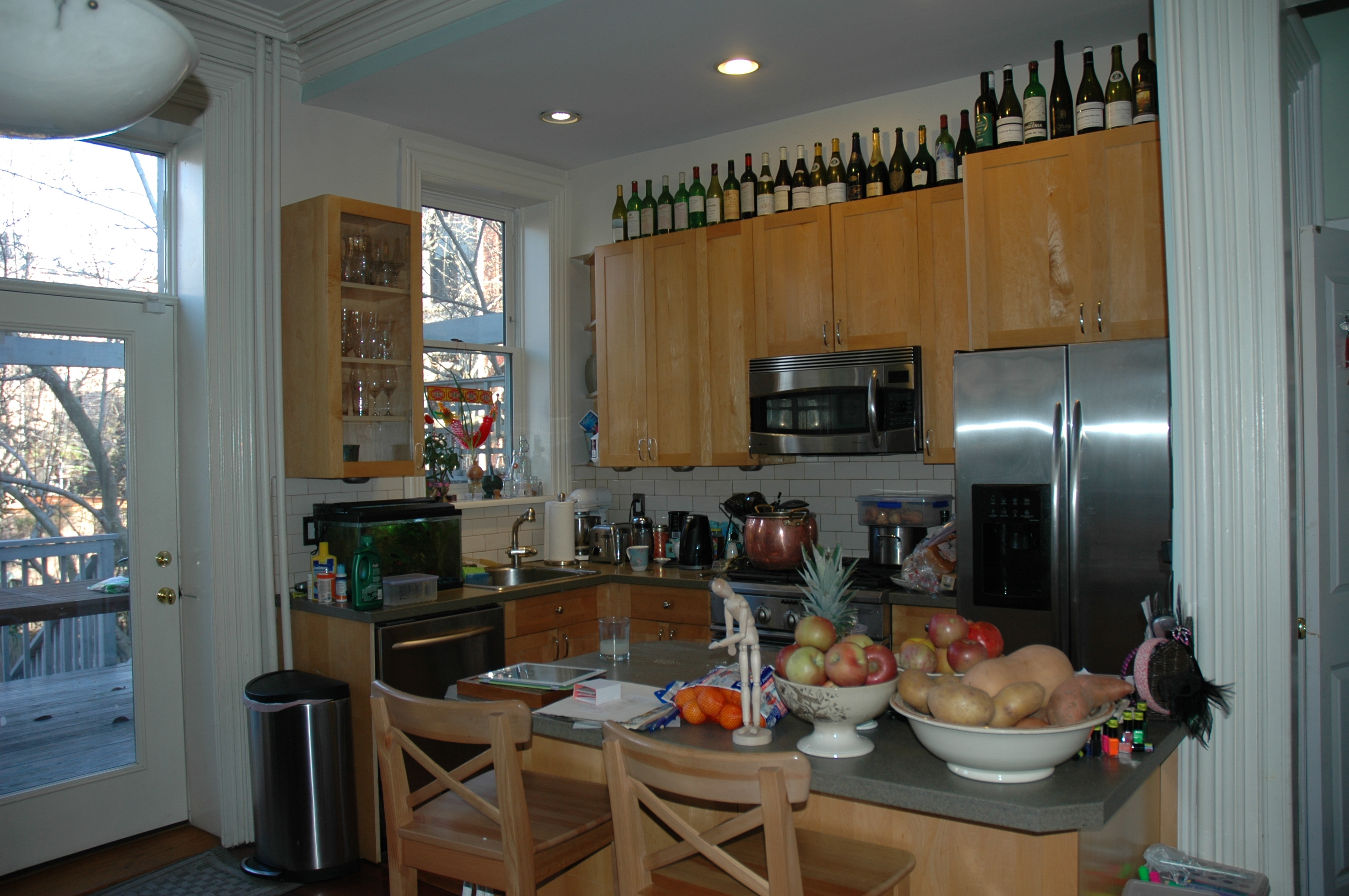
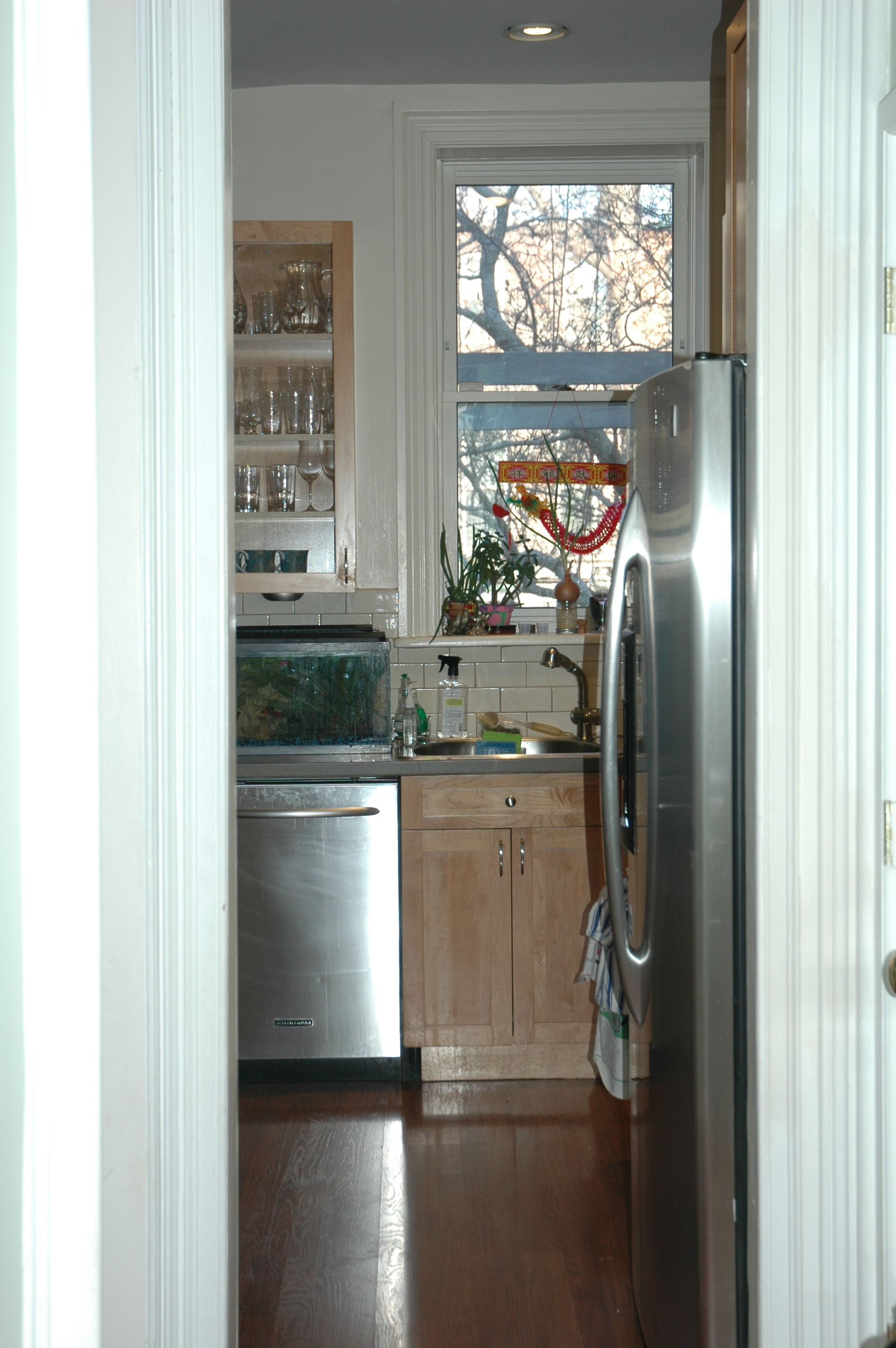
I don’t have a perfect flat front view of my project’s kitchen, but you can see it is an L shaped kitchen with the sink under the back right window. The stove is in the middle of the side wall, with an island opposite. The middle window embrasure has become a door out onto the deck. The high ceiling creates space above the tops of the cabinets.
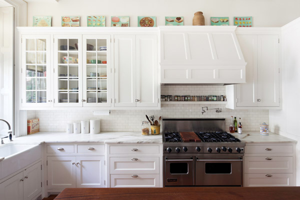
In the Sheila Bridges’ kitchen, the layout is very similar and I am assuming the fridge is on the right just out of view of the photos. There is a an island opposite the stove. This Manhattan brownstone is actually bigger than the Brooklyn one above – both wider and longer. Not only does it have a similar layout, but it has just about exactly the cabinets and fittings we want for our kitchen. Simple white inset door cabinets, with a few glass fronts, subway tile backsplash, polished nickel bin pulls, farmhouse sink, what looks to be a Perrin & Rowe bridge faucet, white marble? (more on that next post) and wood countertops.
In this photo taken facing the back of the house, you see the kitchen sink under the window and the dishwasher covered in a cabinet panel to the left. I believe the island hides the microwave in addition to storage. The center window is also a door out to a deck.
I don’t have such a nice long view camera, but you can see it is basically the same set-up. You can also see why a counter depth refrigerator is absolutely vital for this kitchen. I am thinking since the room is so small and exposed to a fairly formal dining area, both the refrigerator and most definitely the dishwasher will need to be covered with a seamless cabinet panel, like the one above, for visual calm.
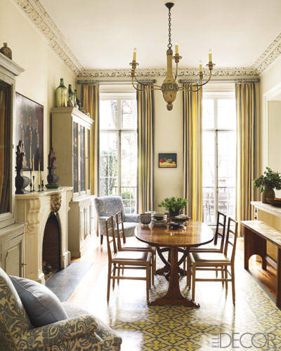
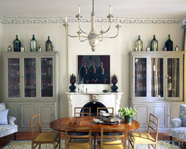
In Sheila Bridges’ dining area the table is in front of the fireplace flanked by two antique vitrine cabinets opposite the main kitchen wall.
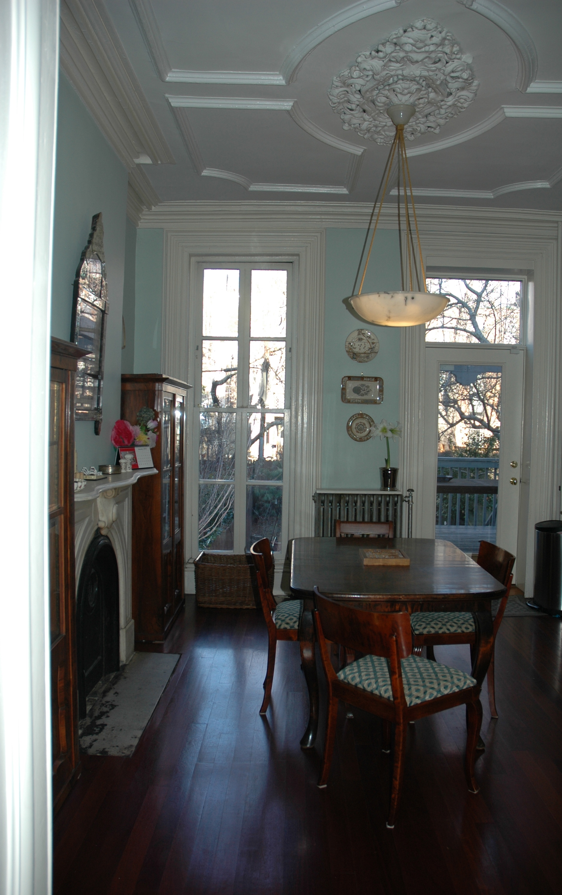
Our set up is incredibly similar. (Note the gorgeous ceiling details in both photos!)
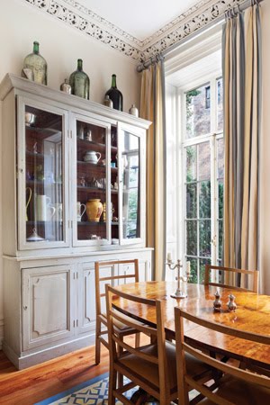
Additional photos from Bridges’ portfolio show a wide-angle view of the entire dining and kitchen area. Make sure to notice that the table has been turned 90 degrees and pushed back from the way it was positioned in the Elle Decor photos.
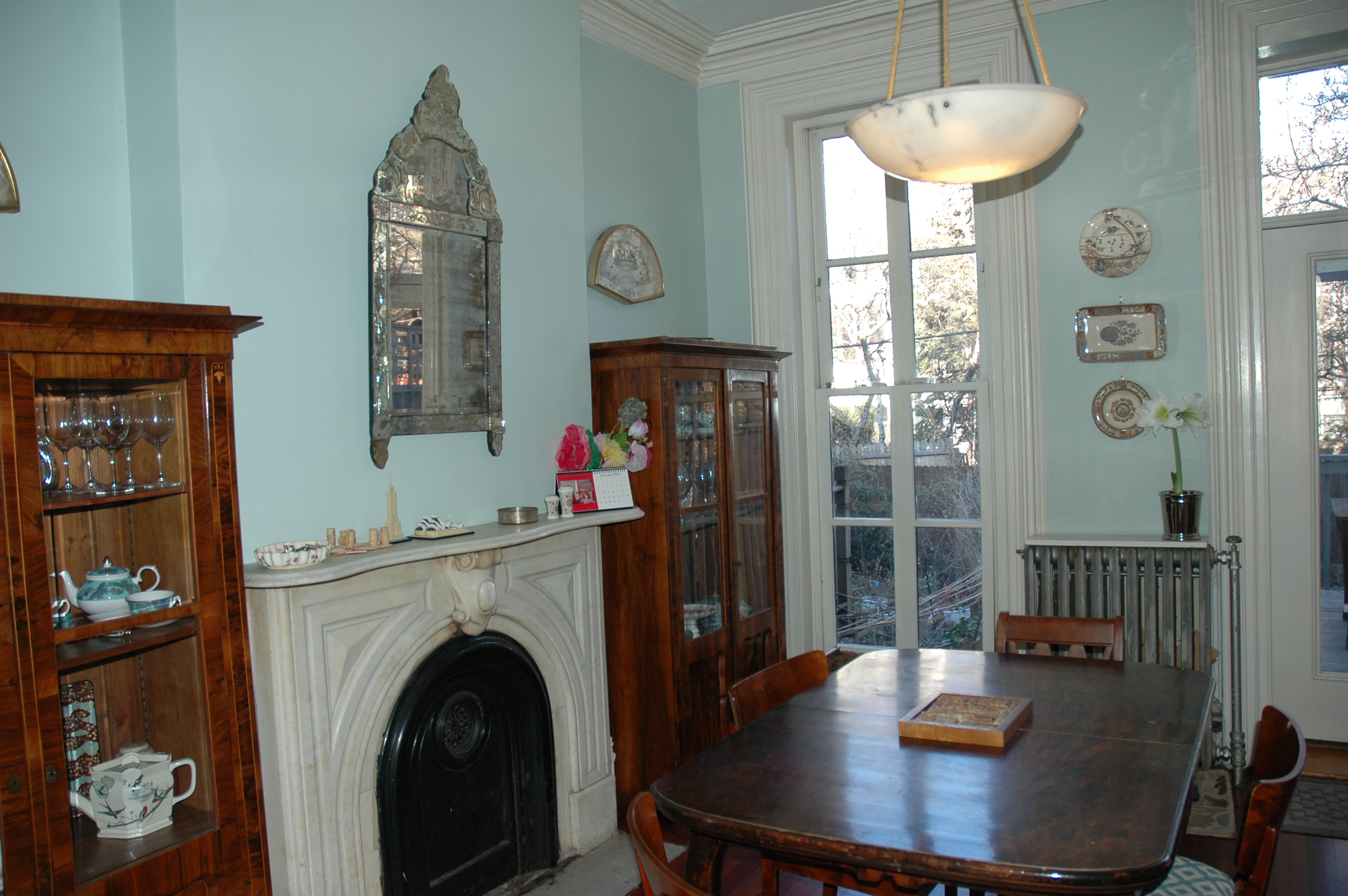
Here’s a somewhat similar shot of the Brooklyn kitchen. The paint isn’t actually bright like this – more of a soft sea foam color with lots of grey in it. The Venetian mirror is 18th century and full of gorgeous patina (read dark spots and small breaks). The alabaster chandelier is from Eileen Lane Antiques. Who else out there besides us remembers the days of their shop on Thompson Street in Soho?
Here’s the wall opposite the main cabinet wall in the kitchen in the Sheila Bridges project. This is the photo that show how much bigger this house is, with its pair of matched three door vitrines on either side of an original marble fireplace and room for an armchair tucked in each corner. Again, back to the Elle Decor photos, I prefer the table turned this way, parallel to the fireplace.
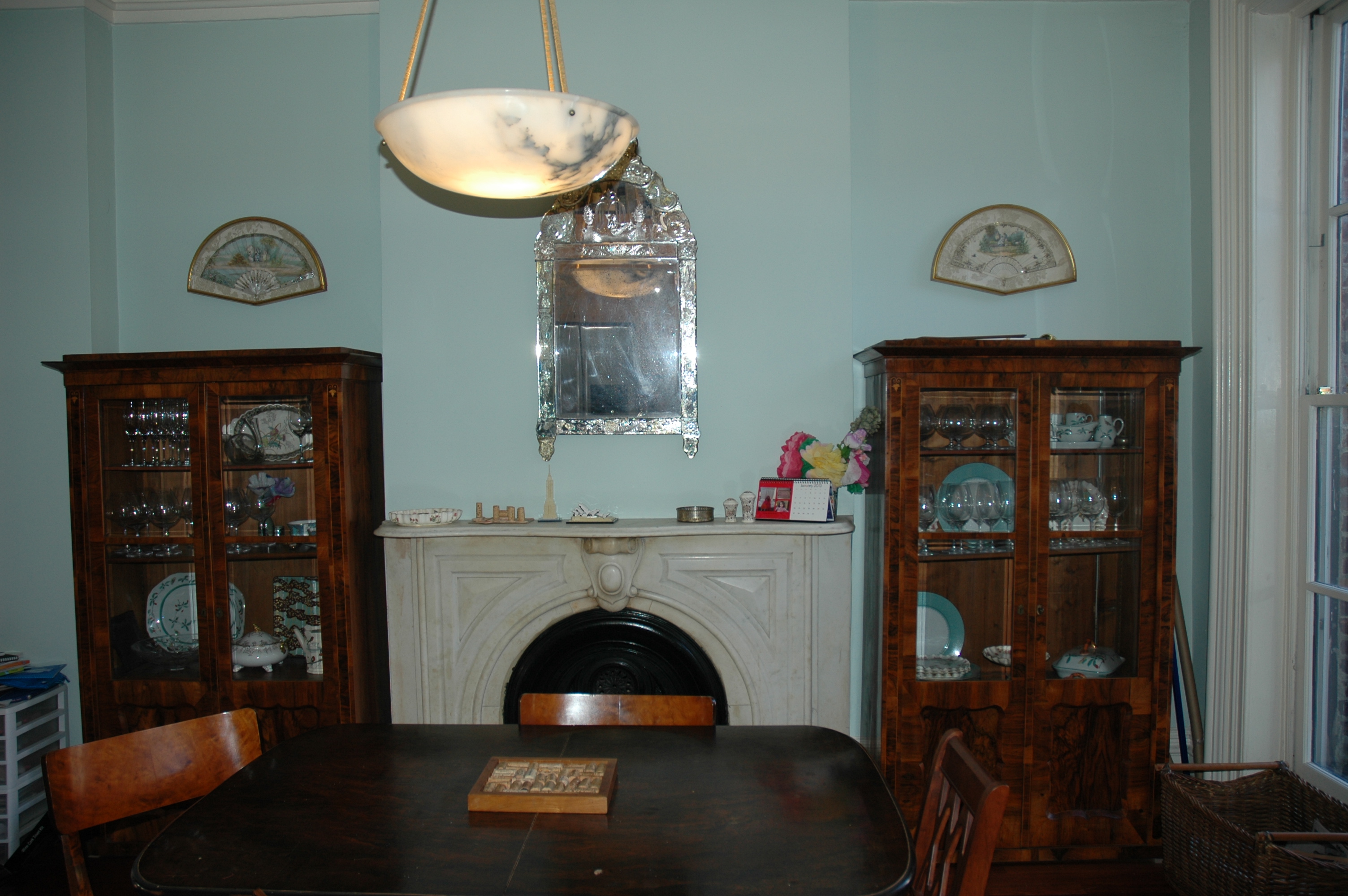
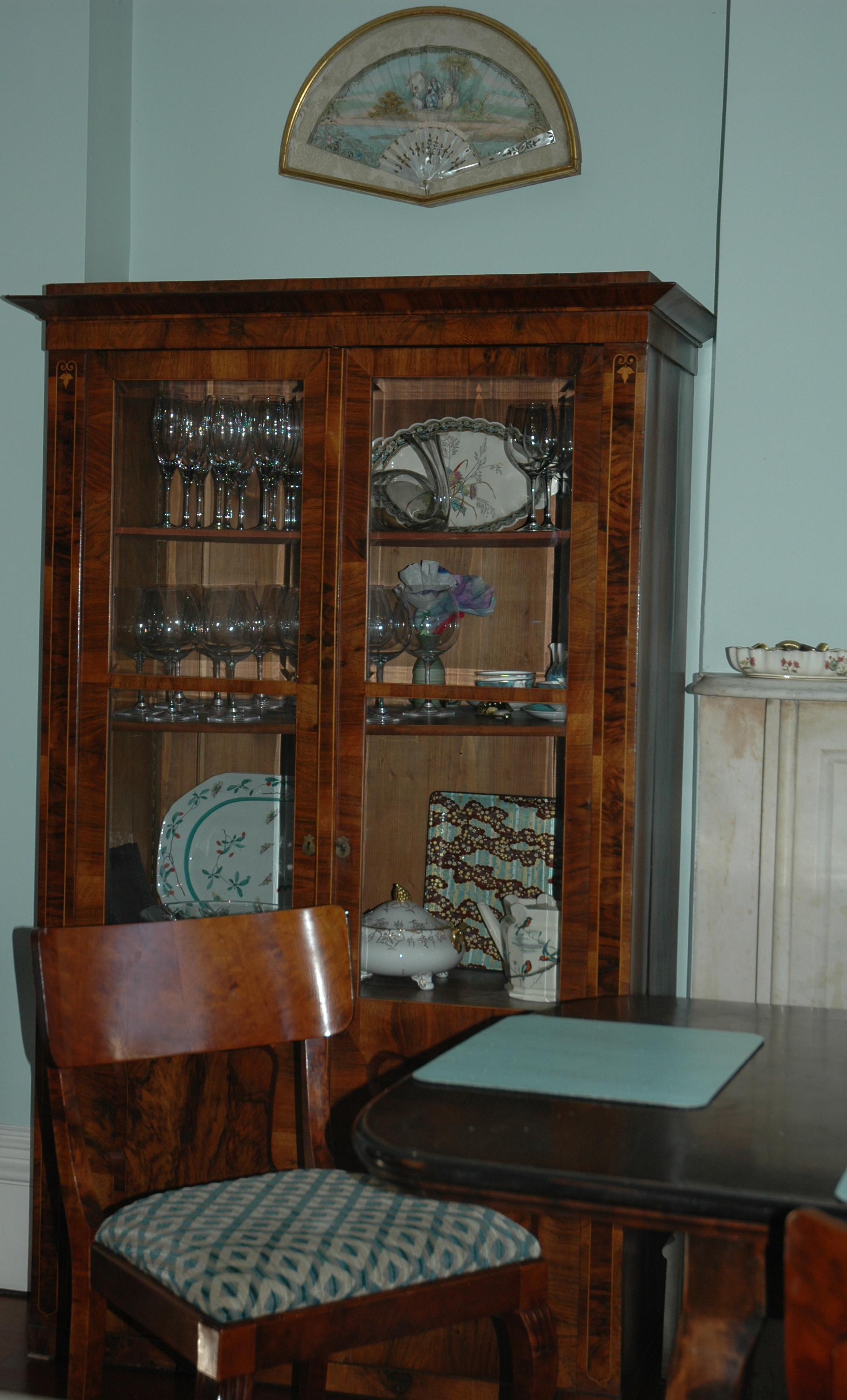
We also have a pair of glass door display cabinets with solid bottoms on both sides of the original marble mantel and our table runs the same way in front of the fireplace. I should have gone to the trouble to style this photo a bit, but I was rushing and just wanted to be sure to get the layout details down. To see this table set beautifully for New Year’s Eve, just peek back here.
This room is wide enough that the table can be turned perpendicular to the cabinets. We can’t do that.
You can get a peek at some of the contents of the vitrines in this shot – glassware, Aesthetic Movement polychrome transferware, more of the Mottahedah Famille Verte from that New Year’s table and even a few Japanese pieces…Wonder who brought those?
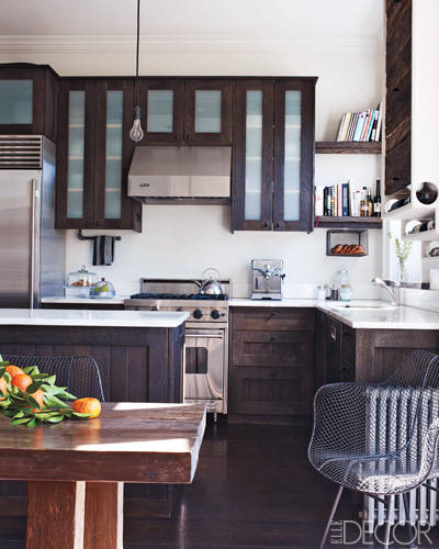
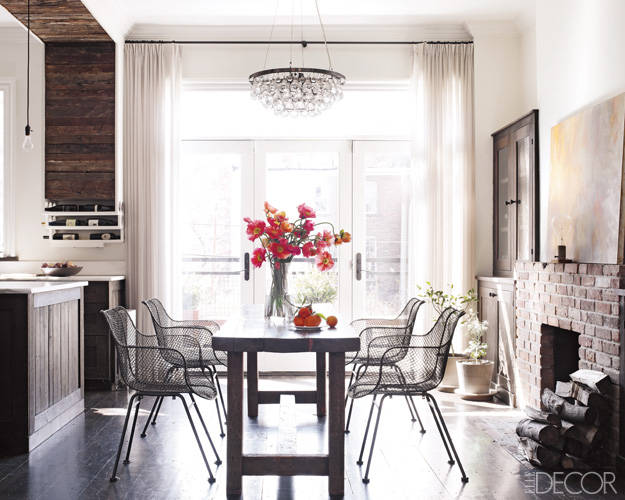
Ironically, that very Elle Decor issue also featured another brownstone, this one in Brooklyn. Owned by actress Kerri Russell and her husband, it is just down the block and very similar to the house I am working on. The kitchen is extremely similar in size and layout (a mirror image), quite different in style, but I can’t help including it here.
I imagine this house long ago lost its marble fireplace and the two single windows have been expanded to make a wall of glass doors. There is also a glass doored cabinet tucked in the nook to the side of the fireplace. I’d love to know if she has a pair just like the two houses above.
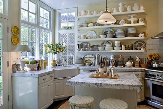
And there is one other kitchen we have been turning to for inspiration, although it was not in that issue, nor is it New York, although it looks like it could be! It’s the kitchen of Dave DeMattei and Patrick Wade in an Edwardian house in San Francisco. The layout is just so similar to our brownstone kitchen. Of course I adore those open shelves, but this client family is just not cut for that kind of overt visual commitment. I’ll have to save that desire for my kitchen renovation at the beach.
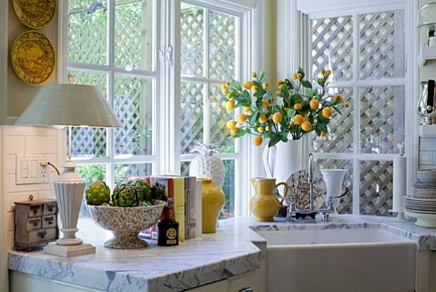
The corner window is extra special and simple not possible in a row house. But the fireclay farm sink and the bridge faucet are there, as well as the super thick marble counter. Lots of transferware too, including vegetables piled in footed compotes…
…just much neater than back in Brooklyn.
Dealing with the clutter of these clients may need a post of its very own, because the truth is, you can’t change a dog’s spots. But hopefully I can give them “spots” to stash it!
My next post will be full of the “form versus function” conundrums we are facing on this project – including sink, faucet and countertop materials.
Related Posts:
Thoughts for 2013…Matisse at The Met, Comfort and Kitchens
Brooklyn Belle from Hilary Robertson and Alastair McCowan
Image Credits: Sheila Bridges photos from Elle Decor June 2011, photo credit: Pieter Estersohn or via her portfolio, Kerri Russell photos from Elle Decor June 2011, photo credit: William Waldron, Dave DeMattei and Patrick Wade photos from San Francisco Chronicle April 1, 2010, photo credit: Peter DaSilva. All photos of my Brooklyn project taken by me and floorplans via real estate listings.

