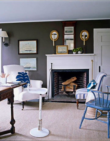
Throughout the time I have been away from Japan, I have been thinking a lot about my friends in Ocean Grove whose house burned on the same day as the earthquake hit here. In a town famous for the most ornate Victorians, with gull-wing roofs or turrets, their house, built in 1923, is a simple four-square Victorian with an arts and crafts style front porch, a pair of bay windows and a dormered attic floor. Like its owners, it is a warm and unpretentious house, always filled to the brim with guests, whether sitting on the porch or cramming around the dining room table. My friends have jumped quickly into the rebuilding process, starting to meet with architects, and I am sure they are not planning to build some kind of fancy faux Victorian, but instead an improved version of what they already had. As they start to plan the exterior, I thought it would be fun to help them along in envisioning what the inside might look like. To do so, I am going to be leaning on certain designers heavily, such as Tom Scheerer and Markham Roberts, whose wonderful relaxed beach and vacation houses fit the bill.
The colors of the interiors before revolved around a palette of blue, white and naturals like tan and brown – the colors of the beach, clouds and sky. I can’t see changing that as it fit the house and locale perfectly. Starting at the arrival point, I am hoping for a similar front porch, with a beadboard ceiling and comfy chairs for happy hour, just as was there before.
One “flaw” of the previous house was the lack of an entryway as the front door opened directly into the living room. Perhaps the new design might make room for one, with space to hang hats and drop beach bags.
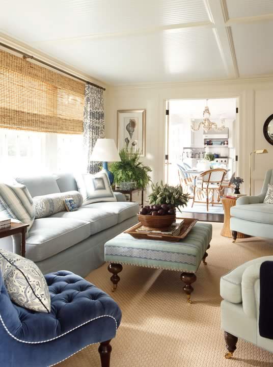
The living room had whitewashed paneled walls and I could see using beadboard or horizontal shipboard in rooms throughout the house. Most of the photos following have some, whether on the walls or ceiling. I also love the idea of some grasscloth to add texture. The original living room had a simple painted brick fireplace, a feature I would love to see kept. My friends also like having carpet in the living room, not as usual in a beach house, but actually practical and easy to keep clean. A patterned one like this one would hide dirt and stains.
Sisal or seagrass would be a reasonable alternative to carpeting too.
Add comfortable upholstered furniture in straight forward shapes and simple bamboo blinds and plain or checked curtains at the windows.
A games table might be a nice feature to sneak in – great for extra diners too! And it is so easy to pick up inexpensive Victorian furniture with great lines along the Jersey shore.
The original dining room was my favorite room in the house with built-in china cabinets with glass doors, the backs of which were painted blue to highlight the contents. Simple Windsor style chairs circled an oval table. This dining room with its Victorian chairs, white cabinet and painted table is quite similar.
Another view of the same dining room shows a simple Aesthetic Movement settee upholstered in a modern fabric. 
Bentwood chairs could be another charming choice and a formica table is always practical, inexpensive and can be custom sized to fit any space. But the key to this Tom Scheerer room is the scenic wallpaper, made from blowing up vintage images.
He does it again here, with a Nantucket feel and simple Windsor style chairs. My friends have a great Ocean Grove vintage postcard collection – I’d love to make a wallpaper out of one of the cards and use it in the dining room like Tom Scheerer does.
Kitchens are the budget busters of these kinds of projects. I am thinking straightforward white cabinets as it is easy to change the look down the road and a compact cooking area because we all do so much barbecuing.
I love the idea of color on the floor – here the wood is painted blue.
Perhaps the most practical solution in terms of care and cost would be a blue linoleum, much like the one used here. Black and white linoleum squares would be another classic choice.
I’m not sure there would be room for an eat-in table in the kitchen, but a built-in booth like this one…
…or this one, could be great.
One great feature of the old house was a small sun porch off the back. I’d love to see them keep a small space like this. With so many guests, more bedrooms and more small spaces to get away to are always at a premium.
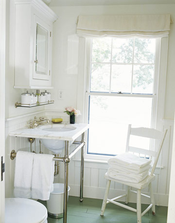
Bathrooms are super easy! Go with all white fittings and fixtures as they are clean, easy to care for, and always look fresh. Either beadboard with a bit of a country feel…
…or more 1920s. I am sure we could find some old photos like these at Shore Antique Center!
Perk up simple white hexagon tiles and a pedestal sink with broad painted stripes. Easy and inexpensive!
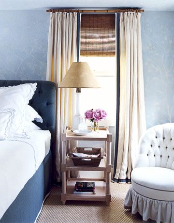
The master bedroom should be relaxed and comfortable, a haven of peace to escape from busy days and the demands of many guests. Beautiful fabrics on an upholstered bed set the mood here…
…and here…
…and here.
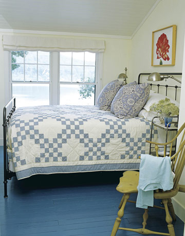
Vintage iron beds are also easy to find and have the right period feel. They are great for kids rooms as they are sturdy and easy to make. Love the little painted table here…
…and the painted chair here.
Attic bedrooms tucked under the eaves don’t even need much furniture, just a comfortable bed, some nice linens and a bit of color.
I’ll be curious to see if my vision in any way matches theirs…
Image credits: 1. via K. Woodruff, 2. design by Myra Hoefer in House Beautiful January 2009, 3, 5, 10, 11, 15 and 17. design by Tom Scheerer in House Beautiful August 2008 and April 2011, 4,8,9,16,21 and 23. design by Markham Roberts in House Beautiful August 2006 and October 2008, 6. design by Ashley Whittaker in House Beautiful February 2008, 7. design by Marshall Watson in House Beautiful September 2008, 12. designer unknown in Cottage Homes, 13, 18, 25 and 26. design by Gil Schafer in House Beautiful August 2007, 14 and 19. design by Alex Bates in Country Living June 2010, 20 and 27. design by Leslie Klotz in House Beautiful July 2008, 22. design by Tom Stringer in House Beautiful February 2008, 24. credit unknown.


