






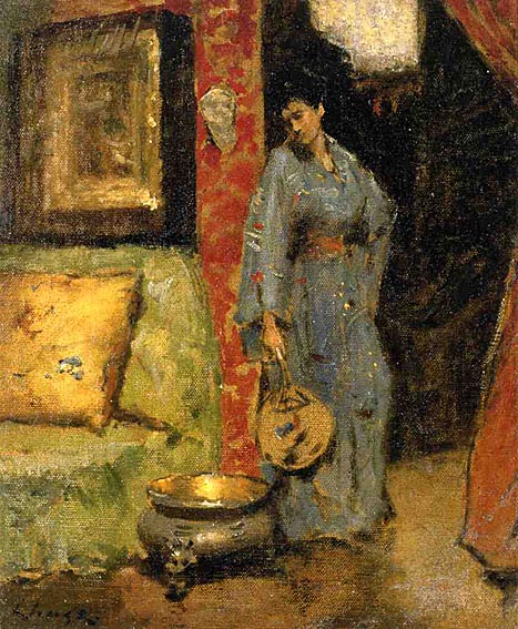


By tokyojinja in Artist Spotlight Tags: Impressionism, Japonisme, William Merritt Chase
In addition to being tiny, the bathroom layout was a straight railroad, which limited the floor space. The shower was a pre-fab 36 inch square, but the remaining unused 7 inches was useless. The opaque shower doors limited the visual size of the room by seeming like a solid wall. We won’t even bother discussing the color, the fittings or that wallpaper border. There were no redeeming qualities whatsoever!
Changes to the original floor plan below include sealing the door into the bathroom and moving it to where the sink is shown. The sink will be relocated to the where the door was. The shower pan will be 42 inches wide and fill the whole back wall. The shower doors will be frameless glass so that the line of vision goes all the way to the back wall, making the bathroom feel visually larger.
The layout of the whole downstairs was one of the problems as well. The bathroom was entered through the back bedroom/TV room (which was itself entered through the kitchen). Our first step was to change the entrance to both rooms, sealing the kitchen entrance (and gaining a pantry) and turning the doors of both rooms to enter directly into the main house. Here is the back corner under the stairs before the renovation.
Here it is with the two new doors. The door on the left opens into the TV room/extra bedroom. The door on the right is the new bathroom door.
The house is a very simple 1880s Victorian cottage. Neither the budget nor the room itself calls for anything fancy and I want the bathroom to look as if maybe it was always just like that. My inspiration for the design came from a small French watercolor that I love, the historic pharmacy turned ice cream shop in town, and other original fixtures in the house made of aged brass. I had already bought a salvaged white pedestal sink from the turn of the century in anticipation. So that means simple white fittings – 1 inch white hexagon tiles for the floor and subway tiles for the shower enclosure – and unlacquered brass faucets and fixtures. Planning for Farrow & Ball Pale Powder on the walls, which is the second lightest color in the second column of the paint chart on the inspiration board below.
Natural or unlacquered brass is definitely on its way back – take a look at the droolicious Henry Collection at Waterworks – but try convincing the locals around here. Everybody was worrying about polishing! It took a lot to convince them that I wanted that deep oxidized caramel color and that my only worry was how long it would take to stop being “brassy” looking. The Waterworks collection was both budget busting and frankly, too stylized to suit my house, which was actually a relief to not have to want it! Nickel or chrome fittings also felt too 1920s art deco.
Here are a few photos from my inspiration files. This bathroom had just the kind of exposed shower I was looking for, but the color and the shelves also really caught my eye. No chance of opening the sheetrock in my tiny space, but I think it is a great idea. Sometimes shells and sea motifs can feel trite in a beach house, but this is charming. It also has a single plain framed window, similar to my bathroom.
This next photo has the hexagon tiles, vintage sink and natural unrenovated, undecorated look I want. We have discussed beadboard to death too, as the house has some original in the kitchen, but in the end, simplicity won out and not the beadboard. Again, space was a big issue and giving up half an inch to beadboard on the walls felt like it would make the room smaller.
The renovation was well on its way when the Dec/Jan issue of House Beautiful came out, featuring a gorgeous Windsor Smith project with this bathroom. While dressier that I plan and significantly more glamorous, this has the closest feel, with thick white molding, a beautifully shaped white tub, and pale wall color. It has a wood floor, not tile, which adds a dark note, which I am hoping to add to my room with a wooden mirror and accessories.
We assembled the pieces – the vintage sink, a round profile Promenade toilet from Toto, which has just the right amount of vintage feeling and is very compact and well priced, an exposed shower from Baths From the Past and an unlacquered brass faucet from Sunrise Specialty to retrofit the sink. I was the only one in the family who voted to keep the original separate hot and cold taps on the sink for authenticity! I also bought a salvaged 24 inch door from Recycling the Past in Barnegat, New Jersey as the original door is too large for the new entrance.
Here is the (almost) finished project. I got into town 3 days ago and was lucky enough to find the perfect mirror at a favorite antiques store (antiquing on the Jersey shore is fabulous – and I am sure I’ll post about it this summer). The frameless shower doors will be installed soon and there is no styling or accessories yet, but you can get the basic idea….
I am planning on small shelves in the cutout above the toilet, like the ones behind the bathtub in the Windsor Smith bathroom. Not sure how long the oxidation will take, but some of the brass is tarnishing already. I also bought a great vintage brass towel bar for a song on eBay, and that will go up on the wall opposite the toilet.
The bathroom is so light and pretty – even more that I expected – and it feels roomier too. I’d love to hear from you all and know what you think! Styling and accessories will have to wait until the summer as we leave for Florida tomorrow, but it gives me something to hunt for. Oh, and I am still considering wallpaper (and can pull out inspiration photos of quirky wallpapered bathrooms too) so let me know what you think of that…
Image Credits: 1-5, 9, 13-16. me, 6. via The Lettered Cottage, 7. from Found Style by David and Amy Butler, 8. House Beautiful December/January 2011 photo credit: Victoria Pearson, 10. Toto, 11. Baths From the Past, 12. Sunrise Specialty
By tokyojinja in Renovation and Decoration Report Tags: aged brass, bathroom renovation, hexagon tiles, Victorian house, vintage, Windsor Smith
This design is very reminiscent of Japanese architecture too – reminding me of the shoji screens used as room dividers in traditional Japanese houses. As space is at such a premium here, most rooms have multifunctional purposes, and space is highly configurable. Shoji screens are covered with rice paper, which also lets light and sound flow through. One of the “go to” books on everyone’s’ coffee tables here is Japan Style: Architecture Interiors Design by Geeta Mehta and Kimie Tada, with great photos by Noburo Murata. I highly recommend it!
For a look more like Hamel’s, this antique fretwork panel door with its “seven treasures” pattern featured in an earlier post would work perfectly.
Image credits: 1. House Beautiful December/January 2011, 2. Japan Style: Architecture Interiors Design photo credit: Noburo Murata, 3. courtesy of Kanarusha Antiques
By tokyojinja in Books, Movies & TV, Interior Design Tags: fretwork, jalis, Japanese design, shoji screens, Thomas Hamel
Japan is no stranger to Van Gogh exhibitions. In fact, they are routinely the most popular, drawing crowds large enough to liken them to the morning commuter trains. This current exhibition at The National Art Center, on the 120th anniversary of his death, sets out to answer the question of how Van Gogh learned his painting techniques and established his signature style. While visiting the exhibition today – on one of the final days of the show – was almost unenjoyable because of the crowds, it did do a good job of demonstrating its premise.
Van Gogh did not arrive effortlessly at the style we all know and love. For him it was a long and laborious process. Beginning with the traditional painting and drawing techniques Van Gogh studied during his time in Holland, the color theory he learned from Eugene Delacroix and his experimentation with Impressionism, Pointillism and other new styles he encountered in Paris, he slowly worked his way towards his visionary style.
Yet most influential on Van Gogh’s vision were the Japanese woodblock prints (ukiyo-e) that he, like so many of his contemporaries, collected. Van Gogh and his brother Theo amassed hundreds and even dealt in them early in their careers. The bold compositions and vibrant flat color planes, truncated perspectives and naturalistic themes informed his later work. Elsewhere on the blog I have shown his copy of Hiroshige’s “Bridge: Sudden Rain at Atake”. He also copied a number of other Japanese prints, including Hiroshige’s “Flowering Plum Tree” and “The Courtesan” (inspired by Keisai Eisen).


Absorbing all of these elements, Van Gogh moved to Arles in 1888 where his style blossomed almost overnight into the individualistic style that today we all recognize as distinctly his. One of the highlight of the show is “The Bedroom” displayed opposite a life-size recreation of his actual bedroom.

Van Gogh truly learned by making his own copies of artwork that interested him. In addition to the ukiyo-e copies above, he attempted many studies of Jean-Francois Millet’s 1850 painting “The Sower” early in his career with no success. I think my favorite piece in this show is his much later version, painted in 1888. I had never seen it in person before and it is riveting.


Elsewhere in the blogosphere, Courtney Barnes of Style Court had a great post about the woodblock prints of Alice Ravenel Huger Smith, a “Charleston Renaissance” artist who made Japanese-influenced prints in the early 20th century along her adventure in becoming an artist. Barnes links to a really cute interactive presentation from the Gibbes Museum of Art in Charleston. While the mispronunciations of the narrator are intense, it certainly does demonstrate the long arm of Japanese artistic influence. I do think the presentation underestimates the influence of art movements at the time, such as art nouveau, nor notices the parallel between Smith’s work and the Japanese shin hanga (new prints) movement. Instead it focuses solely on the influence of the much earlier ukiyo-e. For instance, compare Smith’s “Cotton Picker at Twilight” to Kawase Hasui’s “Fisherman at Sunset” below, and then think about how much they both stylistically owe to Van Gogh, by revisiting “The Sower” above.

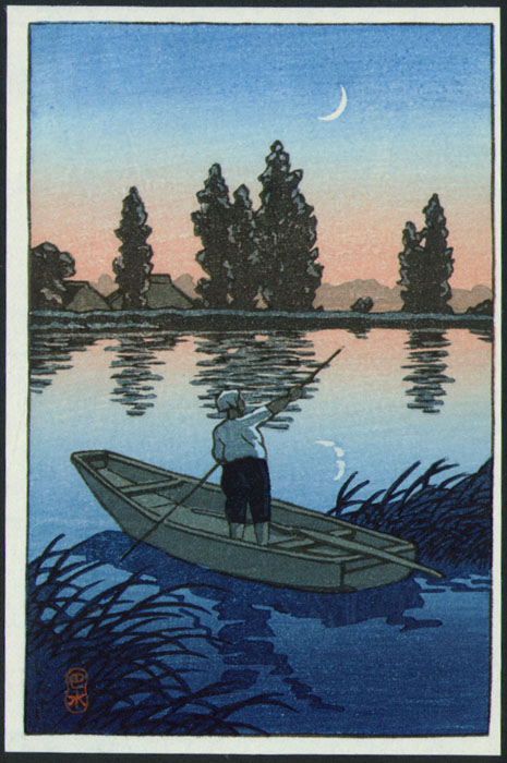
And more local news, Monet and the Artists of Giverny: The Beginning of American Impressionism has opened at Bunkamura in Shibuya, running until February 17, 2011. The show highlights Giverny’s emergence as an artists’ colony, with painters from all over the world, but particularly from America. Ironically, I am in the middle of reading Charlotte in Giverny by Joan MacPhail Knight to my girls, which is the story of a little American girl who moves with her parents to Giverny for a year as her father is an Impressionist painter. Along the way she meets many of the historical and artistic figures of the time and their paintings are the illustrations to the story. We haven’t gotten to the end yet, but I highly recommend it so far. My just-turned 7-year-old loves it, but my 11-year-old middle-schooler is very interested in listening too.
I don’t think I have thought this much about Impressionism since one of my very first art history courses at University! But revisiting these extraordinary works has been amazing. If you too have been enjoying these recent posts on Impressionism and Japonisme, make sure to check back on Christmas and New Years as I have a few special holiday posts planned. Grab some mulled wine and be prepared for beauty.
Image Credits: 1, 3, 6-7. Van Gogh Museum Amsterdam, 2. via About.com, 4-5. Wikipedia, 8-9. Gibbes Museum of Art, 10. via hanga.com, 11. via Bunkamura, 12. Amazon.com
By tokyojinja in Artist Spotlight, Books, Movies & TV Tags: Alice Ravenel Huger Smith, Charleston Renaissance, Claude Monet, Impressionism, Japonisme, Vincent Van Gogh
 Today I went hunting for kashigata (sweets molds) at a few shrine sales and got lucky at Tomioka Hachimangu. A utilitarian but charming folk craft easily found and inexpensive to collect, most of the readily available molds are from the Showa era (1926-1989), and most are not particularly old at that. In use since at least the Edo period, the higashi (dry sweets) made by them are not what we would consider oishi (delicious), but they are very pretty. They were designed to last long periods of time and to suit a very different palate. Because they were sometimes left as funerary commemoratives, some have designs and writing to honor the departed. Other common designs include fruits and vegetables (great for kitchen display), fish and turtles (rarer and harder to find), and botanical motifs (plum, cherry, lotus, pine), as well as more unusual shapes (figures, kamon, etc).
Today, a number of dealers had bins of medium quality molds in common botanical motifs.
This dealer had a few unusual ones, such as the fan in the lower right.
In this picture you can see a fish, most likely tai (sea bream) and a turtle. These are highly covetable motifs.
A friend displays her fish on a small easel, with the cover resting in front.
Amy Katoh’s Japan: The Art of Living has a great photo of a kashigata grouping hung on the wall in a more traditional Japanese style house.
 I have one older kashigata, in a stylized chrysanthemum pattern. I have been waiting, holding on to it, thinking I needed a group like that above to display it properly. Then I came across actress Kim Raver’s charming “undecorated” Bridgehampton home that she shares with her mom and family. Propped on the rustic brick fireplace is a single kashigata. Hard to see, but peer very closely at the mantlepiece…The fireplace is original to the 100+year-old house and where the first residents did their cooking.
I can’t resist adding one more photo of this home. I always love mismatched chairs and tables in a dining space and these bentwood ones painted blue are so charming with the scrubbed pine and simple kilim. The key to this house is that it has been assembled over time by Raver’s mother. “She gathered things from her whole life and created an accessibility and warmth in every room,” says Raver. Go to In Style to see more pictures of this house and Raver’s very different West Coast home.
Sweets and candy molds seem popular right now and not limited to those made in Japan. Barry Dixon has this vintage candy mold in his current One Kings Lane sale, with no provenance information listed.
Eddie Ross tweeted about his newly purchased German cookie presses a few weeks ago. They feel very reminiscent of the Japanese molds. I wonder if there is any relation between them?
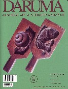 For more on kashigata, pick up back-issue 50 of Daruma Magazine. They have a great article on them, with photos of rare examples and details on how the sweets are made.
Image Credits: 1. yukkimura, 2-4 & 7. me, 5. P. Huxtable, 6. Japan:The Art of Living photo credit Shin Kimura, 8-9. In Style Magazine November 2010 photo credit: David Mushegain, 10. One Kings Lane, 11. Eddie Ross, 12. Daruma Magazine
By tokyojinja in Design Motif, Interior Design, Shrine Sales and Flea Markets Tags: Barry Dixon, Eddie Ross, flea market, folk art, japanese antiques, kashigata, Kim Raver, shrine sale
