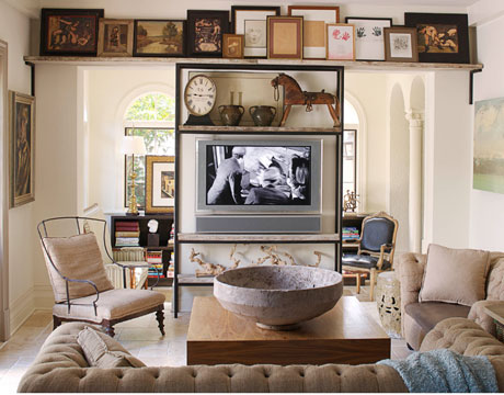
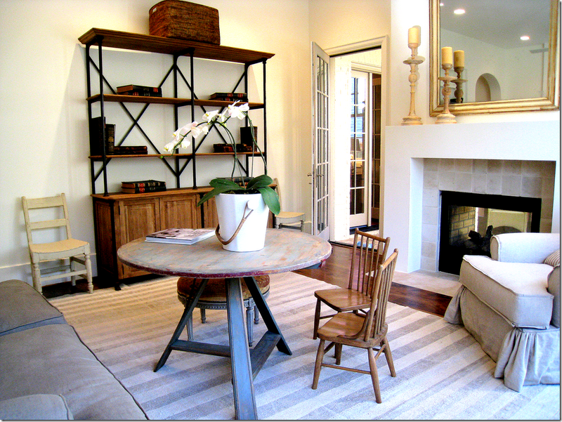
I began to think about the idea of open shelves – wooden – with some kind of metal frame, giving the unit a casual but slightly industrial feel and to look for inspiration photos with that aesthetic.
These are in a kitchen, but if you think about the microwave as if it was the TV, the idea holds.
One Kings Lane had this vintage bookcase a while back, (perhaps in March?) as part of a Tastemaker Tag Sale from Knight Moves (I think) and I bookmarked it both mentally and physically.
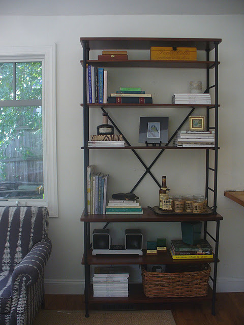
It got me remembering a great post from Michele over at My Notting Hill. She bought an inexpensive Sonoma Bookcase from Ballard Designs on sale…
…and styled it brilliantly.
That promptly sent me over to the website to look at their product photos and measurements. The upper shelves are a shallow 12 inches and the lower ones 16, which is about 4 inches narrower than what the TV had been resting on, freeing up space in the room. It also looked like the TV would fit perfectly, actually even tightly, both vertically and horizontally, which I thought would be more attractive…
…than this one, sent in by a customer, with a TV, but a slightly too small TV. So I waited for a sale offer too – it was $499 list but why not spend 25% less? – and then I pulled the plug and ordered it.
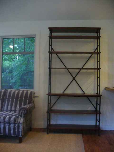
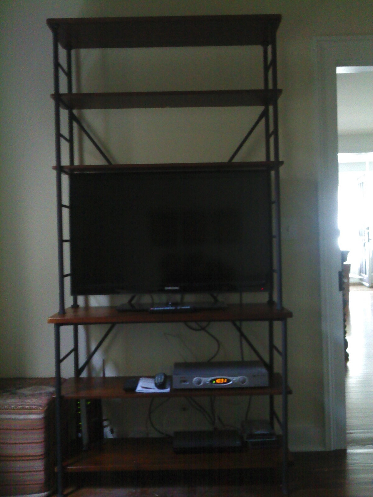
Now don’t hold your breath! Here’s the horrible crooked photo my handyman just sent me. But close your eyes and imagine the shelves all styled with books and tchotkes and baskets holding the ugly stuff. Imagine all the cords gathered and tied and hidden. And realize the paint color looks sickly green and awful here but it isn’t.
That makes two pieces from Ballard. Imagine that!
Related Posts:
Found! Kilim Footstools in Tokyo and Decisions on the TV Room
Sweating the Details…A Round-Up of Brass Library Wall Sconces
Just in Time…Last Piece of Cream Hibiscus Branch From Aleta
Beach Baskets…PaperGlueBamboo Sale and an Idea for the Ceiling Fan
Image credits: 1. House Beautiful, photo credit: Thibault Jeanson, 2. Ginger Barber via Cote de Texas, 3. Elle Decor September 2010, photo credit: Roger Davies, 4. via One Kings Lane, 5-6. via My Notting Hill, 7-8. via Ballard Designs, 9.

