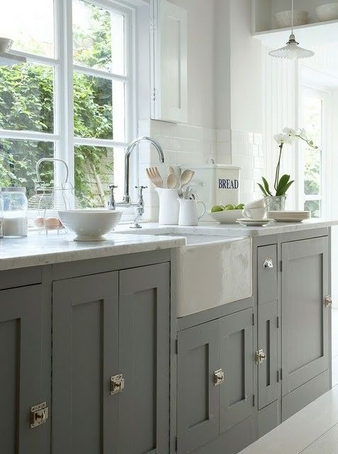
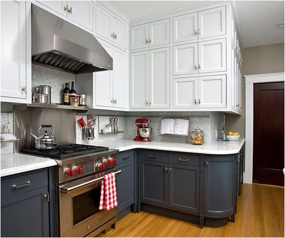
I’ve covered the basics of inset vs. overlay doors, marble counter tops and farmhouse sinks in an earlier series of kitchen posts. My biggest conundrum for this kitchen is stainless steel. There really is no other attractive appliance option (in my budget anyway), but I don’t want a showy fancy kitchen. Luckily, I’ve thought of a solution to that which is to paint the cabinets a lovely dark blue-gray which helps to blend with stainless stove and refrigerator. I’m thinking Benjamin Moore Wolf Gray 2127-40 might be just the thing.
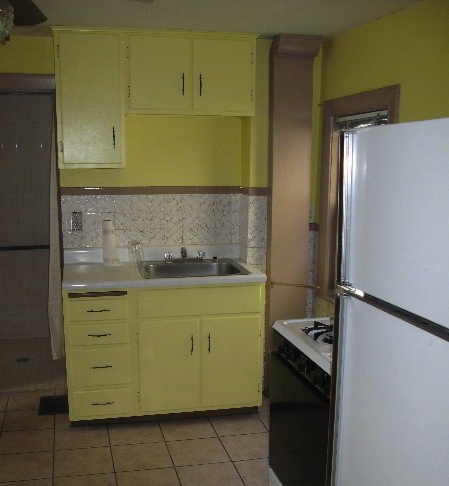
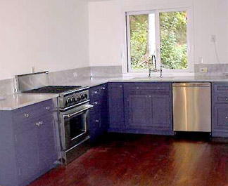 I’m feeling grumpy though that this has become a massive trend as I have had a long-running love affair with this look. I renovated a kitchen in 1999 in just that way – dark purple-blue-gray cabinets with a Carrera marble top and dark wood floors. Digital cameras were not very good back then and this is the only photo I could find of the project before it was completely finished. If only all my photos weren’t on a container ship steaming towards Doha, I would have one to show of how nice it was when completed. The implication for me personally is that this combo is a keeper.
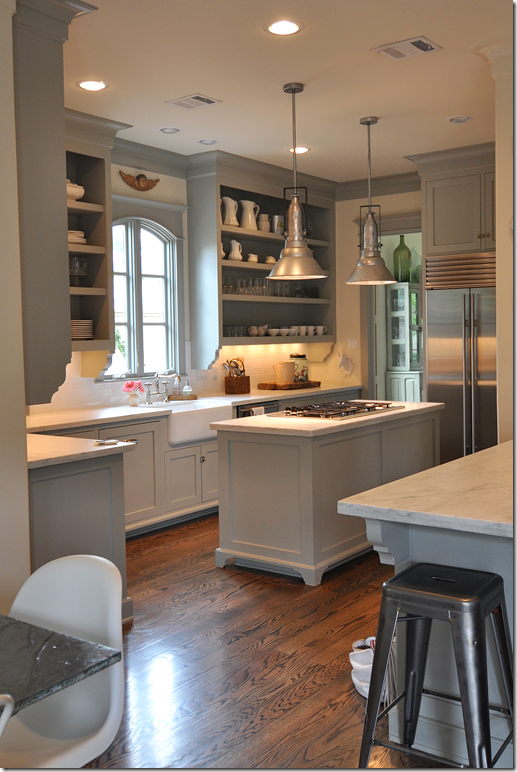
I’m going to run you through a stream of inspiration photos I’ve been saving, which I am sure you have already seen all over Pinterest. Sally Wheat’s kitchen started the gray trend although she has gray upper cabinets too.
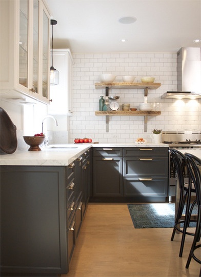
The no upper cabinets/white uppers/white shelves came a little later…
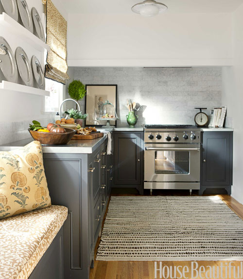
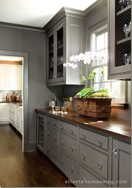
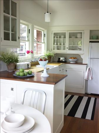
See how nicely the dark cabinets soften the stainless? It looks particularly good with open upper shelving as I’m not as much of a fan when it is paired with a big bank of white upper cabinets. These examples above all have white marble or marble-like counters but the gray also looks good with wood counters too…
I’d like to use a combination of wood and marble surfaces in our kitchen with the island and the counter being different from each other. So as I’d like the island to be a “found” piece, it does make it hard to know which surface will go where. But I think I am leaning towards marble counters on the cabinets.
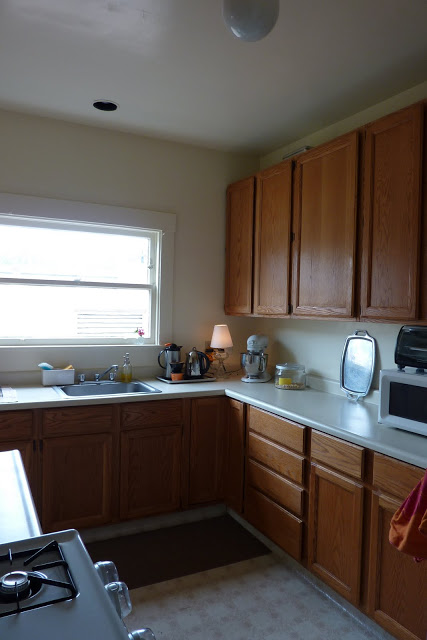
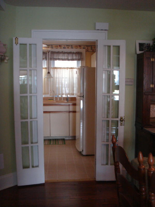
So stop and look at this photo one more time. Imagine a kitchen similar to the examples above through this doorway – the same dark wood floor as the dining room running into the kitchen, white beadboard covering the back wall, deep blue-gray cabinets, Carrera-like counter and the refrigerator out of your sight line and integrated into the cabinets. Imagine a more seamless color palette instead of the jarring switch from cool to warm.
Imagine a simple stainless range, centered on the wall between the windows (the asymmetry of the stove is another thing that drives me crazy) with either a real hood or no hood – I haven’t needed it for 4 years, so why worry about it now as almost everything is cooked on the grill outside? Maybe small shelves for spices and oils on either side. I can’t really use that 12 inch lower cabinet to the left of the stove, and we would narrow it down anyway when centering the stove and just use it for cutting boards/cookie sheets. We would also gain a few inches to move to the counter on the other side which will be important in the next paragraph.
The sink is a full 36 inch cabinet space and I would go down to a single bowl of 30 inches or more likely 24 inches – probably farmhouse style – which would free up more space. I think if I add the space from the stove side to the space from the sink side I might even be able to fit a small bank of drawers in between the dishwasher and stove and get rid of the appliance-touching-appliance look that I hate.
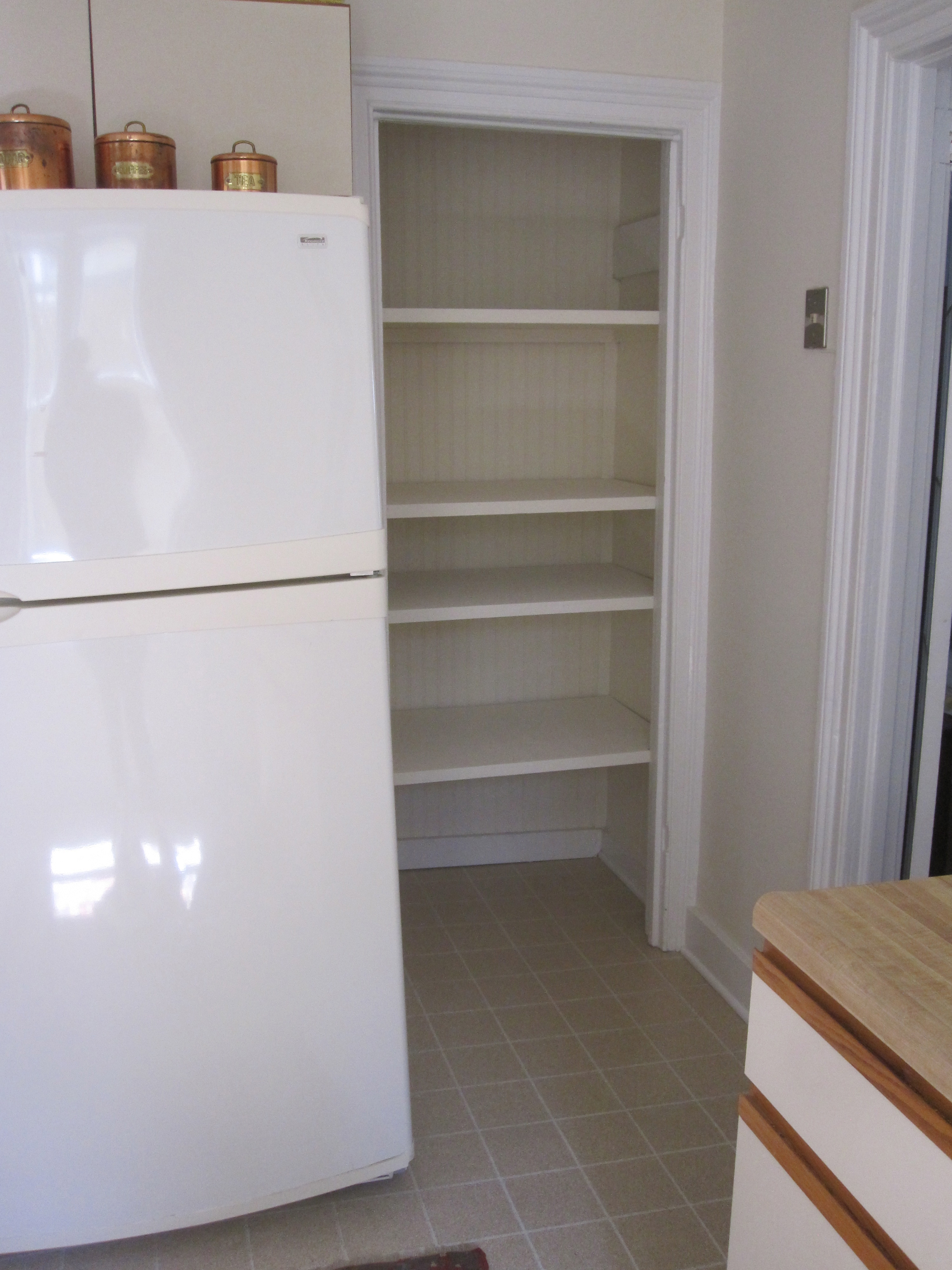
 And look at this beauty – the Liebherr CS 1660 – all 30 inches wide and 24 1/4 inches deep – narrower than what is there now and fully counter depth but with more and better cubic feet of storage. I’ve hated leaning over to get things out of the low fridge I currently have and much prefer freezers on the bottom. The house is certainly too humble to merit the expense of a Sub Zero and this is less than half the price and very well rated. It is simple and streamlined and tall enough to balance next to the pantry with nothing above it.
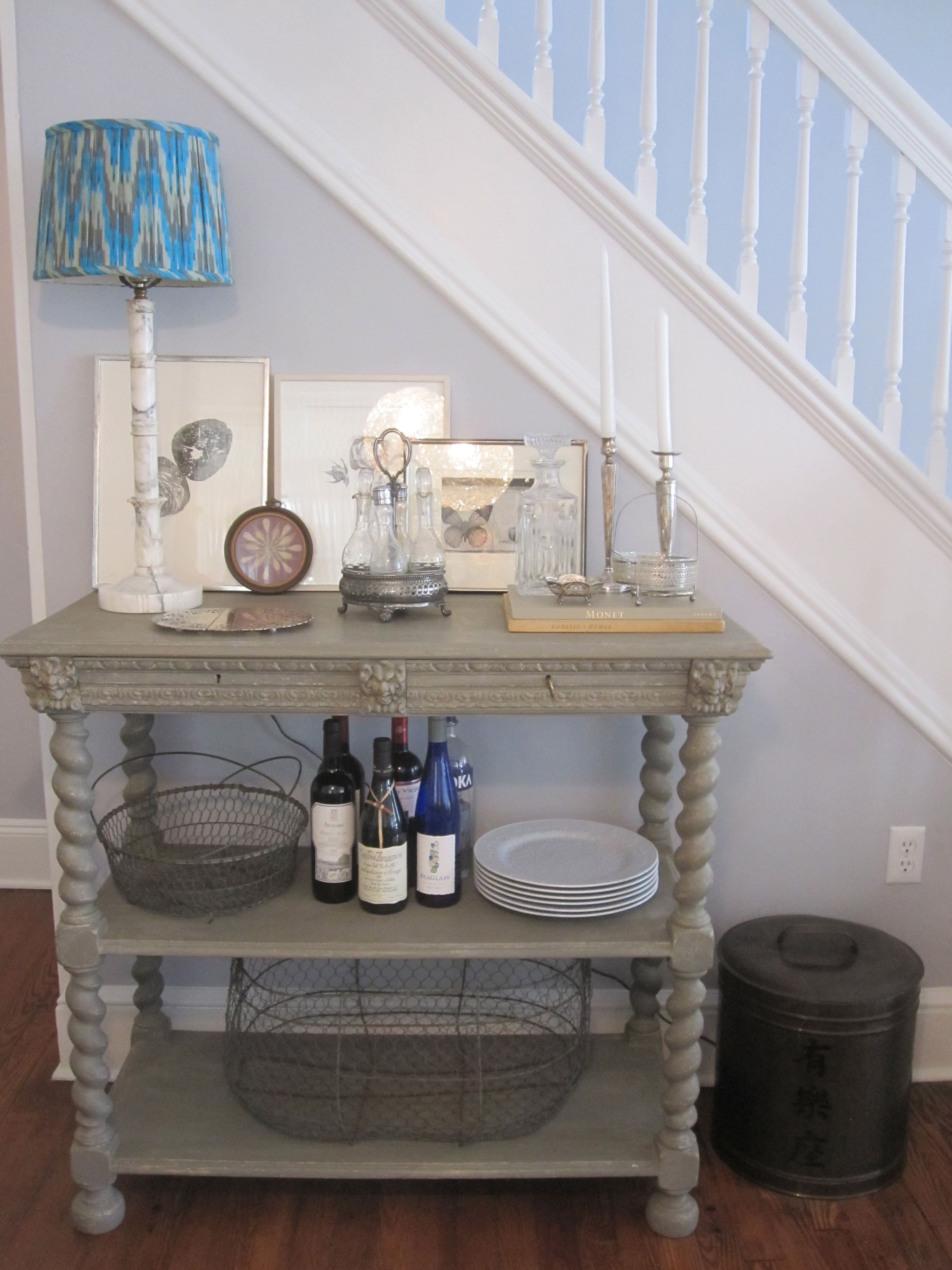
I’m searching desperately for a set of salvaged French doors that are a similar match to those into the kitchen as we would build out the pantry to meet the side of the refrigerator, making it substantially sized. The shelves have been designed so I can even put the microwave inside! And that bit of cabinet you see on the right lower side of the photo would be gone, replaced by the freestanding island. Since this kitchen will be less vintage looking, an antique island will be a key part of the design, providing patina and contrast.
So there you have it. Four days of unrelenting posts on the kitchen here at the beach. I’m sure there are some details I forgot, but I think you get the picture. Ideas? Comments? Opinions?
I’ll be reading your comments in London where the Duchess of Cambridge is patiently waiting for me to arrive so that she can give birth to the future heir of the British Throne. She knew I’d be grumpy of she did it before I got there. While hanging out in bonny England for the next ten days, I’ll be visiting markets and antique shops as well as some other favorite haunts like the shops of Robert Kime, Ben Pentreath and Bennison. I’ll be on Instagram for sure and hopefully able to post from my iPad.
Related Posts:
Beach House Kitchen Diary Part 1…Before and Currently
Beach House Kitchen Diary Part 2…What I Wish Was Here Originally
Beach House Kitchen Diary Part 3…Cheap and Cheerful Renovation Inspiration
Photo links can be found on my Pinterest kitchen pages.


