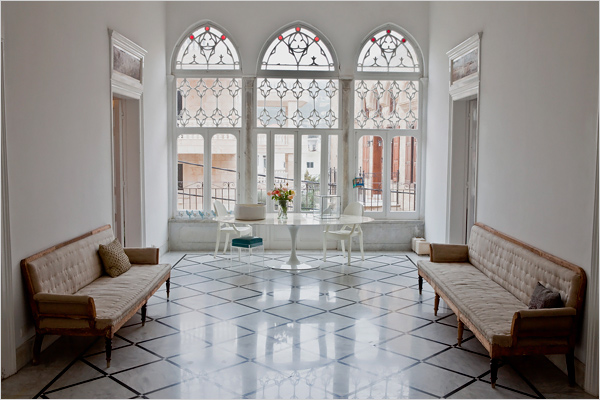
“In English the trifore is a triple arch, and is also known by the name “Lebanese window” and is identified with the typology of the central hall house that was common in Lebanon…This is a decorated wooden window characterized by three arched openings supported on the sides by engaged stone columns in the wall and in the center by separate columns that are mainly made of marble. The column consists of three components: a base, column and capital. The carpentry details include a wooden lattice that adorns the upper part of the window and a folding double-wing window element on its bottom part. The trifore also occurs next to the balcony – in these instances the middle unit in the trifore is constructed as a door. “
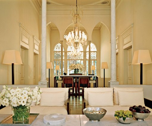
One of the joys of change is how it can alter our vision. Moving to Qatar has turned my eye towards parts of the world I didn’t think about much while I was living in Japan. I have written effusively about designer May Daouk’s Beirut home featured in Architectural Digest before, in particular the amazing arched windows in her great room. What I hadn’t quite realized was that this layout and design is not unusual and is in fact a classic style Lebanese house, with roots that stretch back through the Phoenicians, Romans, Ottomans, Venetians and others. I’m not going to show the other photos of May’s house again, so be sure to visit them in the post or the magazine. They are truly that good!
In addition to May Daouk’s home in Lebanon, I have stumbled across a few others and been amazed at the architectural consistency among them. Trifore, triple arch windows, or mandalouns as I have also seen them called, are the integral centerpiece to a great room with doors opening directly and symmetrically off to smaller chambers. Having just toured Pompeii and ancient Rome a few weeks ago, I can clearly see the links between the open courtyard centered homes there with these. The windowed axis provides cross ventilation in the summer months and copious sun for the colder months as well as views across the water or over the valleys, as traditionally they face outwards and often have a balcony. The triple window is almost always on the second floor, as we would call it, much like the Italian piano nobile that is so common to Venice. It seems very practical that the principal rooms for entertaining and living should be upstairs where the light and views are better.
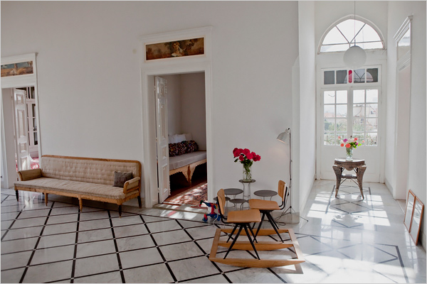
The vacation home of Kamal Mouzawak and Rabih Kayrouz, a Lebanese fashion designer, that was featured in The New York Times a few years ago has the same exact setup – a grand salon with a trifore window and doors opening off to the other rooms. This home was stripped to its bones and fully renovated after having been shuttered since Lebanon’s civil war in the 1980s. It was very sensitively done – about 70% of the original stone floors were taken up, restored and replaced. The decorating here is the antithesis of that in May Daouk’s home, being as spare as hers was richly layered. But both versions work. My eye can’t help but be drawn to the oval tulip table in front of the windows, proof again that that table works anywhere. I am excited as mine is on the boat from Malaysia as I type.
From this angle you can see more clearly how the other rooms open directly off the great room. Inset transom panels were painted in the early 20th century by Lebanese painter Youssef Howayek.
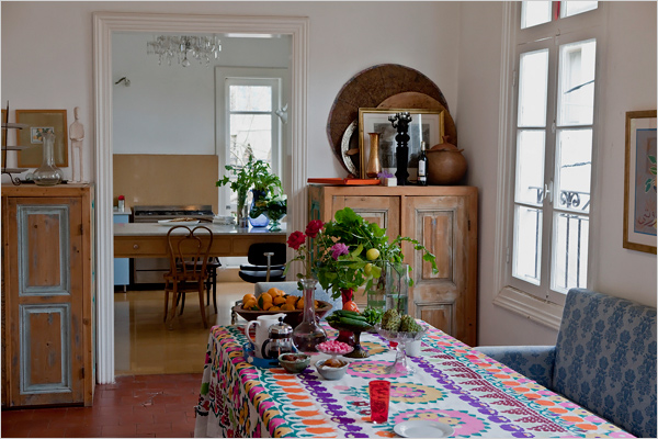
It isn’t only in the central salon that the light is outstanding. This view of the dining room with the kitchen beyond shows the high ceilings and tall windows throughout the house. I love the colors and simplicity of this space.
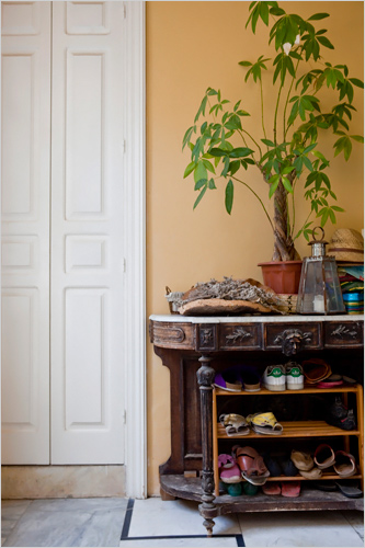
Shoe storage for them seems to be just as much of an issue as it is in Japan. This antique console has been well repurposed as a shoe cupboard.
On yet a third design note is fashion designer Elie Saab’s Beirut home, designed by Chakib Richani, also featured in Architectural Digest. Saab’s house is unusual in that the central hall and main living rooms are on the ground floor, not the second floor, with an enclosed garden. The doors in the central arch open directly to the lushly planted space, rather than the more expected balcony.
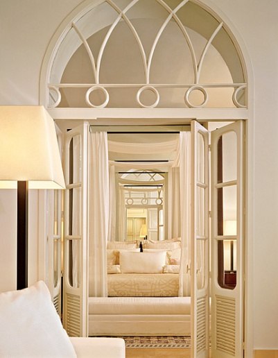
The simple palette and minimalist upholstery is designed to set off the carefully placed antiques. The space is also broken into three sections with internal trifore, again similar to May Daouk’s home.
The arch motif and gothic tracery continues into the master bedroom.
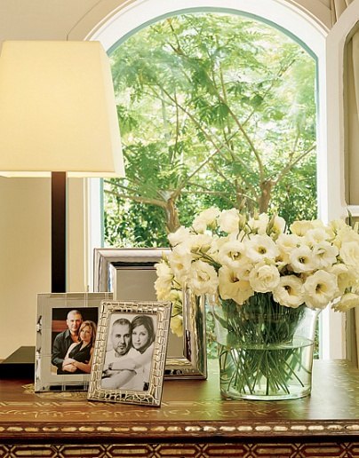
I can’t resist this photo and its detail of what looks to be an amazing inlaid chest. More on inlay coming soon!
Are you as entranced by this extraordinary architecture as I am? I know it influenced me tremendously in the choosing of our Doha house, but I can feel it affecting me well beyond that choice.
Related Posts:
Living Lavender Dreams
Image credits: 1. Architectural Digest, photo credit: Simon Watson, 2. via Because I Love Sand, 3-6. The New York Times, photo credit: Bryan Denton, 7-10. Architectural Digest, photo credit: Marina Faust.



Amazing architecture! Those windows are so dramatic, and make stunning focal points. Now I know what to call them – thank you 🙂 Also, I noticed the ceilings in many of these homes are quite tall.
I absolutely love Elie Saab’s beautiful home, this isn’t the first time that I have seen photographs of it, it appears so peaceful and the architecture is amazing, almost like the embellishment on his beautiful designs. It must be so exciting to have such a different set of plans, so to speak architecturally, from those of Tokyo and the colours, they make me smile.
I also can’t believe that Loi is commenting on your blog, how amazing is that! I love Loi’s work too!
Can’t wait to see what you do with the new home in the coming months jacqueline.
Angela xx