
I’m a hard-core believer that paint colors have to be tested on the wall before selection, but unfortunately that’s not possible for our house in Doha. I’m actually ecstatic that we can paint at all as our house in Japan was covered in an off-white textured wallpaper that could not be changed. And better yet, we have just discovered that there is Benjamin Moore to be had in Qatar! So if I can give my husband the paint color names and numbers in the next day or so, he can leave the paint for the painters in each room and that is what will go up on the walls in lieu of the ugly yellowish beige they would normally paint.
I always tend to choose a cool color palette for my own projects – it’s just my instinctual nature – and my plan for the house is to have it be a seamless assortment of pale grays, with a bit of pigment in some rooms where a color is called for. Gray is by far the most difficult tone to get right and there are thousands of posts and even entire blogs devoted to the color. Since I have such limited time, I’ve constrained my search to my own tried and true colors and decorator favorites. I routinely recommend Benjamin Moore Revere Pewter HC 172 and more recently Balboa Mist OC-27 to others, but I never use them for myself as they are warm grays, not cool. After quite a bit of deliberation, I’m positive I don’t want cool blue tones in the living room/dining room or in the entry and hallways, so I am pushing myself to use the light and warm gray Balboa Mist. These kind of warm grays look awful to me on the chip – very beige which you know is like a four letter word to me – but lovely on the walls.
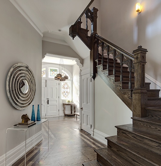
This is the photo that inspired the use Balboa Mist in my Chicago client’s living room…
…and it has been a great success. The room is still in progress and quite neutral, but we are finding that it can handle any color thrown at it.
And the most important decision for my new place is how the color will serve as a backdrop to my silver leaf and pine byobu and the rich color of my bamboo altar table?
Inspiration photos reveal it to be a wonderful gray with greens and medium toned woods.
So I have convinced myself and it will be the main color in the house. Wish me luck as this would be my largest mistake if it is wrong!
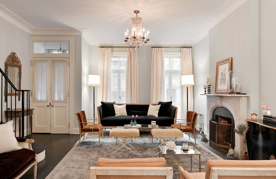
The den will get much of my existing living room furniture and rugs so it should ideally be a blue-green gray. I’m going with Nate Berkus’s favorite Pale Smoke 1584, which is very close to the now discontinued Benjamin Moore color (from three color wheels ago – I’m dating myself!) that my New York living room was historically painted.
It is best known for his use of it in Katie Lee Joel’s Manhattan townhouse.
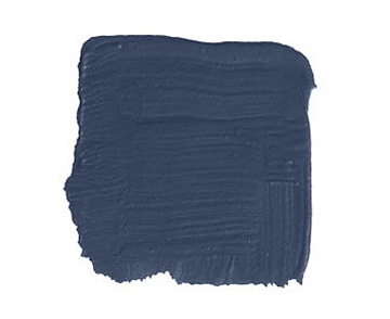
That’s not to say that I’m not still considering going dark and dreamy in the TV room, using something like Farrow & Ball‘s Hague Blue like I wrote about here, or even F & B‘s Claydon Blue, but those kinds of decisions will have to wait until I’m there.
My bedroom has been an easy pick – Harbor Gray AC 25 – and my only struggle is that I almost want to change the living room and dining room to this purer gray. In my heart I know it’s not the right thing to do, but this is the kind of gray I like best. It nudged out Stonington Gray HC-170 by a small margin as the Stonington has a touch more blue.
I just happened to stop by and visit our tenants in our New York City apartment yesterday where the master bedroom is still painted my (also discontinued) dream gray, a color by Sherwin Williams called Windham Gray. I dug up old photos of our bedroom there for you (you’ll recognize much of the furniture from our Tokyo place here and here) and I was able to match the paint chips to the wall. I’m feeling impressed with myself that the Harbor Gray I had chosen before going there was as close to an exact match as could be!
My elder daughter is lucky enough to be having her room entirely re-conceptualized and re-done when we get there. Blue is her unquestionable favorite color so I am going with a favorite of designers Steven Gambrel and Vincente Wolf called Iceberg 2122-50. This is the first digital chip that doesn’t do a good job of representing the color – it is much bluer and less seafoam than it looks here.
And I am cheating here as I don’t know for sure that this Jeffrey Bilhuber bedroom is actually Iceberg, but I can’t resist using it as it has some of the ideas we are planning on, including tons of one textile and accents of black. For more of her ideas for her room, she has started a Pinterest board here.
My younger daughter is getting a consolidated group of her things and her older sister’s including that divine painted armoire. For her room we are choosing a soft French green called Silver Crest 1583.
It has a very shimmery quality. She will also have deep raspberry as an accent color, but I couldn’t find any inspiration photos with that kind of colorway.
I’m also planning on using this wonderful wedding noren, which is less blue in person, as a bed hanging on a four-poster.
The guest bedroom needs a twinge of a yellow-green so it will either be November Rain OC-50…
…or Silken Pine 2144-50. I’m worried that the November Rain is too putty and the Silken Pine to literally green.
The color needs to set off these antiques – an old Tabriz and a lacquer tansu.
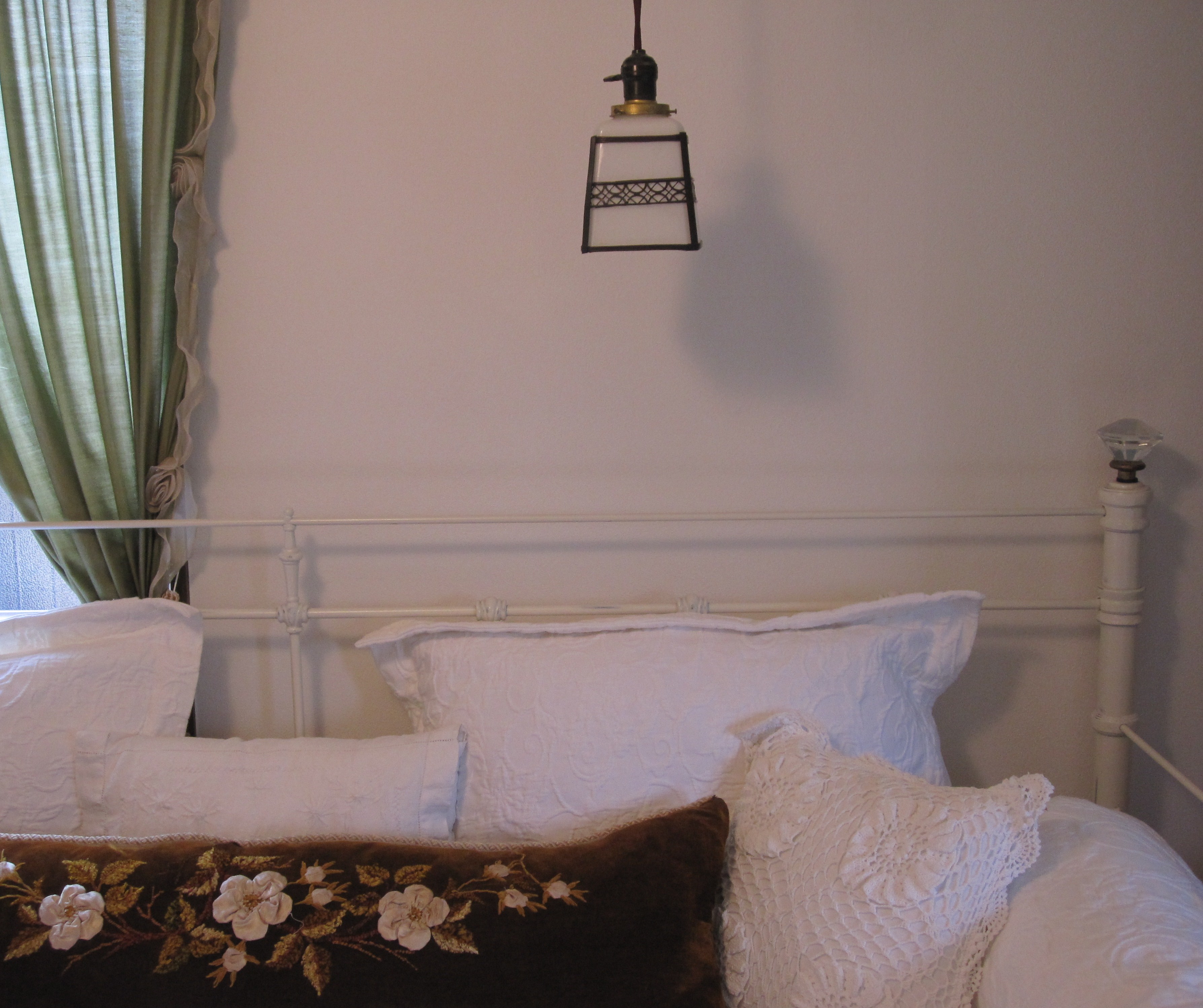
The bed is white iron and the bedding is all white, with a bolster made from and antique velvet pelmet.
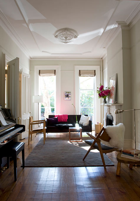
And I think I am going to paint the office Gray Owl OC-52 just because I love the color and I want to see it on the wall. It’s a gray with quite a bit of green in it, which is why it wasn’t quite right for elsewhere.
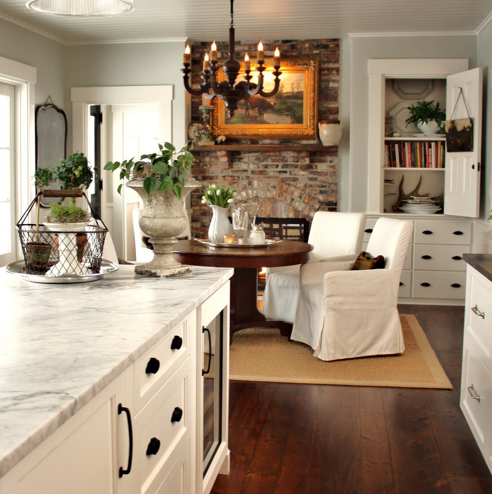
Joan used it in her kitchen and I love it and everything she does.
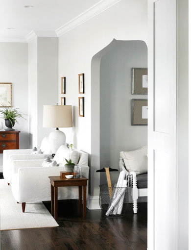
It’s an option if the Balboa Mist turns out to be a fail and looks beige, which is my secret fear. This room is so seductive because it reminds me of the arched entryway into our new living room.
But I’m sticking with my Balboa Mist as my gut says it is the right choice. Opinions? I know you have them! I figure if I even get 50% of the rooms correct, then it is well worth it to just have it be done before the container arrives and the unpacking begins!
Image credits: All paint Benjamin Moore paint chips via Benjamin Moore, Farrow & Ball chips via House Beautiful, 3. Buckingham Interiors, 6.via Apartment Therapy, 7. Lindsay Reid in House Beautiful June 2011, photo credit: Amy Neunsinger, 9. Nate Berkus, photo credit: Evan Joseph, 15. Jeffrey Bilhuber in Elle Decor, photo credit: Simon Upton, 17. Beth Elsey in Atlanta Homes Magazine, photo credit: Mali Azima, 20. via Design Sponge, 22. via Decorpad, 26, via For the Love of a House, 27. via CCG Interiors. All other photos mine.









I love the Balboa Mist, but feel kind-a sunk – no mention or even a hint of the cool lavender walls from your earlier post “Living Lavender Dreams” 23rd April- no temptation what so ever…?
I haven’t ruled that out and should have referenced it in the post, but if you think picking gray long distance is hard, just imagine lavender – from pinky lilac to to bluey periwinkle – it is another of the most difficult colors and so light dependent that it will have to wait for an on site decision. I just don’t want to move in with the “Magnolia” walls – that’s the British name for it as I’m sure you know and what they called the color in Hong Kong. It’s sure to spiral me into a depression!
oh and that Noren is Spectacular! Cant wait to see that up!
I have no idea how to choose colors without knowing first hand what the natural light direction is in the room–you have your work cut out for you! I LOVE gray and have been using Ralph Lauren Weathered Stone forever. I looks great in all light conditions although it is an even split between warm and cool. I also love Farrow and Ball Stone Blue for a rich blue as it has a grayish quality too. Good luck!!
I know, I know – but its a free paint job so its worth a try. Going to check out the Ralph Lauren color to compare with the Ben Moore, but it isn’t available there. No Farrow & Ball in Doha unfortunately either!
It seems to be coming together nicely!
thank you!
Love all he talk on greys. Where were you a few months ago when I painted the kitchen Heather Gray 2139-40? I could have used some support. Accent wall is Sharkskin 2139-30. Have fun. Miss you.
Do you like them? More photos please!
I agree with you about picking colors. When possible I prefer to live in a place for a month or a couple of weeks before I pick a color. I believe that the rooms themselves suggest the specific tone. But of course there are times or situations in which this is impossible. It is easy to forget that latitude changes perception of color. I remember how strange it was for me to choose colors when I lived in Algeria where there is a silver reflection to sunlight, and now in Rio de Janeiro, the sun here is more yellow than we get in the Mid-Atlantic states in the US. That’s why color can be so cultural linked. Good post, thanks once again.
The quality of the light there is exactly why I don’t want a cool blue gray in the the main space. We will see if I gambled correctly! Love that idea of color and light being culturally linked!
I always love your blog! And it’s nice to see even the professionals fret over the color puzzle. I started to cut in the upstairs walls and had to stop due to the color being too beige. I’ll be back to consult this post…frequently.
What color were you using?
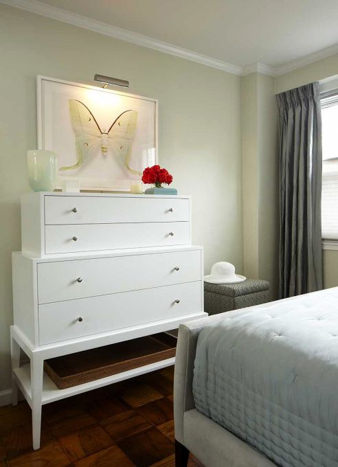
is the giant moth a painting? print?
I enjoy your blog so much that I would like to share with you my journey to perfect gray. So many grays skew green or blue. I wanted something not too dark, not too beige, not too blue, not too green and very soothing for use in a master bedroom. After a dozen or so trials from three or four paint companies, the winner….Benjamin Moore Silver Satin.
Sarah, thank you so much for commenting – I love hearing from readers. And Silver Satin is basically the lighter version of Balboa Mist so I am so excited to hear that it didn’t skew too beige for you!
And for a moment of levity in this agonizing process I recommend a viewing of “Mrs. Blandjngs chooses paint color” on YouTube.
LOL! Of course!
I could read this all day — and probably will in order to catch up! Harbor Gray is a lovely color. We painted our house with BM Ozark Shadows (AC-26, one shade darker than your HG) when we first moved in but we had to repaint as the color lost all of its red and turned green — a hideous hospital green — from sun exposure. Hope that doesn’t happen to Harbor Gray, too!?
Our living room and den are Iceberg Blue….love it more every day!
I hate the brick on our home.I thought about painting it.I have seen several that were painted and they looked good.I was wondering if anyone had suggestions on it And maybe were to start.Thanks
Hi there I am just about to paint our living room in Balboa Mist and wanted to know how yours turned out. Did you go for Balboa Mist in the end and where you happy? Any pictures to send. Thanks.
Take a look at my recent posts – and there are quite a few of the living room – also in my Instagram feed (tokyojinja). I absolutely adore the Balbia Mist – neither too warm nor too cool. I’d be curious to know how yours turns out!!
Hi..just wanted to let you know that our designer suggested Balboa Mist but I was not sure I would like it…your blog is giving me the courage to try it…it would be nice if you could let me know if you still like it or if you repainted the wall another gray color.
Just to let you all know…we love the Balboa Mist…we are happy we decided to go ahead with it!
November rain, in a small room turned out to be way too green where we wanted a light neutral that reflected green. Could Benjamin Moore’s Silken Pine be the best choice?
We’re looking for a light neutral that reflects pine tree greens for use in small or dark rooms.
The main color is my house is BM Balboa Mist and the bathrooms are BM Revere Pewter. I am very happy with the color choices! I wanted something slightly different for the bedrooms so I chose BM Pale Oak. I am not seeing that much difference between the Balboa Mist and Pale Oak… do you have another paint color suggestion for the bedrooms? Thanks!
I just went nuts with paint colours for my ensuite.
My tub sink and toilet are gray .. My new tile is calledwhite marble tech and I tried gray owl but it showed too green (I have a window north exposure) I tried stonington also green… Was going to do my original paint colour cement gray made 25% lighter but I found the room monotone… Sooooooo I chose balboa mist! Wish me luck
I too am hoping that Balboa Mist will work in my home (dining room with cherry/mahogany furniture). Just wondering if the color might be too beigy/brown or if the undertones will work in this space.
How did Balboa Mist look with your cherry cabinets?
We have been living with “The Balboa” for almost one year now and I can tell you that any color frame or painting even silver looks wonderful on it. What we did is paint one wall and lived with it for a week before painting the whole room.
I love the balboa mist! It turned out perfect!
It’s a beige gray… Very very clean and fresh… Did you sample it yet? I would attach my picture but don’t know how
Thanks, that is reassuring! Oh the joy of painting and being so scared not to choose the wrong color… I ended up painting my dining room revere pewter (75% tint) which just looks like a pretty beige (but probably wasn’t best choice). But now I’m stuck on the living room and connecting hallway to dining room. Am revisiting harbor gray (probably the 2nd of 20 samples) or balboa mist. Any thoughts?
i too used bilbao mist in our penthouse in malta it is a winner everyone one that sees it has gone mad about it!
I love the BM Balboa Mist but it didn’t go with my 1930’s blue. Think Iceberg would? Are you happy with your choice?