Undoubtably, the room that has been influencing me for years is this Michael Smith designed bedroom, one of my favorite bedrooms ever. There is so much perfection and a kind of sweetness to it which is then neatly cut by those two extraordinary brushwork paintings.
The bedroom is just one in the incredible Malibu house which is chronicled in Michael Smith’s new book Building Beauty: The Alchemy of Design, which details the step by step process through which he, the architect and craftsmen travelled to create an American dwelling at its purest. I’ve featured other favorite rooms from it here and here before and never cease to find new details in the spaces.
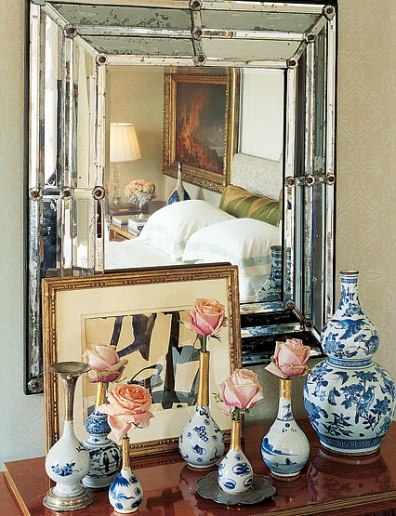
Michael Smith has also had some major success using Franz Kline’s paintings too – who could forget this cover from AD? I think both he and Miles Redd have sparked a Kline craze in fact. Or perhaps it was Martha Stewart Editor Kevin Sharkey’s Kline-like paintings that started the ball rolling? Personally, I’ve had a few others images in my inspiration folders for some time, like this Kline with very formal blue and white porcelain…
…and this one (via Mark Sikes) with the sparest lined antiques.
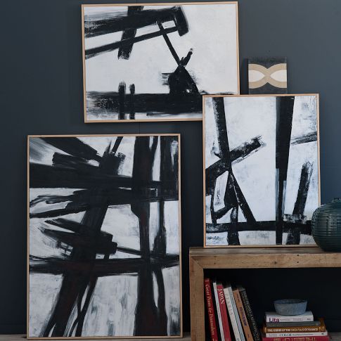
But the Kline fascination has gone truly viral, with even mass-retailers like West Elm featuring abstract paintings in his exact style.
They are showing up everywhere, but in particular over at designer and stylist Emily Henderson‘s projects, here reflected in a mirror in a boldly papered dining room…
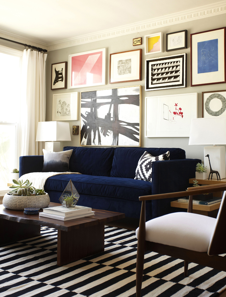
…and here as part of an art wall installation in her assistant’s living room. His whole apartment is quite fun (there’s a Japanese screen over his bed) and well worth scrolling through.
It’s not that I’m against these works – basically nobody can afford to own a real Kline – it’s just that I believe there is so much amazing original artwork out there that it isn’t necessary to buy these replicas. Which brings me right back around to my extraordinary monoprint by Naoto Okuyama. His work on paper is unusual in that he creates monoprints – which means a single edition, much like a painting – as opposed to multiple copies which is more common for prints. I had not really been familiar with his work until last year when he was featured in the CWAJ Print Show‘s Associate Show. But as I walked in the door of the gallery, this work – entitled Blood #393 – just caught me, hook, line and sinker. It was everything I had been imagining, plus a little bit of nostalgia even (does anyone else imagine Mt. Fuji when they look at it?)
The title put me off at first, but after a bit of conversation with Sue Abe and later answers from the artist himself, it made me feel even more connected to it:
The title of my carborundum works are all entitled ‘Blood’. The ‘Blood’ in the title incurs the image of something which continues and circulates endlessly. The lines and shapes are abstract and organic, and the materialistic textural expression is created by [the] technique. With all of these elements, I am trying to express the energy underlying and inherent in all phenomena. I would like the viewer to project my images on his/her experience and knowledge and have a feel of the ‘movements’ of something which endlessly drives everything forward, even though their perception may be different from my intention.
It also has a tactile textured quality – impossible to photograph – which involves mixing grainy material into his ink on his printing plate. As Okuyama explains:
The grainy substance is Carborundum powder. Carborundum is the name of an abrasive compound whose main component is silicon carbide. Print artists began using it as a printmaking medium in late 1960s. Miró and Tàpies made carborundum pieces, and also today there are artists who use this technique throughout the world though the number may be smaller compared to other printmaking techniques. I use aluminum plates. After drawing freely with resin and glue on the plate, I spray carborundum powder and let it stick. This way I intentionally make an unstable surface. So carborundum powder move to paper with ink when I print it with a press machine. A complicated, three-dimensional expression is made in this way.
But the most special part of all about my new acquisition is that my girlfriends all got together and purchased it for me as a going away present!!!! I still tear up when I think about it and think about leaving them all! This post is really a shout out thank you to my darling friends!
And in case you were worried that I’d lost all my proclivity for sweetness, I also got this amazing peony by Shinji Ando. Although, maybe not so sweet as the peony is overblown and almost ready to rot and the lace leaves have a bit of a punk feel…
Friendship is the sweetest!
To see more of these artists’ work, visit Yoseido Gallery.


Reblogged this on Recycled Interiors: Homes With Heart and commented:
Love the black and white when there is lots of pretty too 🙂
I don’t think there’s any bigger Franz Kline fan than me but I would never want a copy. I agree with you that I would rather have any piece of original art than a print or copy of someone else’s work/idea. An original piece of art retains a tiny bit of the artist’s soul that makes it a living thing. And so much more exciting. And there’s original art for every budget and I’d rather support an artist than a corporation. I was captivated by both of your new pieces when I saw them on instagram.
I love that expression of yours – “an original piece of art retains a tiny bit of the artist’s soul”. Thanks so much Steve!
I agree that a bold image adds a modern punch and balance to rooms that shall we say, lack gravitas. I also feel that it is a good way to mix-up an Asian theme so that it doesn’t seem too one dimensional. However it’s a real challenge to find the right piece to make it work. This print is perfect. You mention that it’s a “going away” present. I will so miss your musings on Japan and I’m wondering if you have made a decision yet as to where you’ll be scavenging next.
Thanks Amy! Looks like we are headed to Doha. More adventures on the horizon!
That is such a lovely gift! How sweet is it that you love it and everytime you see it is just such a great vibe to it. I also like a monochromatic piece but not calligraphy in the Asian style so I also really like that piece of art.
Symmetry in the design. I wish I knew something about anything; but I do not.
The print looks very comfortable in its new home!
Love it, Jacqueline! So graphic and such movement. I especially love it paired with classic blue-and-white ~ Loi