One of the most distinct logos in the world, the chunky bars of the Red Cross have been on my mind lately for obvious reasons, and not so obvious ones. I think I am not the only one either – ironically, the interior design world seems quite interested in it too. Maybe it’s just these constant disasters have worked on people’s subconscious and turned it into a larger decor trend?
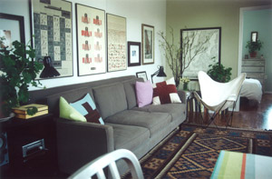 I have been inexorably collecting design images featuring that red cross shape since the earthquake and tsunami here in Japan. And then one of the things I noticed from my post the other day was how much Ben Pentreath liked his red cross pillows, shown here in his old New York apartment around or before 2003…
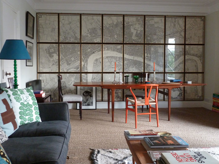
…and then here again just the other day in his new London flat. He obviously really likes them (and his sofa) because while other things have changed, he’s kept them in rotation. Of course it’s not really the pillows that grab your attention in his new apartment – it’s that amazing map grouping (a re-print of John Roque’s Plan of the Cities of London and Westminster, and Borough of Southwark from 1746) against the wall. But more on maps some other time!
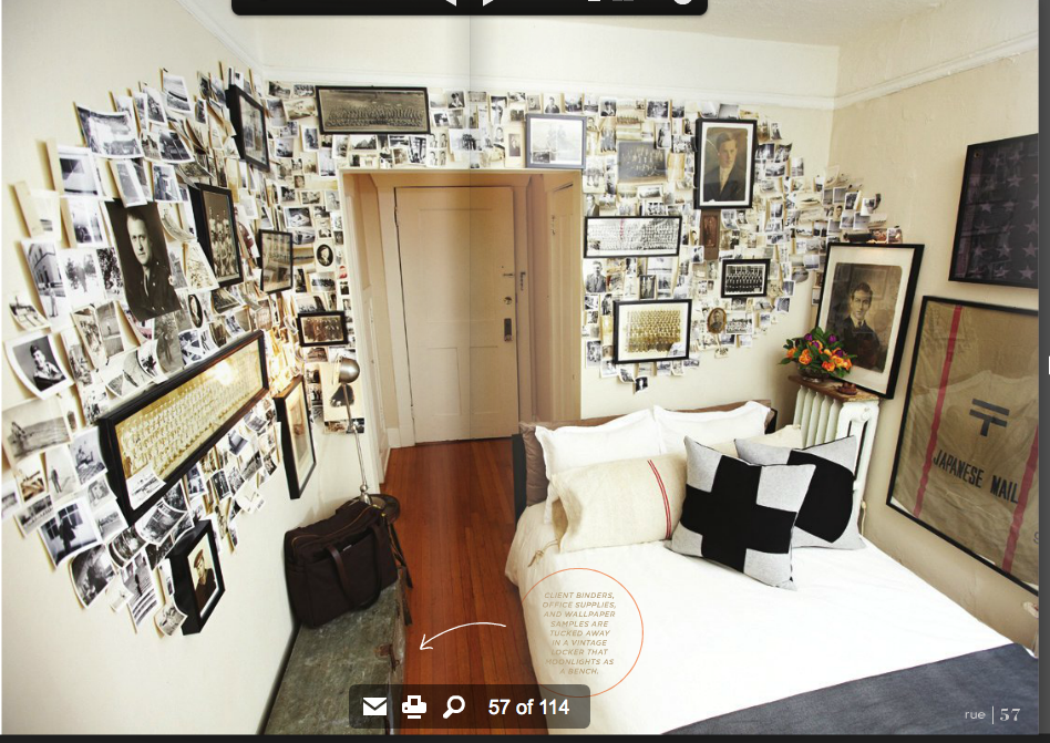
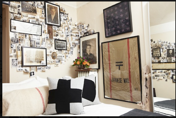
Interior designer Brian Paquette boasts a pair of the cross pillows in his 220 square foot Seattle studio.
The collage of vintage photos and the framed Japanese mail bag are amazing and imbue the space with a masculine kind of romanticism.
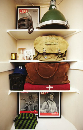
He likes the cross motif so much he even has it here on a stored blanket. Frankly, the entire space has a ship-shape/found object vintage military vibe – it’s a bit of an oxymoron, but that’s what makes it work!
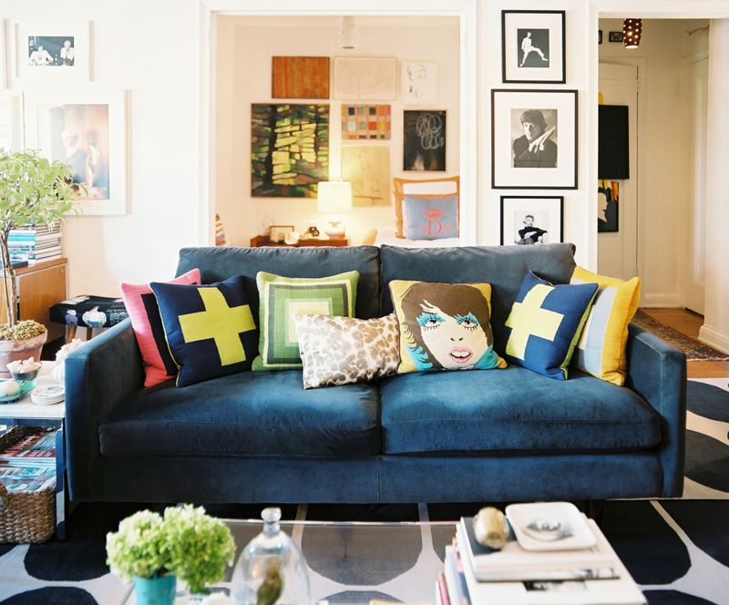
I’m not sure where Ben or Brian got their pillows, but Angel Dormer got hers from Jonathan Adler. I had started to feel that this trend was distinct to men, but this photo disproves that theory.
Jonathan Adler offers the pillows in a variety of fun colors.


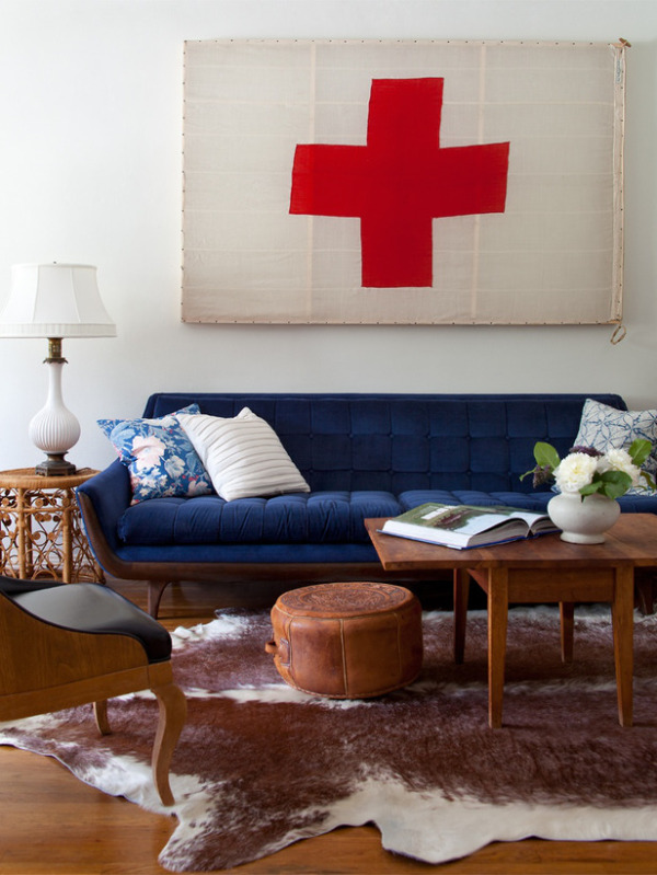
I am always discovering great things on Emily Henderson of Secrets From a Stylist‘s blog. As an antique dealer, it drives me a bit crazy that she is so inaccurate about naming items she uses (calling a Louis style chair Victorian, for example) but as a stylist and designer she has a way of knocking your socks off. Here her red cross (actually a vintage Swiss flag) provides the exclamation point to a funky couch and warm brown furniture.
A red cross pattern is not uncommon in traditional quilting. Love this modern usage – graphic, but sensible – you can pull it down if you get chilly.
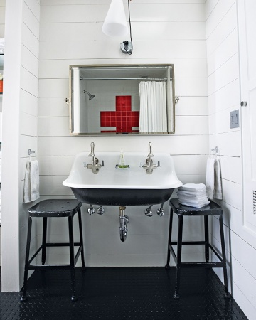
Red crosses seem more literal in bathroom spaces, like this one tiled in a kids bathroom. Love that trough sink – it’s everywhere these days!
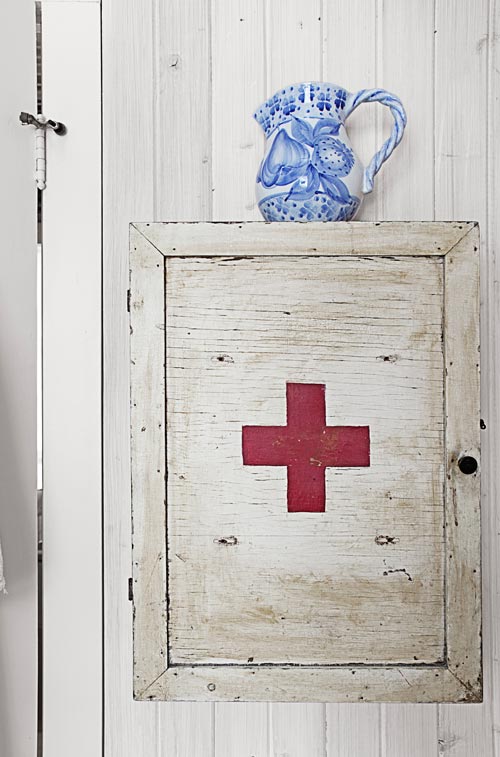
Or this vintage medicine cabinet. You always know where the band aids are in this home.
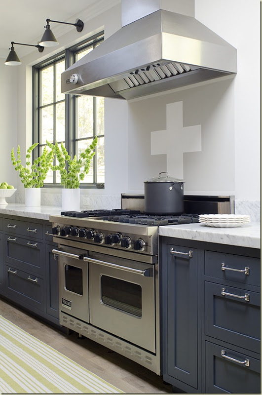
Love love these gray cabinets and slab marble counter but not sure how I feel about the subtle cross on the backsplash under the hood.
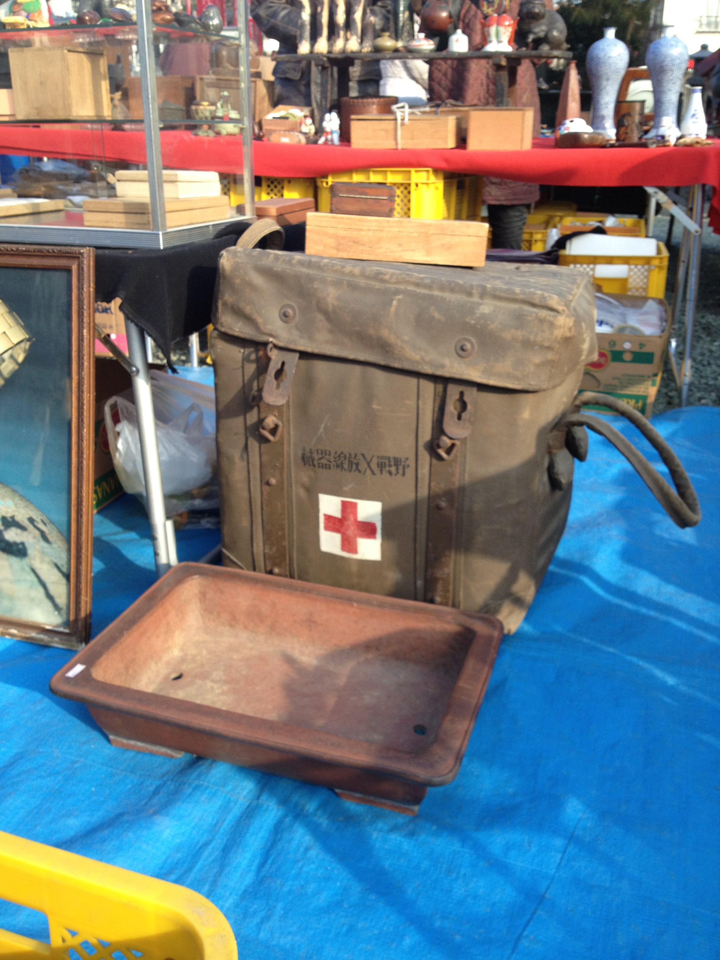
I’ve seen my fair share of official old Red Cross items at the shrine sales, like this large square carrying trunk at Kawagoe. I think Brian Paquette would love it, don’t you?
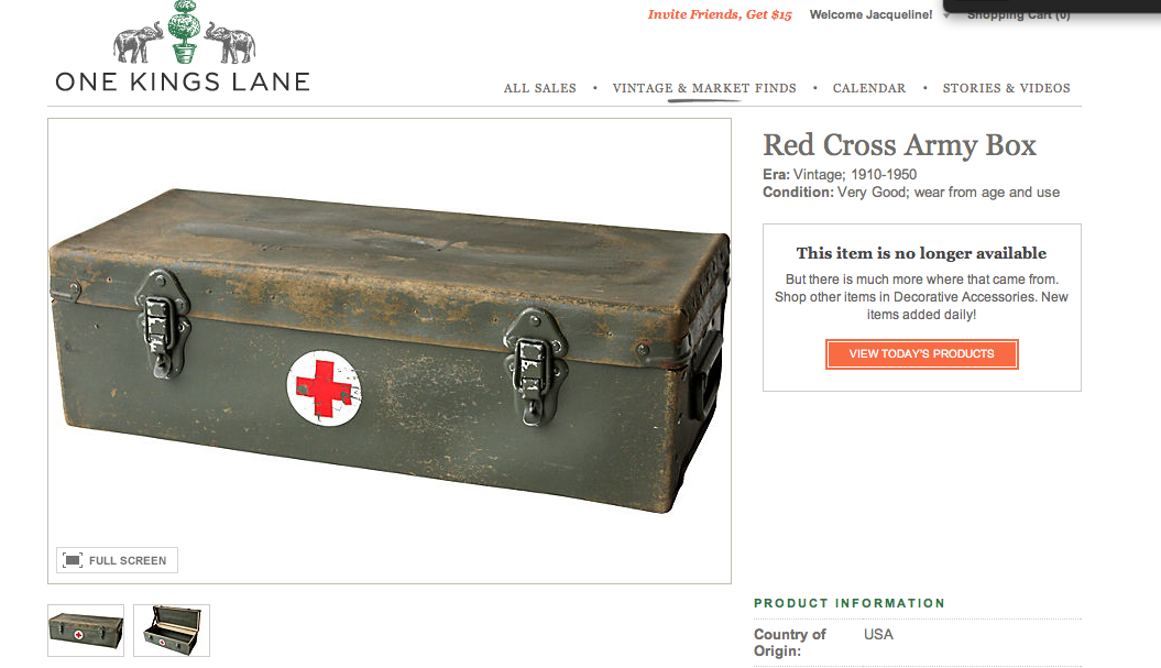
And others are interested in this trend too – this Red Cross army box sold quickly on One Kings Lane.
Is it just the graphic punch the cross gives that makes people like it? Or do you think that is so because it represents succor and security in an emergency? Any which way, if I have helped you feel like making a donation, of money or blood, here’s the link: RED CROSS. At the end of the day, they always show up to help.
Image credits: 1. Red Cross, 2. The Financial Times, 3. via Ben Pentreath Inspiration, 4-6. Rue Magazine January 2012, photo credit: We are the Rhoads, 7. Lonny Magazine January/February 2011, photo credit: Patrick Cline, 8. Jonathan Adler, 9. Emily Henderson, 10. Limilee, 11. Martha Stewart Living October 2010, 12. Country Living, October 2011, photo credit: Bjorn Wallander, 13. via Willow Decor, photo credit: Jamie Salomon, 14. me, 15. One Kings Lane


very topical yet chic! thanks for sharing.
I never have understood why we call Red CROSS, red cross other than the red part.. that cross is too short to be a cross or not the right angle isn’t this a cross “X”? There has to be some reasoning behind this as to why we regard it as such.. Do you know Jacq? It looks like a “Plus” sign a positive mark -what ever I love it be it simple red on white, or vivid colours….
I think it is such a positive sign because it is both representative of a cross and a plus, so visually it appeals to us. But there are actually strict Geneva Convention rules about usage to preserve the use of the symbol for protection and mercy. More here: http://chapters.redcross.org/ok/okc/OKCBombingRecovery/emblem.htm
I hope I haven’t broken those rules in this post!
Jacqueline, I always enjoy your posts – beautifully written and informative. And it helps that we have similar taste 🙂 Thanks for all your efforts.
Curt, these comments the last few days have been wonderful! Thank you very much! And I am honored to be in your design links!
Oh, I added you to my design inspiration links – I hope that’s ok?
Hello, Jacqueline –
Great post! You’ve shown how versatile this iconic logo can be. My favorite is the pillow form. Just like the Union Jack, the red cross is all over the design world…..I love them both!
Will you be spending Thanksgiving in Japan? I wish you a wonderful and warm Thanksgiving.
Very best from DC,
Loi
Thanks Loi – I am sure the holidays are looking beautiful over at your place! Hope for a post soon!