You choose an object that you really love and everything else falls into place.
-Marjorie Wollan
 I knew there was another reason I had been hunting for this particular issue of Elle Decor from 1996 featuring Marjorie Wollan’s New York apartment. Back in the spring I had noticed it was for sale – but totally redecorated with only a vestige of the old furniture and design. It was so different I almost couldn’t believe it! What also made the difference stand out so strongly to me is that the real estate listing photos are so bad. Their goal is showing practical information such as square footage and layout and have absolutely no styling in comparison to the magazine shoots. So I am going to pull a mini-Joni and play a little decorator detective here. As you read, think about which way you prefer it – you’ll have no doubt of my opinions!
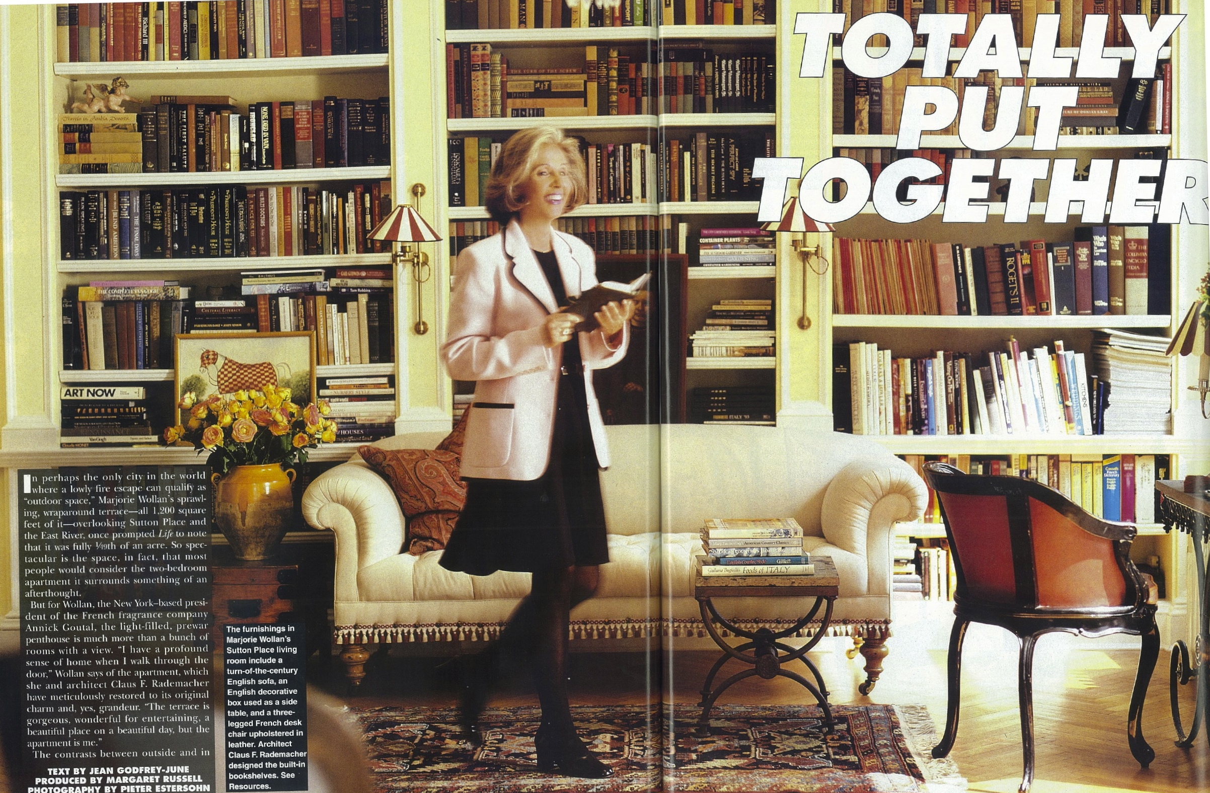
So as I mentioned in that last post, this was one of the first “undecorated” decorated spaces that caught my eye and it influenced me tremendously. Wollan, who worked for the French perfume company Annick Goutal at the time, had such a Gallic flair that Goutal herself said “Whatever you want to do with my company, I trust you,” upon walking into the apartment. Nothing felt planned or stagey, it was just a group of beautiful objects, some precious, some less so, arranged for comfortable living. It didn’t hurt that the large two bedroom was surrounded by a wraparound terrace on all sides with gorgeous old-fashioned French doors everywhere either!
The living room had great bookshelves with molding and sconces and well read looking books stacked and crowded in. Yes, the yellow is dated now, but was the height of fashion at the time. That being said, it was used as a neutral and not to create a particular color scheme, which was a very modern choice. Click the photo for a larger detailed view – you can even see the cute tassels along the bottom of the settee.

The close-up shots are much better. I think this might be the first of those marble-topped French bakers tables I love so. The giant clock and puddled draperies struck me as very European at the time.
Here’s a better view of the ticking stripe Chesterfield – you’ll note Elle Decor reversed the image for the front cover. There is a full length mirror on the back wall with a crystal sconce overlayed on it. I love the worn leather cushion on the painted antique chair.
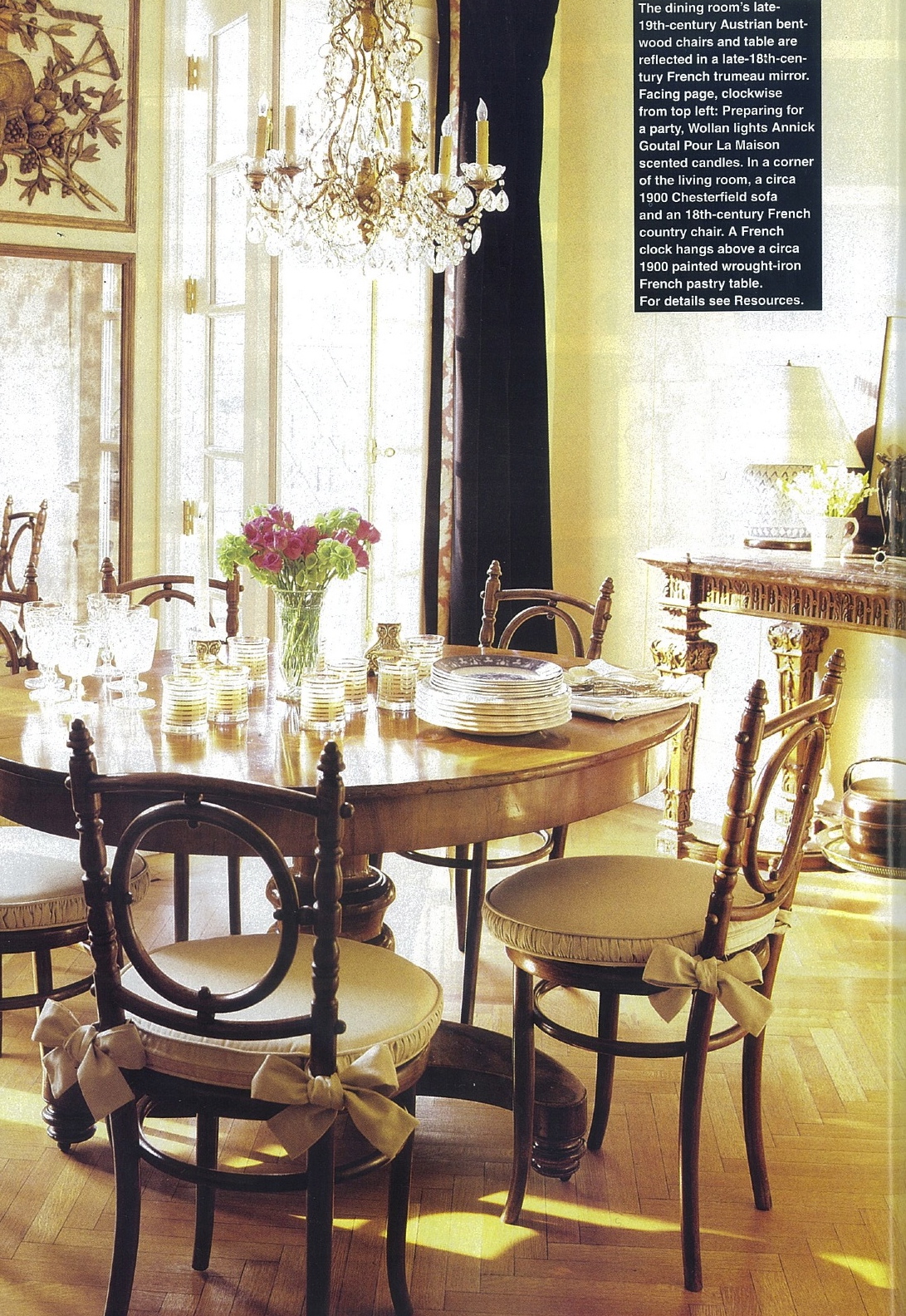
The dining room was just dreamy with its polished pedestal table and unusual Thonet bentwood chairs – even the cushions and the bows – and that amazing trumeau mirror. Fancy but casual at the same time. I still love this dining room to pieces!
The master bedroom had a wonderful exposed metal canopy bed, long before the Anthroplogie one was available to everybody. Painted Chinoiserie screen paired with an antique American quilt. Ruffled sconce shade against stripey wall covering. Loved the mix!
While boasting nothing significant, the guest room had a play of color and texture.
The bathroom was all about this little shelf vignette – a perfect piece of jewelry. Brown and white aesthetic movement soap dish and toothbrush holder – all the details are there. And note the vintage style brass faucets which are the height of popularity now. Wollan was ahead of her time.
A later tear sheet from a 1999 House & Garden lists Wollan as working at Guerlain and shows a later version of what I believe is the same bathroom. Look closely at the sink and fittings from the photo above and below – I think they are the same. But the bathroom has been redone with white marble lining the walls. The jewelry effect has been kept with this Italian gilt mirror, exposed brass fittings and animal print chair.
A similar vignette to the one in the earlier photos has been created on this vintage marble washstand. Just so pretty without appearing staged.
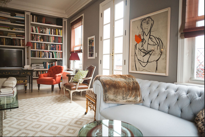
And now on to the February 2012 real estate listing – 16 years after the Elle Decor spread. The living room is structurally unchanged – the bookshelves remain and the apartment has been painted a very au courant grey. I do love this new color and with all the natural light from the many windows, I bet it works very well. The settee is gone from in front of the shelves and a flat screen TV lives there now. A leather-covered bergere sits where the bakers table used to, between the window and the french door. The Chesterfield is in the same place but has been recovered in a plain light blue fabric. Waaaah!!!! No more ticking!
Looking the other way in the living room, the large mirrors remain but just about everything else has changed. Graphic Hicks-style rug, Mies van der Rohe Barcelona cocktail table, and an animal print stool mixed together are again very “undecorated” and eclectic but very different from the original version. It is all still trés chic!
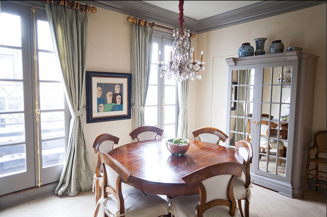
Need I say anything about the dining room? Table and chandelier are the same but everything else different! I would not have traded the gilt and marble sideboard that was there before for this mirrored armoire and more particularly the chairs! Waaaah! At first I thought no more trumeau mirror but…
…found it here on the other side of the dining room now. This entryway photo gives a good sense of how the rooms relate to each other and a view of another modern icon piece, a Le Corbusier chair, added to the living room.
I can’t tell which bedroom this is from the listing and it is the only one shown, but my suspicion is that it is the master. While charming, I think this newer version looks way more dated than the blue and white iron campaign bed version above. I do spy our old friend the giant clock from the living room hanging over the dresser.
If you are as crazy as I am and want to see more photos, including the kitchen and terrace which were never featured in the original Elle Decor issue, check out the listing at House of the Day in The Wall Street Journal. And now dear readers, which way do you prefer Wollan’s apartment and why? Do you like these posts tracking the evolution of a space? Do you change your spaces often? And how? By rearranging gently? Adding over time? Or completely re-doing all at once? Do you follow interior trends or buy with an idea of ownership forever?


The bentwood dining chairs!!! Those are so pretty!
I am astonished that the same person still lives there and would change my favorite things!! Kinda sad, really! You are so correct! The bed, the dining chairs, the Chesterfield; so much better before! Even the bathroom!
Oh well; go figure!
Isn’t it funny how personally attached we can get to a design? I wish she”d offered me those dining room chairs – I would have bought them in a split second…
Ditto!! So much better!
I still prefer house nº 1. I understand we need to update things, looks, but the first decor was warmer, more inviting. That dining room , for instance, the old one, we could see people having a good time during a meal, warm conversation, a great set of friends. Now, it is just BLAH. Well, there is taste for everything. I guess I have not accompanied the new trends. Much prefer the entire older home.
And to answer your question, yes I love the comparisons, Keep up the good work, it is a pleasure to follow your blog
I agree, #2 is a little cold for me, and that bedroom …. What were they thinking …. It looks like a refugee from a 1980s Laura Ashley catalogue.
You made me laugh with that one!
I agree. Love the comparisons…….it is unusual and very informative and so interesting!!
Keep those coming!
I wonder what happened to the ticking stripe chesterfield? Such a classic piece. I’d take that in heartbeat! Also really interesting to see how the home has changed. Yes, I do love these posts!!
Camille
I’ve been carrying around the picture of the master bedroom with the campaign bed for years – totally agree with you.
It always struck me as just the right mix of asian/country/disheveled/cozy – nonchalant sophisticated. Isn’t it amazing what sticks and has resonance? Thank you for bringing it back, even if the updates don’t quite make the grade it’s a fascinating thing to see its evolution.
Great post.
Courtney
New owners: HRH Princess Madeleine of Sweden and her husband Chris o’Neill. Newlyweds.
Wow! Would love to see how they decorate it, wouldn’t you!
A shot on Pinterest of the ticking Chesterfield (which I remember so fondly and was recently looking for) led me to this post. I am so with you and most of your readers – I adored the first apartment – everything was pitch perfect!
I so agree – still an inspiring but realistic space. Happy New Year!
Textile Spotlight: The Ticking Trend | TIDBITS&TWINE
[…] {via Elle Decor} […]