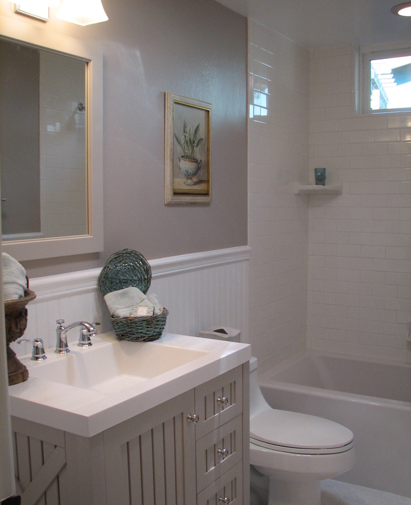
With only 10 days left to our time here at the beach, there are two readily available, very reasonably priced vanity choices for my master bathroom that I have found. The first is the Seal Harbor Vanity in Sharkey Gray by Martha Stewart for Home Depot. Infinitely more attractive than in the photo on Home Depot’s website below and surprisingly well made for its bargain price of $299, it has 3 drawers for storage that glide easily and a cabinet side for larger items.

Look how nice it looks in this bathroom redesign on a shoestring by Barbara Stock.
My hesitation with this piece is that while it would look lovely in the other bathrooms in the house, I think it is a bit too “country cottage” for the master bathroom and the design direction it has taken. There is no complimentary beadboard in my bathroom compared to this one and from a practical point of view, while it has a larger sink, it does not have much counter space.
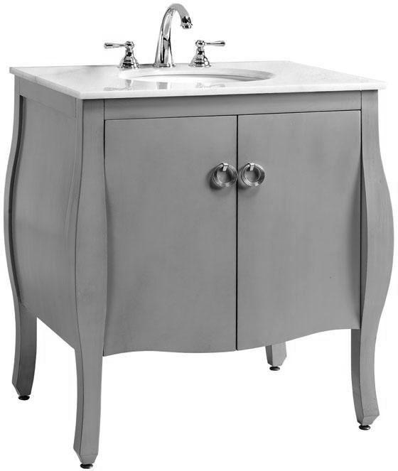
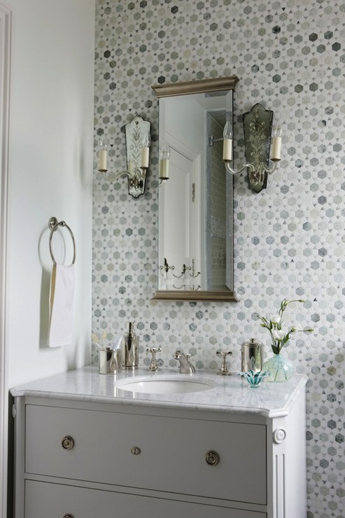
The Savoy Sink Cabinet in gray from Home Decorators is another possibility. Also readily available and reasonably priced at $559, it is dressier, with the white marble top (thin though) that I am craving. Nice cabinet storage and more counter space are another plus as is the dressier design – love the ring pulls.
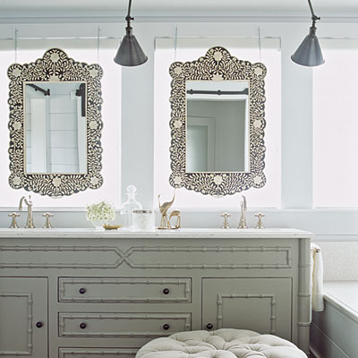
I’ve pulled this inspiration photo below for comparison with its similar vanity and vibe. If we ever did change out the tile in the master bath, I would want to use Carrera marble instead and love the way this looks. But if I was upgrading to a marble bathroom, wouldn’t I be upgrading the vanity as well? And is this piece just out of line with the feel of the rest of the house? It’s neither tongue-in-cheek nor literal interpretation, which tend to be the two avenues I stick to here and mix together.
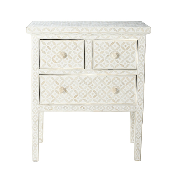
So my two fantasy choices are actually obtainable, but they take time and effort. The first is the tongue-in-cheek choice – a bone or mother-of-pearl inlaid piece, which I have always loved, and are now uber-trendy. It plays off the other Indian and Moroccan pieces in the house and the bedroom (remember the suzani valence?). I thought a console or a chest of drawers or small cabinet could be fitted for a sink with a marble top added. It is pretty easy to retro-fit almost any piece of furniture with the right proportions, but the catch is that I can’t seem to find any with the needed measurements. Either too long…
…too high…
…or too small. I have searched major retailers from the Graham and Green pieces above to the Serena and Lily Aleppo Table below. I have combed through the on-line catalogs of Indian importers. No luck!
I could do a plainer vanity (not that this gorgeous painted faux-bamboo vanity is plain!) and get an inlaid mirror instead, but that just isn’t as exciting, although this bathroom from Coastal Living is just gorgeous.
And then the question is whether or not it is just too trendy: to note, see the coffee table on the cover of this month’s House Beautiful.
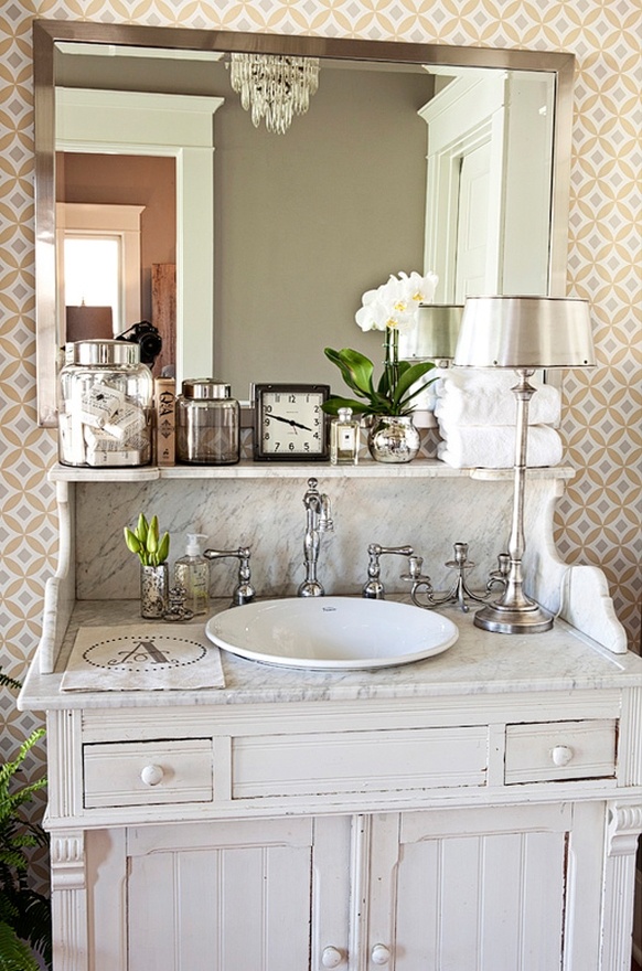
So now we come to the literal choice, which is to find a vintage washstand with a gorgeous marble top, retro-fit it for a sink and paint the dark wood cabinet below. I adore this one belonging to Kristin Alber! An ironic detail is that the wallpaper is the same pattern you see on many of the inlaid pieces like the ones I just showed. That makes me feel like there is actually some logical link here and that my wood block print “wallpaper” will also work well with a Victorian antique.
There are plenty currently available on eBay right now, like this one with a shelf…
…or this one with the two marble brackets. I think the lines on this one would look great painted!
I’d paint the wooden cabinet gray, highlighting the marble tops. Sad that this one on Ebay doesn’t have a marble top or it has been painted out. I love the color and the drawer pulls.
Similar style ones can also be made out of modern cabinetry pieces and marble.
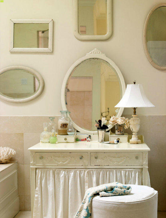
So there is the basic dilemma in a nutshell. Which of the four choices do you like best? And to help you think about it, here are a few more inspiration photos that have the overall feel I am trying to achieve, even if not the literal pieces.
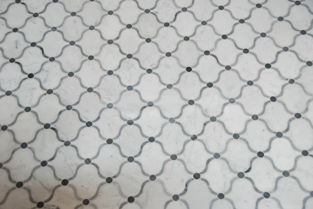
Oooh, and look at these quatrefoil marble tiles! I know I can’t have these, but makes me even happier to be getting my quatrefoil glass!
And some more dreamy Moroccan shapes…now, let’s not get distracted…
Master Bathroom Related Posts:
Renovation Report…Do You Throw Good Money After Bad? Thoughts on Fixing My Master Bathroom
A Day Too Late…One Perfect Bathroom Photo
Renovation Report…Pocket Door Progress
All uncredited inspiration photos via DecorPad.









I would choose the 2nd ebay cabinet and paint it gray as you suggested. You can bring out the whimsy in the wallpaper, curtains or some other way. I know you will make it fabulous!
I love it when my comments agree with my secret opinion!
#2 on ebay- you are right the lines would look great painted. I also love the whimsy dressing table with fabric curtain, but #2 is my 1st pick. That leaf would be sweet in paint.
Will you come paint it with me?? That is the one part that makes me a bit nervous.
I’m also a fan of the second ebay cabinet, but wonder if you even want to wait to paint it gray until you see how it looks with the current tile since that’s staying a while, right? I was thinking the wood might be quite lovely in the (new) current version of the bathroom and the gray for the future version as I’m understanding it when tile comes along to totally change it again.
There is a dark wood dresser right outside the bathroom which is one of the reasons I want to paint it – but I agree with you that it would like nice in wood too.
Do not rush, you have made great strides, but enjoy the few remaining days of summer! Here are my thoughts…
#1 – cute, but agree not in keeping
#2 – not my style and not in keeping, but isn’t it similar to what you have now; you could paint the current piece gray for a quick fix
#3 – I love the Indian pieces and don’t care that they are trendy BUT I think you have Indian covered in that room with the wall paper and they do seem costly
#4 – you love the hunt, so I think you should go for a vintage piece either through ebay or have your local dealers keep an eye out and install next summer.
Definitely go with the Kristin Alber inspired bathroom – including the wallpaper – it’s gorgeous – don’t rush with the off-the-shelf vanities (although ok) – you’ve put too much love and effort into your cottage – you’ll be disappointed if you rush just to get it finished.
I love that all the comments are reaching a consensus! Thanks so much!
Vintage washstand without a doubt! You’ll have time to mull over choices and think about how they fit with the wallpaper (which I can’t wait to see!). The extra space provided above in many of the vintage ones is also a benefit. While I like the idea of the inlay cabinet and think you could probably find the right size given enough time, I agree with Kathleen that the wallpaper will tie in with the other pieces in the house.
Have to agree with the others! Vintage washstand is the way to go. That inspiration photo of Kristin Alber’s is so lovely. I actually like the first E-bay washstand because the legs are a little bit longer which would be easier to clean underneath because of course once it’s in you won’t be able to move it. I do love the bone inlaid furniture but I think it would be too much in such a small space with the ‘block printed’ wallpaper. I also have my doubts how well it would stand up against moisture. The door you installed looks great and I’m really looking forward to seeing how it turns out.
Thanks Mary! It turns out everyone agrees and the truth is it was my first choice from the beginning. I am actually passing on the ones currently on eBay and waiting for just the right piece to come along.
I’d also go with the marble topped antique. When you paint it, I’d the kitchen and bath Behr variety from Home Depot. It’s a good paint.
Camille
P.S. Secretly loving the bone inlay too.