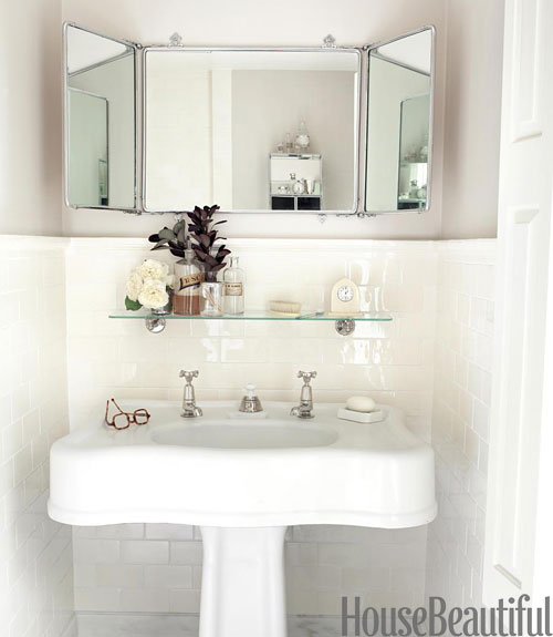
Is there anything that needs to be said about the perfection of Barbara Sallick‘s bathroom after reading what I wrote yesterday? Even the space around the sink/door placement is almost identical to my layout. So hopefully, this is my bathroom’s future one day, just not in the short term. But I continue to solicit ideas on temporary prettiness in the meantime, so keep the comments, all much appreciated, coming! Mary, I love the beadboard idea and could even do a rough rip out of the tile myself if I am putting beadboard over it anyway. Alisha, it is definitely time to get out the Annie Sloan Chalk Paint and have a go at that vanity!
But for now I am going to sigh and sigh…
Image credit: House Beautiful December/January 2012, photo credit: Miki Duisterhof


it is gorgeous but still no storage space!!! you would need to put baskets underneath to hold all the stuff in my master bathroom. it doesn’t seem practical to me.
I know. I put a vintage pedestal sink in the downstairs bath because I could get away without storage there, but it truly is a choice I cannot make in my master bath, no matter how much I wish I could!!!
________________________________
I love it and that tryptic mirror, wow, so simple, yet so beautiful. Don’t you just love the clean lines of everything? We just got back from a lovely night away in beautiful Dusseldorf Germany and saw something that reminded me of something I had promised long ago for a bathroom, Venetian plaster! I lurrve it! I just cannot imagine how much that would cost here, the earth no doubt!
I have some beautiful etched silvered mirrors hanging collection style in the bedroom – they aren’t clear enough to serve as the mirror in the bath. But seeing that silvered tri-part mirror has moved my momentum away from the Phoebe Howard photo with the French mirror. Still gung-ho about some kind of soft block print wallpaper/paint.
________________________________
Incredible how similar the two spaces are! That must have been the ultimate feedback to open the mag & see that photo. My second thought was where is the toothpaste, but then I see the storage unit in mirror’s reflection.
The gorgeousness of the image is unrealistic in my situation, I know, but still!!!
________________________________
I’m commenting a bit late since you already wrote another entry, but I wanted to draw your attention to a post on the Scarf Boys blog. Look at the Sunday, November 6, 2011 entry and below for photos of a georgeous Edwardian House in San Francisco. Especially the bathroom with its antique hospital shower head, which reminded me of your own quest for a similar piece.
I love your blog and I’m truly sorry I visited Japan before you started it !!!
Just went over to check it out – I think their brass set must be original! And the room called “The Perfect Room (Guest Room #2)” reminds me of bedroom at the beach.
Thanks so much for commenting – it is never too late – as I am busy thinking about all the things I write about all the time!
________________________________
I agree that this space is probably one of the prettier bathrooms I’ve seen. Photography is pretty stinkin’ great too. Now I’m curious to see your bathroom.
Boy are you going to be disappointed!!! This is the other problematic space in the house – unlike the kitchen which is ild and crummy, the master bath is brand new but ugly!!!
________________________________