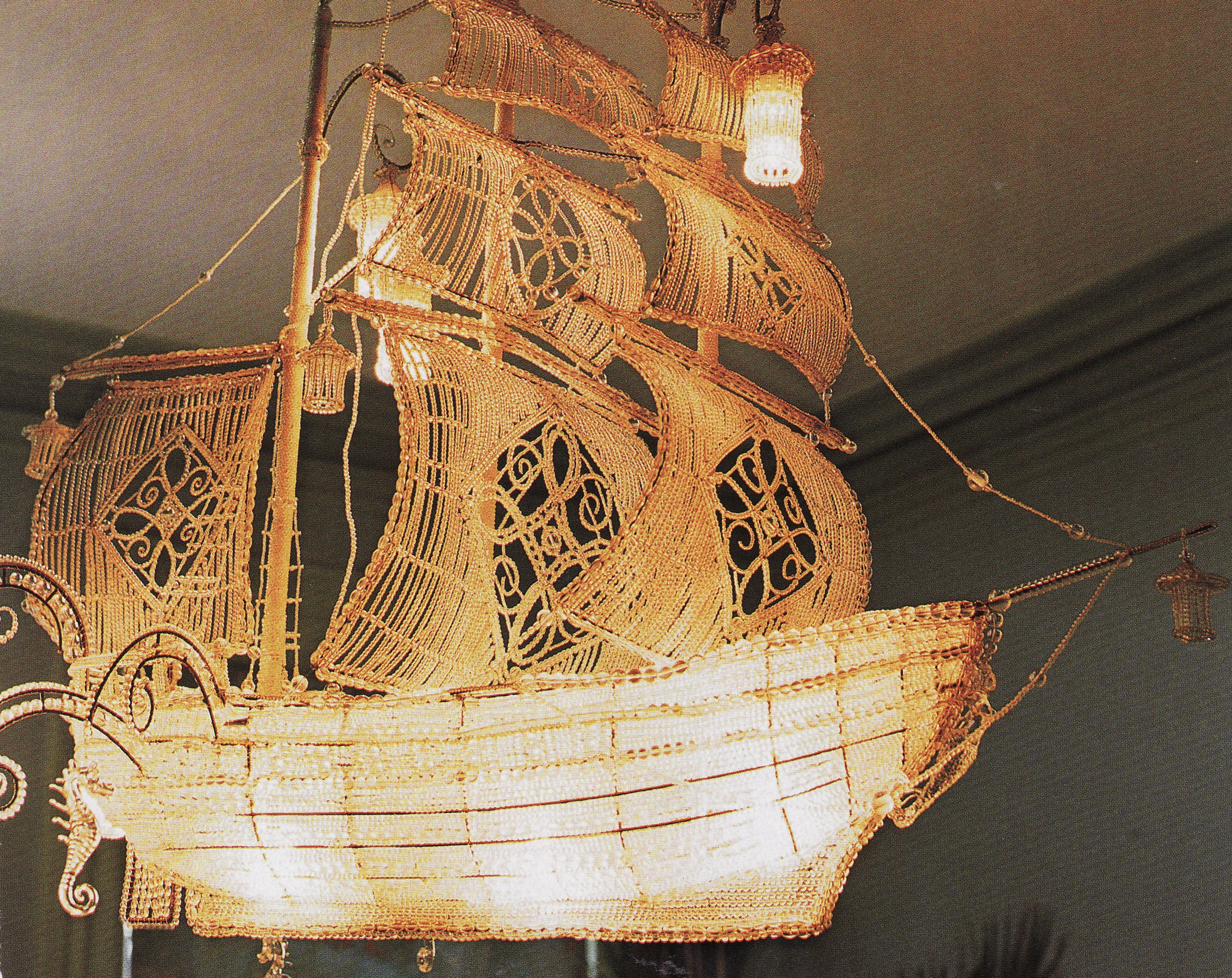
 I love that feeling of a ship being blown by the wind. The chandelier wouldn’t be nearly as pretty if the sails were flat.
Muriel Brandolini
While Muriel Brandolini has not actually been missing, I feel like we haven’t seen many of her projects in the recent design press. Luckily, the freshly renovated Architectural Digest has a great spread on her most recent redecoration of her own townhouse. The half Vietnamese and half French/Venezuelan interior designer is one of my favorites for her riotous use of color and ethnic objects and textiles from around the world. Her deft mix of the unexpected means that her designs are always thought-provoking and never boring, even when they go too far or don’t work for me. Branded the queen of “eclectic” style (just go to any of the on-line magazine sites and click that category), she was one of the first to combine such a broad variety this way. Over the years she has used a number of “trademark” pieces in most of her designs, but at the same time she has a signature by having no set signature. She has said, “If I had to describe my style I would have to stop working. I always like to surprise myself and my clients, to evolve with the flow of life.”
Brandolini’s kaboom moment for me and many others was the amazing set of double height patchwork curtains showcased in the January 1998 Vogue. Her command of color and textile was evident at this early date, although many of her trademark pieces are not yet evident.
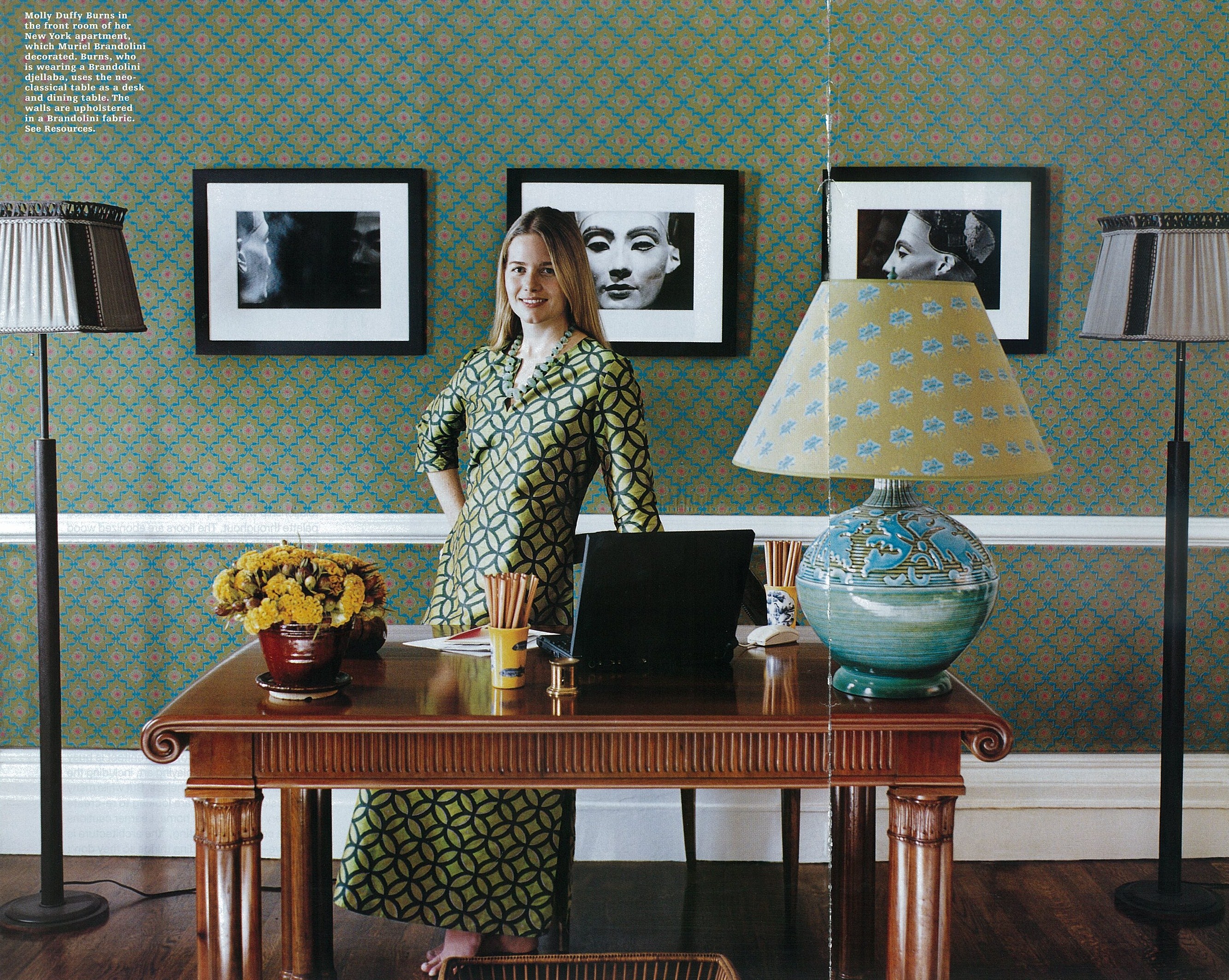
The next space of hers to really catch my eye was the Manhattan townhouse apartment she designed for Molly and Hugh Burns. In their space we start to see many of the early and ongoing signature Brandolini touches such as fabric covered walls in bold ethnic prints, interesting flat-woven rugs (this one by Allegra Hicks), and stylized tufted seating in the round. Brandolini has a gorgeous line of textiles, rich with color and pattern, one of which was used to cover the walls.
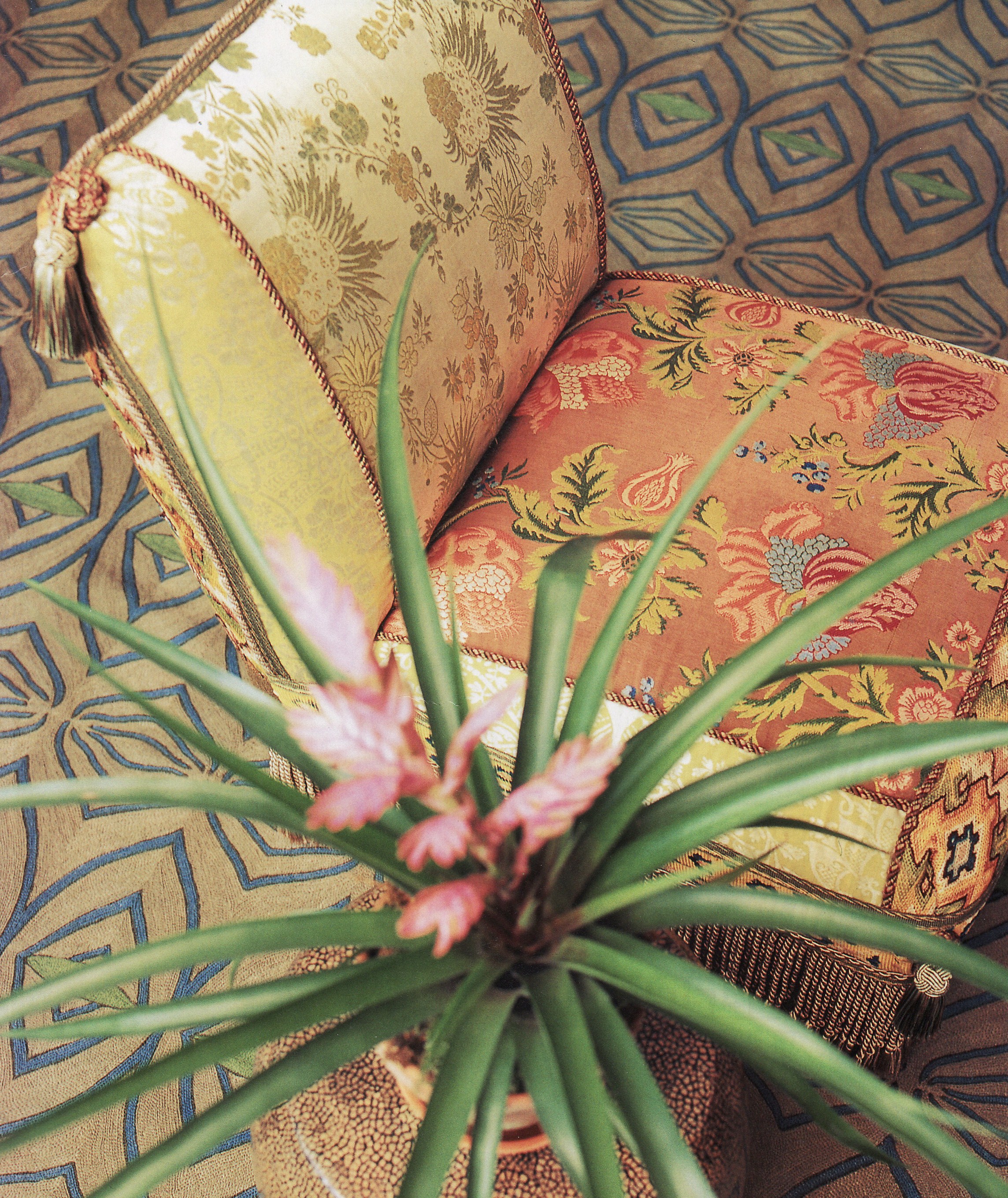
The central living room boasts a turquoise portière (door curtain) and a pair of her trademark slipper chairs, upholstered in 18th century Japanese ikat, French tapestry and silk. I don’t think there is a Brandolini interior without one of these chairs! And the Madeleine Castaing cocktail table is another piece found often in her early rooms – “You either like it or you don’t. I love it, ” Brandolini has said. I agree!
One of the best features in the bedroom started out as a mistake. Rather than try to make the tiny cramped space seem bigger, she cozied it up with grasscloth on the walls and ceiling. Unfortunately, the seams didn’t lay flat, so she added strips of embroidered ribbon to cover them, creating a grid. The bright silk pillows and suzani pick up the colors in the detail of the ribbons, making this room feel like a tiny jewel box.

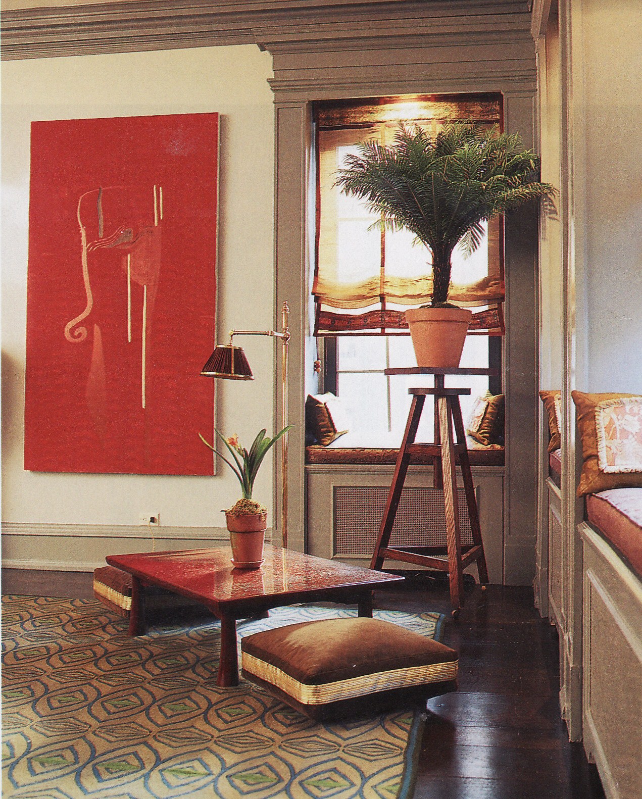
Over time, Brandolini has pared down her color palette without losing any of her whimsical juxtapostioning. This New York apartment featured in the April 2001 edition of House & Garden has that toned down color scheme. The furnishings continue to include other Brandolini signatures, including her rolled arm sofa and the tufted center seat. She also begins using Japanese bamboo blinds called sudare, which become another of her trademarks, found in almost all her decorating projects. Again we see an interesting hand embroidered flatweave on the floor (this one by Frederica Tondato of Fedora Design)…
…and the patchwork slipper chair covered in antique textiles.
One corner of the living room features a 19th century Japanese low table with floor cushions.
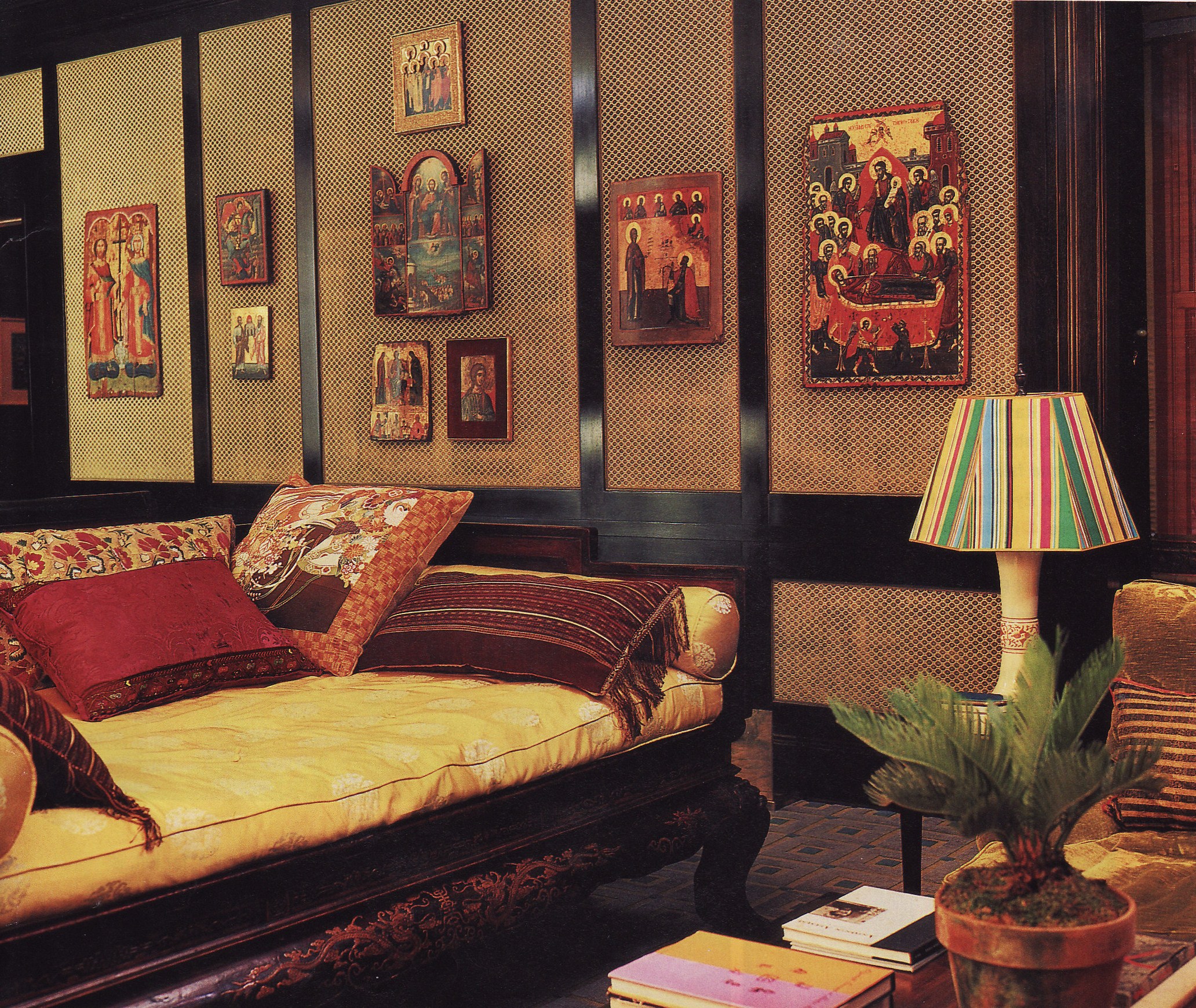
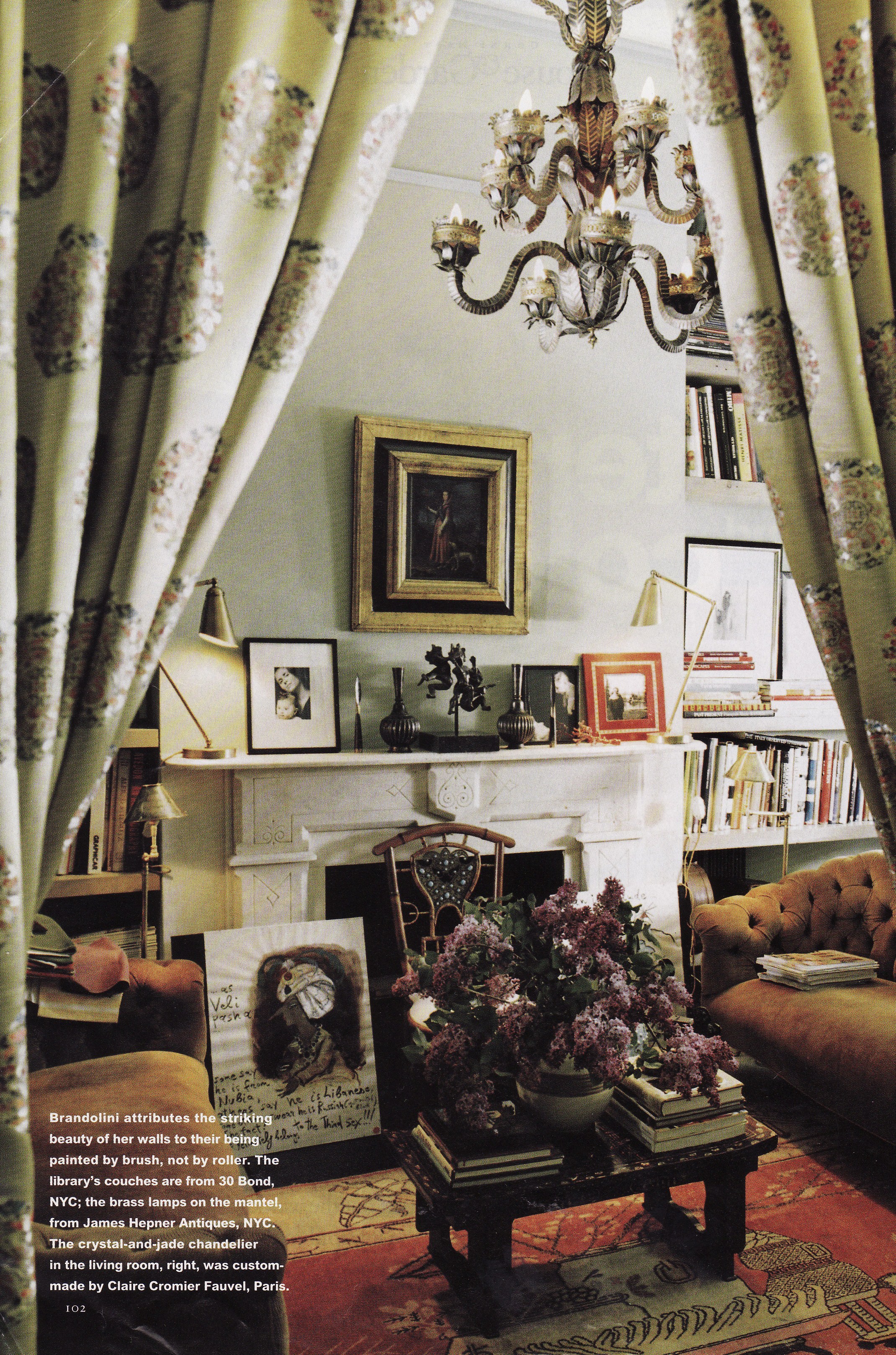
The library has a unique wall treatment – cut velvet upholstery panels – which read like fretwork doors. A 19th century Chinese daybed piled with cushions made of global antique textiles provides a comfy spot to curl up.
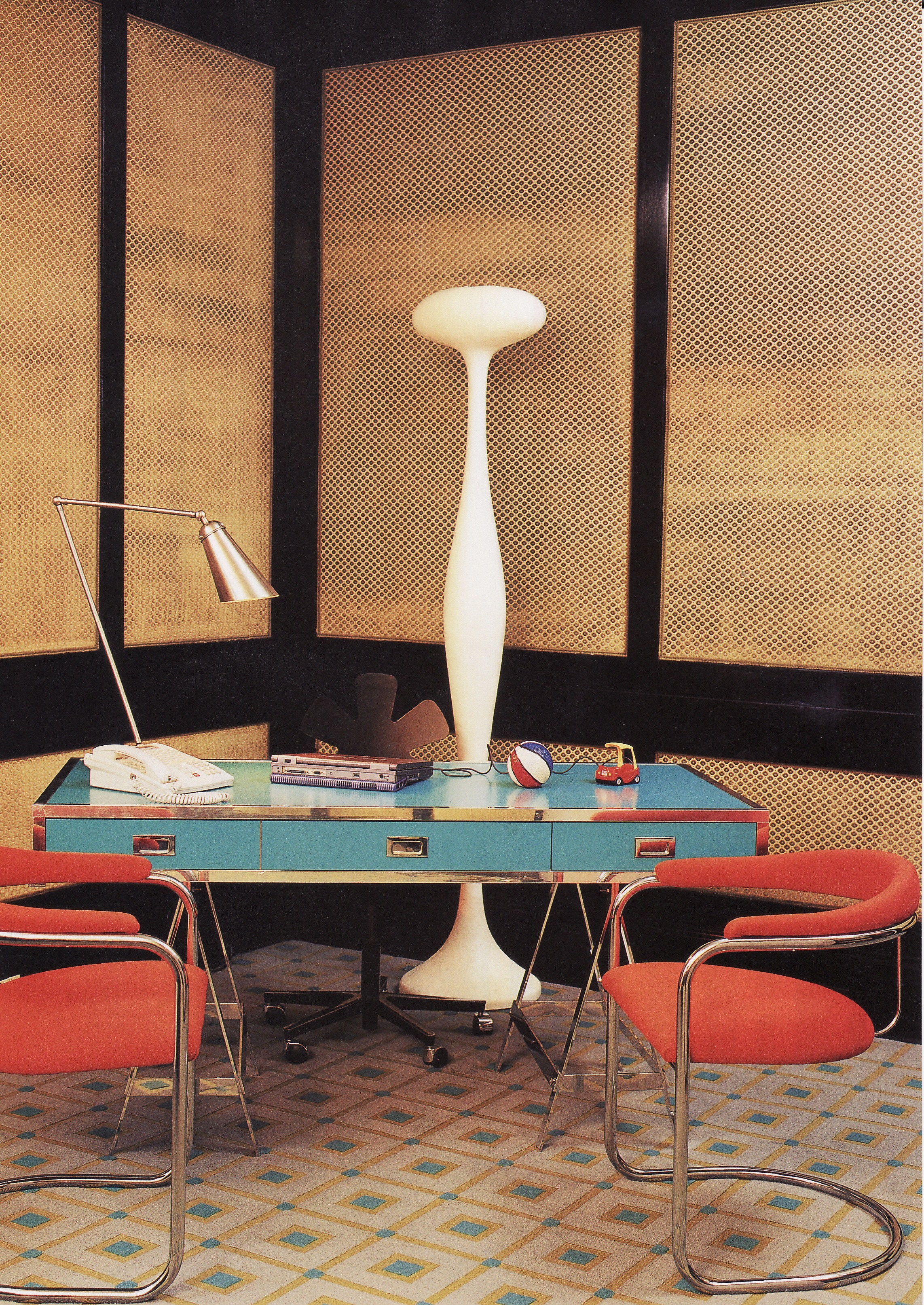
In contrast, a modern turquoise desk and orange upholstered flea market chairs anchor the other corner. This entire room is full of unusual choices.
For an Upper East Side apartment, Brandolini combined graceful sudare blinds with a modern adaptation of a Japanese screen. Another trademark, pierced fretwork tables, are seen here too, along with a flatweave rug and interesting throw pillows. An earlier version of this room had lucite coffee tables and different throw pillows. Which do you prefer?
And in this amazing Chelsea dining room, designed for Ava and Henry Pincus, a modern mural painted on stylized sliding doors (fusuma) gives the room a real Japanese vibe. I find this room eminently functional but oh so charming.
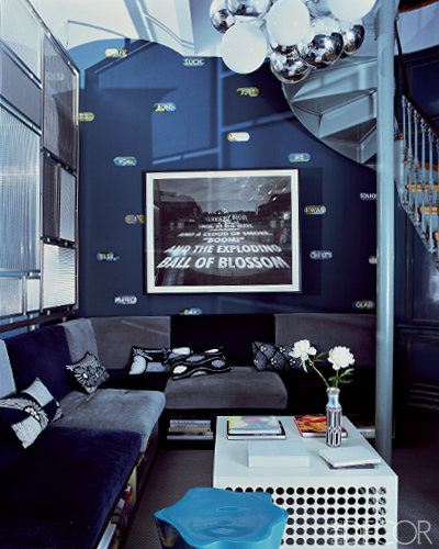
Brandolini can also handle very contemporary spaces, as in the media room designed for Sean and Leslie Goodrich which showcases modern artwork (including a piece by Jenny Holzer), that perforated table and throw pillows made of Japanese fabric.
But it is in Brandolini’s own townhouse which she redesigns on a regular basis that I think we see her real genius at work. By changing paint colors  and furniture placement, adding and subtracting, but fundamentally re-using so many of her things, she transforms the space completely each time she redecorates. My kids have long loved the “Where’s Waldo” books, perfect for entertainment on plane
  flights or train rides. If you have never seen one, a character in a striped red and white shirt is hidden among hundreds of other small people and the goal is to spot him on each page. As you look through Brandolini’s incarnations of her home, play it with yourself. Pick an object and see where you find it next.
I have ordered the photos by room, having a version from 1997, again in 2006 and finally the newest version just published in the March 2011 issue of Architectural Digest. In some cases the perspectives line up perfectly, but in others they don’t, so it may take some imagination to sort it out.
Living Room
In the earliest version I have, Brandolini’s living room is painted blue with green trim and she uses a similar Allegra Hicks rug and Madeleine Castaing table as in the Burns apartment and the slipper chairs covered in antique fabric. She has not yet discovered sudare and has soft Roman blinds at the windows. A huge painting by George Condor hangs over the sofa. The show-stopper of the room is the extraordinary crystal and jade galleon ship chandelier made by Claire Cromier Fauvel. She also loves to use Venetian half shades on her lamps. Brownstone rooms can be very narrow, so they are a great space-saving device, as well as a design statement. 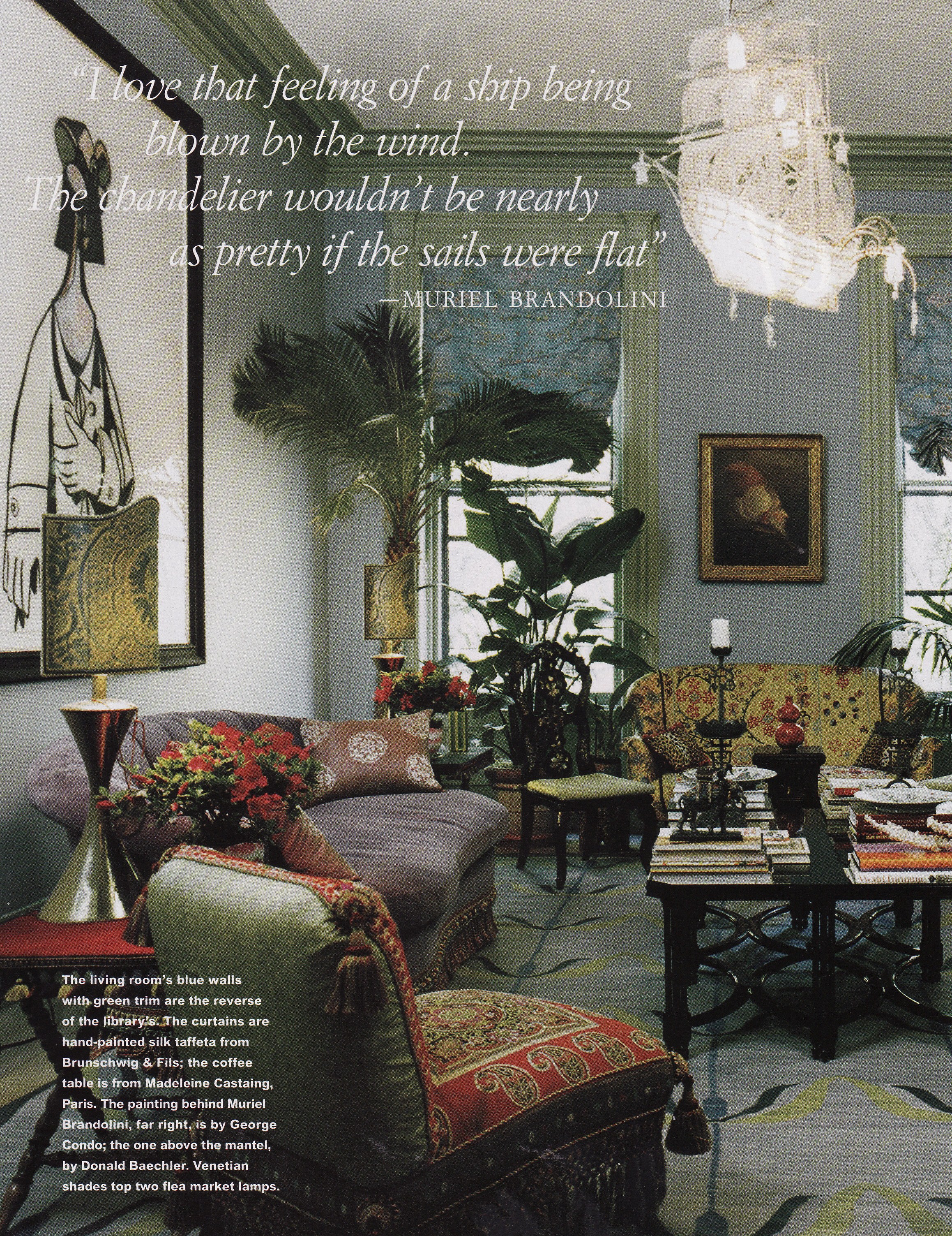
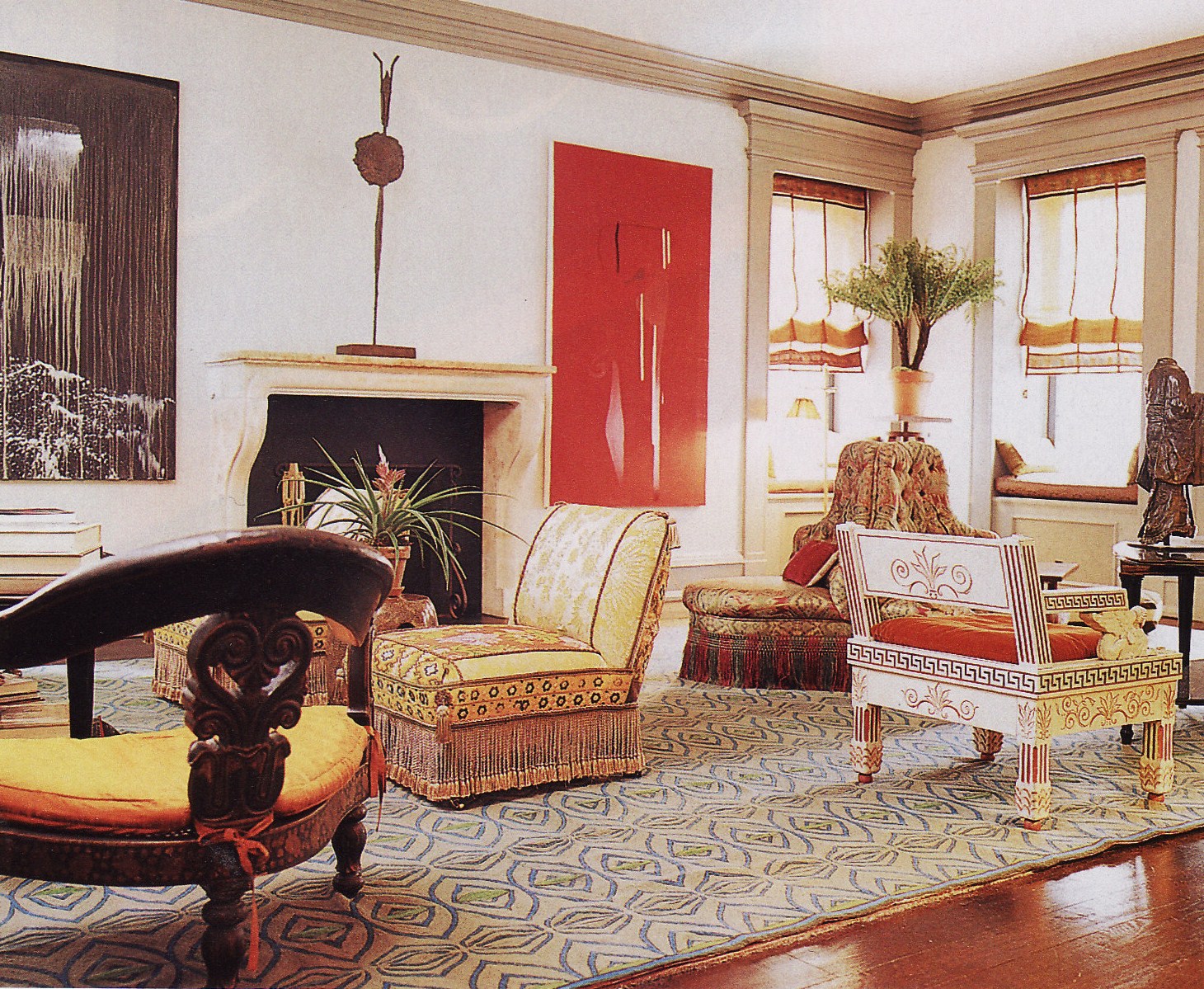
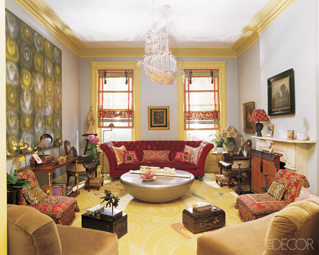
By 2006, Brandolini had completely changed the color scheme in her living room as well as tweaked the layout. She still had a large size painting on the left wall, but a different one by Ross Bleckner. The rug is changed, she has added a Mattia Bonetti designed Smarties cocktail table and sudare at the windows. The two slipper chairs are still there but re-positioned and two 19th century armchairs have been added along side a new red sofa. The ship continues to sail on…
In the most recent incarnation of the room (2011), the palette has been toned down, the original Condo painting returned to its position, yet a different sofa moved under it, and the armchairs activated into the seating plan. The sudare and Smarties table remain. She has changed the rug to yet another design by Tondato. Imagine my despair at seeing the crystal ship chandelier gone (replaced by a Dutch modernist fixture by Gerrit Rietveld) but do not panic yet.
Dining Room
Brandolini’s dining rooms have undergone some of the most dramatic transformations. One of her unique choice is to place a daybed in the dining room for reclining after eating. This photo shows Brandolini in her circa 1997 dining room on a red lacquer Chinese daybed, with walls covered in a fuchsia Indian block-print of her design. Maybe we should be playing “Where’s Nuno” with the 1956 portrait of her husband Nuno hanging behind her (hint- we have just seen it relocated to the 2011 living room).
By 2006 the dining room was completely changed. There was still a daybed to recline on, but this one is 19th century French. Vintage fabrics from Turkey, Japan and China have been made into pillows and hand-embroidered Vietnamese silk lines the walls. The Fortuny sconces are still there though.
I didn’t show a photo of the Louis XV inspired antique chairs in the earlier version of the dining room, but I believe she was using them then, and continues to do so.
While the 2011 version is paler in color, it is no less exuberant. Again Brandolini uses fabric on the walls, this time a white corduroy, beaded in Vietnam with her favorite Ernest Hemingway quote. I wonder if she still has a daybed in the dining room?
Study
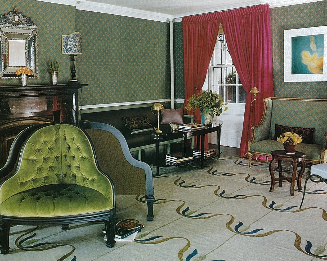
Like some of her earlier work shown above, the 1997 study has portières, these made of a Chinese silk. The room is painted the opposite colors of the living room, green walls with blue trim and I feel fairly sure that the window does not yet have her trademark sudare blinds.
Her 2006 study was wildly popular in the blogosphere. The richly saturated color and the neoclassical banquettes covered in a mix of Japanese, French and Indian textiles were actively admired. The Chinese rug has been traded for another one of Tondato’s designs, sudare added and the chandelier changed as well. In fact, I think I remember this chandelier from an earlier version of her bedroom, pictured in the ’98 Vogue.
Thar she blows! This is where I breathed a deep sigh of relief. I knew Brandolini could not have gotten rid of the Fauvel ship chandelier. Instead she moved it from the living room into the study. On the other hand, this 2011 version of the study just cannot live up to the last one. I loved the blue and I am sad to see the Neoclassic banquettes are gone (but I have spotted them here in her beach house in the Hamptons, along with numerous other recycled items here and here. See how many you can find!)
Kitchen
I don’t have a view of her kitchen earlier than 2006. Here the 1940’s Jean Dunand marble table is the showpiece along with the Ingo Maurer designed light fixture.
In the 2011 kitchen, not that much has changed. The 1940s marble table hasn’t moved – I figure it is too heavy! The bentwood chairs have been traded out, as has the light fixture and new cabinets commissioned from furniture maker Jonah Zuckerman.
Master Bedroom
Unfortunately, I don’t have earlier views of the bedrooms either. In 2006, Brandolini’s master bedroom has another rug designed by Fedora designs and a bed upholstered in 18th century French brocade.
The wall covering remains the same in 2011 but she has added an ornate Portuguese bed and changed much of the artwork.
Guest Room/Media Room
The guest room doesn’t change that much either. The patchwork grasscloth on the walls, the vintage silk saris lining the ceiling and Donald Baechler print are found in both. This 2006 version has a wrought iron bed. Another view of this room, including a very familiar chair can be seen here.
Her guest room in 2011. The wrought iron bed is gone but do you remember where you last saw this lamp?
I’d love to hear your comments on which version you like best, as well as the items you spot moved around. And I can’t possibly show as many photos as I would like so I really recommend taking a look at her portfolio on her website, as there are projects there I have not shown. More photos of the 2006 version of her apartment and the Goodrich apartment can be found at Elle Decor.
And how is the newly revamped Architectural Digest with former Elle Decor Editor-In-Chief Margaret Russell at the helm you may ask? This first issue is looking good, frankly, looking a lot like Elle Decor…More on that changeover can be found in a recent article in The New York Times.
For more background on sudare, see On the Blind’s Side…Sudare and Curtains.
Image credits: Patchwork curtain photo from Vogue January 1998, image credit: Eric Bowman, Burns apartment from Elle Decor February 2001, photo credit: Fernando Bengoechea, Upper East Side apartment and Pincus Chelsea dining room from Muriel Brandolini’s website, Goodrich media room from Elle Decor January October 2009, 1997 Muriel Bandolini townhouse photos from House & Garden October 1997, image credit: François Halard, 2006 townhouse photos from Elle Decor January 2006, photo credit: Pieter Estersohn, 2011 townhouse photos from Architectural Digest March 2011, photo credit: Pieter Estersohn.









AMAZING post!
Loved much about it – and like many others, I think the ‘blue walls’ study is my favorite too!
I am so impressed by your research and attention to detail–
I often am drawn to fabulous interiors with a gut feeling, and just know if it resonates with me, as I have with many Muriel interiors. You take it completely beyond and show your beautiful taste and encyclopedic design knowledge on so many levels!
Bravo!
I concur with Maja, an absolutely wonderful post this time, I have to admit that I had not heard of Ms. Brandolini before picking up the March issue of Architectural Digest but love her work, especially the use of Japanese/Asian influences, it’s so nice to see Asian furnishings being incorporated into western lifestyle so easily. I especially love the Upper East Side apartment where she combines the sudare blinds with as you state “a modern adaptation of a Japanese screen”, beautiful. When I have the time I’ll sit and absorb more detail from the photos, but for now I enjoyed scanning through them with the option to return for “further viewing”.
On the Architectural Digest note, I think that Margaret Russell is doing a wonderful job as Editor in Chief, you can definitely see her influence in the magazine since her involvement and subsequent taking over as Editor in Chief officially in January. These editions look fresher and much more appealing than the Paige Rense Noland days which I think spanned 20 years or so with AD, just goes to show that if you are in the public eye and involved in such things as editorials then they have to remain fresh, new and exciting, otherwise they become stayed and mundane, new Editor, new life! Well done Ms. Russell.
Angela
I have never been a fan of Brandolini’s work as a whole; though I love all the elements, the color and pattern combinations have never worked for me. But that ship chandelier! I fall in love with it again, every time I see it.
In any case, your article really pulls together her evolving designs and re-use of well loved pieces. Your archives are wonderful for the purpose!
That ship is still my favorite thing in all the interiors she has ever done!
I’m drooling over that Upper East Site apartment that Brandolini decorated. The Asian influences in the design really make the rooms pop!
Hello. This is an excellent post, thank you. Is there further information available the Portuguese bed?
I just discovered this designer today while doing research on a series I am doing for my blog on the history of design. As a designer who loves colour and fabric, I can’t believe I didn’t know about her before. This was a great post, and I can see how much time and effort you put into it. It was a pleasure to read it. Her work is stunning and right up my alley. I love it!
Jane Hall
Thanks so much! There is always something interesting and inspiring in her interiors…
Colorful Stair Risers, June Magazines and Muriel Brandolini « Tokyo Jinja
[…] …which in turn reminded me of the ship chandelier hanging in this Ken Fulk designed San Francisco bathroom in the June House Beautiful, much like the one of Muriel’s featured here. […]
Thank you for an education-in-a-nutshell on Brandolini! I was uninitiated and now feel as though I might kick my Asian-y environs into some more saturated hues than I have presently. Nice inspiration!.
Go for it!
________________________________
That’s just my crystal ship chandelier. NBD. « THE VELVET FANTASTIC.
[…] Muriel Brandolini study, Via Tokyo Ninja Blog. […]
Lovely post and the most inspirational images! Have a great weekend. Love your IG pics! Xo Nancy
Ideas - The Evolution of a Designer : Muriel Brandolini Post by Paizlee Hazel - House Ideas - House Ideas
[…] of find digital photos of that first home,however sourcing photographs for this put up, lastly found them – […]