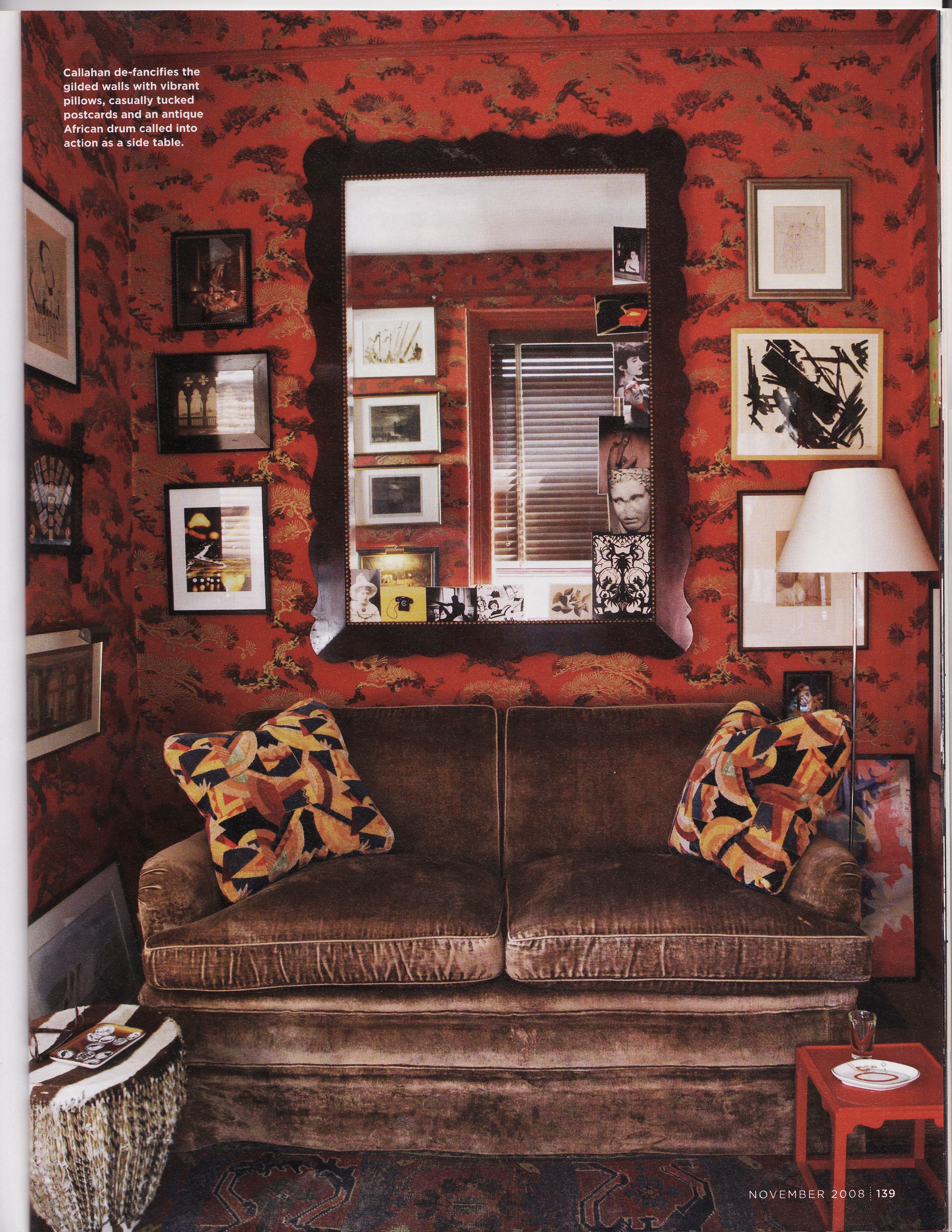
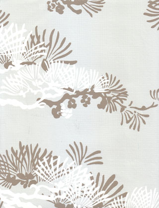
Callahan’s living room is covered in a wallpaper of one of their designs – Edo Pines – in a dramatic red colorway. Pines symbolize long life and happiness in Japan, so perhaps not a bad thing to have papering all your walls.
This living room has a little bit of everything! On the left there are typical Japanese lacquer tray tables stacked high, but they are done in a glossy modern white finish. In contrast, a polychrome Imari platter set in a tray table sits in the center of the room towards the back – something the design world seems to think of as kind of “grandma-ish”. The white iron garden chair has cushions upholstered in a Jed Johnson fabric called (coincidentally?) Kamakura in the Indigo colorway.
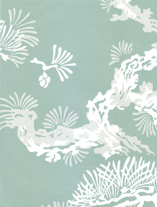
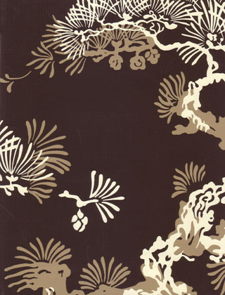
Callahan is quoted as saying “No one looks bad in a red room”. But I think I might consider some of the other Edo Pines colorways.
Robin’s Egg
Truffle
Dove
The bedroom, by contrast, is painted a dark soothing blue.
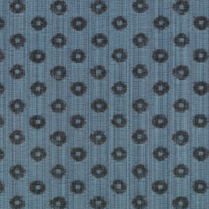
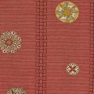
The headboard has been upholstered in the same fabric as the throw pillows on the living room couch to give the apartment a sense of continuity. The throw pillows on the bed look remarkably similar to a Japanese rayon shibori (tie-dye) fabric, but they are actually a very expensive linen/cotton from Jed Johnson called Medallion. (The Imperial colorway looks a bit darker in the swatch below).
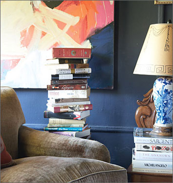
Almost all the Asian blue and white porcelain seen in shelter magazines is Chinese, but this lamp is a converted Imari porcelain vase.
What I find so fascinating about it this apartment is the use of specifically Japanese patterns and objects (as opposed to Chinese for instance) as if he wanted to keep to a theme started by the wallpaper. With the preponderance of Chinese antiques and Chinoiserie readily available in the decorating world, it continues to be unusual to see Japanese items used. I really wonder if he did it on purpose.
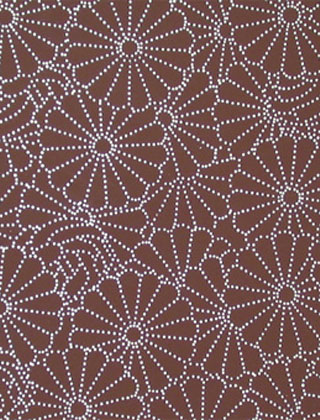
And as a follow up to Tuesday’s post, Studio Printworks has a fantastic wallpaper called “Kiku Kamon” in eight different colorways. Here it is below in my favorite “raisin”.
I wonder what the Emperor would think of having his kamon on a wallpaper…
Image Credits:1,2,7 & 9 photographed by Paul Costello for Domino, 4-6 & 10 Studio Printworks, 3, 8 Jed Johnson Home



Lovely post!
Hmm, I was just searching for Temo’s contact information today on Google, trying to see if he heard from his sister after the Tornadoes in Alabama, and I came across this post. Cool apartment!! My husband and I had lunch with him in NYC in 2004, but haven’t kept in contact. Well, if he reads this, I left a message for Nancy… will keep trying to get a hold of her!!!!
So sorry that I don’t have any contact information for him. Did you check the Studio Printworks website? http://www.studioprintworks.com/